The development of technology has led to significant changes in customer behavior. While until recently, it was enough to put your call center number and social media icons on your website, which no longer works, customers demand real-time communication, and more often than not, they want it online. According to surveys, more than 30% of customers expect live chat on a business’s website. So, they will simply leave if you can’t fulfill their demands.
And our client just provides services for implementing such valuable functions for a site or application. Applozic is a developer tool that brings chat APIs to different digital solutions.
Today, we will give you a glance at another bright design project from our team. This case study will uncover the catchy website design and branding for such an exciting project. Enjoy!
Project and Client
Applozic is a product that brings real-time engagement with chat, video, and voice to the web, mobile, and conversational apps. They provide startups and established companies with the most scalable and robust chat APIs.
Customers and developers from over 50+ countries appreciate it, from online marketplaces and eCommerce to on-demand services, to Education Tech, Health Tech, Gaming, Live-Streaming, and more.
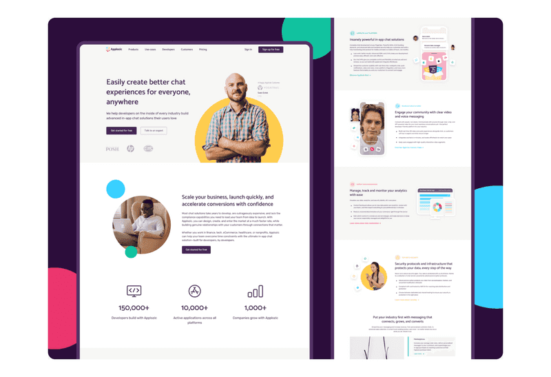
Dribbble shot by Axicube
The task for the Axicube team was making a corporate website redesign to uncover the project’s mission and content brightly and uncommonly to inform and engage potential clients. Also, we needed to create a brand’s visual language that would describe the company’s value and evolution.
What is Branding in Business?
Branding is a business identifier. It is what separates it from hundreds of other competitors in its field. However, strong branding is more than just a logo. The visual language of business branding ranges from brand colors to service style and marketing materials.
So, business branding is the backbone of any company. It helps to strategize and identify what business stands for. And our client also needed strong branding to enhance marketing efforts. So, what other benefits could our client get from it?
-
Enhanced credibility
Business branding creates trust and gives the company the right edge to stand out in the market. And people will choose this company because of an increased sense of having a good reputation and credibility.
-
Boosted customer loyalty
With the help of business branding, it is possible to build good relationships with the target market so that they are loyal. Businesses need to worry about time-consuming marketing strategies when you have a brand voice people trust because those customers will already be brand ambassadors.
-
Gained referrals
Customers will tell their friends about the business if they are loyal and satisfied. Thus, the company can get additional leads from this.
-
Increased business value
Since business branding is responsible for the recognition of a business, it is also associated with an increase in value. As the company develops, more and more people remember it, which means that more and more people appreciate new reached peaks. Moreover, investors only prefer a company with a more structured and reliable business brand.
-
Lasting impression
The first impression is significant. Sometimes, it affects whether the client will cooperate with the business if it is wrong. You could even say that branding is the first thing customers will see in a business and what they will remember after.
For our client, it was essential to create branding from scratch to increase customer loyalty and make a good impression. As we described earlier, having good branding means a lot to a business. So let’s look at how we created business branding for Applozic.
Process of Сreating B2B Brand Strategy
We know how important branding is to the long-term success of our clients. Our team has taken several steps to develop a B2B brand strategy to make your business stand out in the market.
First, with the customer, we defined the goals of his business. It simplifies the creation of business to business branding because it is easier to do it knowing what the company wants to achieve. Next, we surveyed the audience. With the help of this, we learned what kind of visual is needed for a business so that it resonates in the hearts of users.
After that, we determined the brand’s positioning and began thinking about how to separate it from the rest of the competitors in the market. Then, finally, our team was ready to start creating after all these processes.
Logo
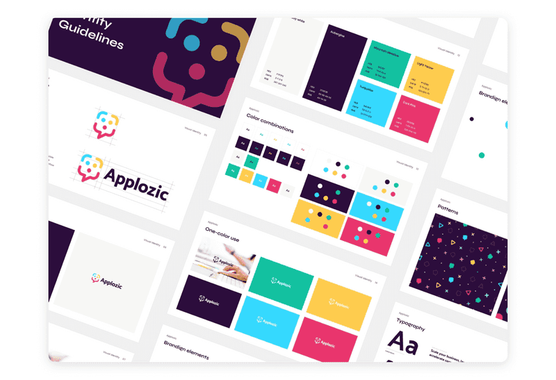
The first thing that comes to mind when creating a b2b brand identity is the logo. When creating a logo, the team must take into account its visual component and that it should look good on the website, graphic materials, possibly business cards, and so on.
There were several options for the discussion with the client, but in all of them, the central concept was to show a conversation platform for mobile applications and sites in text, voice, and video messages. Therefore, the main element of the logo was the chat bubble, the icon that everyone is used to and is always associated with chat and conversation.
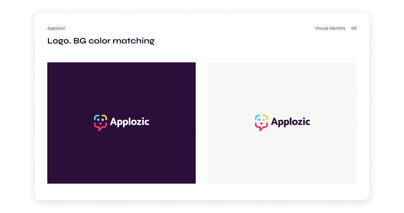
And if we talk about the final approved result, there are three circles in the bubble. So it is like text, video, and the main message. That is, we have combined bubble chat and information services offered by Applozic.
We chose this option for presentation to the client as we believe it best reveals the essence of the project and meets all the tasks. Furthermore, such a logo represents the company’s services, looks stylish and not loaded, and is memorable.
Colors for B2B Brand Identity
The next step was choosing a color palette. It is quite an essential step in creating b2b branding because the chosen colors will accompany the subsequent visual component. After the research was done and the wishes voiced by the clients, we understood that the palette should be quite cheerful but at the same time stylish.
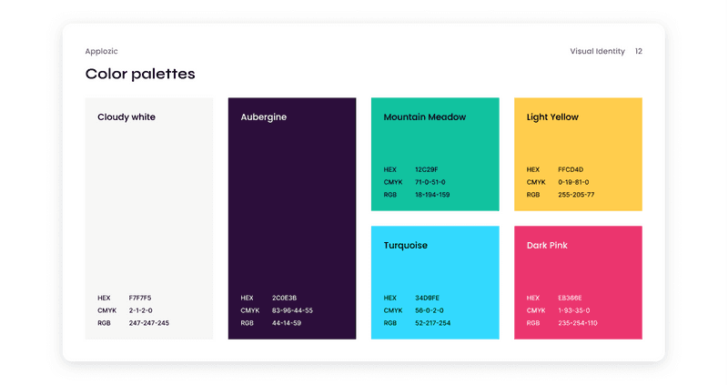
Based on the psychology of color, we have chosen colors representing joy, security, respect, and freedom. You can read more about the psychology of color in our previous article about it.

Color Psychology: How to Choose Colors That Attract Customers?
We offered our client several color palettes, in which most colors were warm undertones. As a result, he chose one, and we continued to work on the design with it.
Typography
The next step was to work on the typography. It may not seem like an essential aspect of b2b branding, but it is. Typography, like other elements, helps build a brand and not only affects the readability of the text. In short, here is what typography affects:
-
Meaning
Typefaces and typefaces convey brand values and tone just as much as your colors do. Typography represents what the brand stands for. Clean, modern, and simple sans-serif fonts resonate differently with audiences than old-fashioned serifs.
Monospaced fonts have a tech sound, while blackletter and script fonts are more personal. That’s why it’s important to choose typography wisely and understand why you’re using it.
-
Perception and recognition
Typography and fonts affect how your audience sees and remembers a brand because they are essential to your visual identity. A catchy font is instantly recognizable - think of well-known brands like Coca-Cola or Disney, who even created and registered their font to make it part of their identity.
-
The way people experience the brand
Your customers perceive your brand through words, and business branding is very much the sum of your customer’s experiences with your business. Therefore, a positive experience creates a positive brand connotation.
Typographical errors, such as fonts that are too small or too obscure due to decorative elements on a website - one of the main complaints of netizens - lead to poor brand perception.
In typography, the client’s request was to choose a simple and easy-to-read typeface, similar to the type that programmers use when writing code. With this wish in mind, we began to select font families that would show the openness of the brand well and, at the same time, look good in combination with the logo.
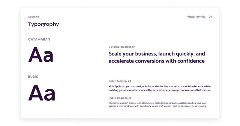
As a result, we settled on a font pair from Catamaran and Rubik. They are perfectly combined and meet the requirements.
Icons
An estimated 84 percent of communications will be visual by 2018Icons are traditionally small graphic elements that are used to provide information at a glance. Therefore, it’s essential to understand the value icons can bring to the b2b brand strategy.
-
Recognition
Brand awareness is an influential factor for any business. It increases sales, engagement, and brand loyalty. Using icons is beneficial for brand awareness as they can convey messages quickly, grab attention, and be used in various ways.
-
Simple communication
Icons are great for making it easier to communicate with your audience. Icons can break up the text, be used as buttons, or easily classify steps to guide your audience.
-
Grabbing attention
A website is typically filled with content from blog posts, service descriptions, or information pages. Content can be easily separated using icons to increase the level of attention.
-
Standing out
63% of consumers say they have engaged with disappointing brand content, and 23% said they wouldn’t reread that brand’s content after that. And the use of icons improves brand visibility and understanding.
To achieve all of the above, we have chosen clear, recognizable, and beautiful icons that go well with the rest of the design. We understood that these icons would be used both on the site and in some guidelines, so we chose a wide range of images.
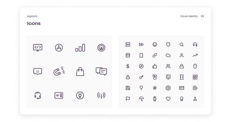
Interestingly, icons sometimes use a background as a circle - this makes the icon more noticeable and fits it better into the overall style.
Visual Elements
And in addition to the b2b brand strategy, we created visual elements that the client can use at their discretion. These are collage elements with different people and chat bubbles that can be collected in a separate order. Such a solution allowed the client to create new visuals independently, thus growing and scaling without losing their identity.
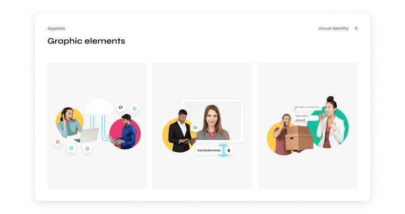
With the help of these elements, our client can stylishly design social networks, banners for a website, or work presentations. Also, we have created templates for PDF files with covers so our client can easily organize internal documents.
At this stage, we have finished the branding and started working on the website redesign. After working on the branding, we already had a clear idea of what the design would be like.
How We Made Corporate Website Redesign
A corporate website is what will represent our client’s services on the Internet. A website increases business awareness, loyalty, increases sales, and more. Our previous article discussed how to make a corporate marketing website from scratch.

Close Insights on How to Design a Corporate Website Which Will Attract More Customers
Along with the rebranding, our client decided to change the website completely. A significant corporate website redesign boosts revenue, lowers bounce rates, and improves user experience. Since it was a redesign of everything, our team absolutely changed all the elements, and ultimately we got a completely different website.
In our previous article, we analyzed the steps that you need to take to corporate website redesign. Our team followed these tips as well. Read this article, and you will find out why you need a website redesign, what benefits it will give your business and how to do it all.

Step by Step Guide on How to Redesign Your App or Website
Our work on the corporate website redesign developed according to a particular workflow action described in the previous article. Of course, each project requires an individual approach, but some steps remain unchanged.

How Do the Perfect Design Process Steps Look?
For example, our team always does a discovery phase to understand our client’s market and audience. After that, we definitely make wireframes to outline the future structure of the site so that our client can see in advance how the content will be located.
So, it was pretty fast and productive work. We often called and discussed the behavior of some blocks on certain pages, changed the structure of pages, or looked together for reasonable solutions for displaying certain parts of the site.
Dribbble shot by Axicube
For example, decisions related to the display of services. That is, how this block will behave (we have a shot of the animation of this block). Also, we often use the block system in our work when the layout of a block is repeated on several pages, but the context changes. Therefore, this challenge was interesting because we could get some good practice in rebuilding content for complex blocks.
Another new experience for our team was working in conjunction with a copywriter who gave us texts for visualization on the site. But overall, it was very productive work on both sides. And the most exciting thing for our team began at the stage of mobile adaptation.
Mobile Adaptation
The vast majority of the world’s internet users – 92.4 percent – use a mobile phone to go online at least some of the time, and mobile phones now account for more than half of our online time and more than half of the world’s web traffic. That is why creating a mobile adaptation of a website is always essential, so our client won’t lose any users.
So, one of the main challenges in the mobile adaptation was simplifying navigation on the site. In the web version, we used open navigation in the header. It was displayed on the screen and provided quick transitions to other site sections.
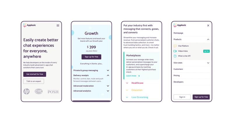
In the case of a mobile adaptation, we needed to add a hamburger menu that would allow saving all sections on a separate page. In our case, the difficulty was that almost every section had its subdivisions. On the mobile adaptation, we resolved it with the help of an accordion. And the Sign In and Sign Up for free buttons were fixed at the bottom of the screen.
To improve the display, some sections have been modified—for example, the section where we talk about services. On the web, it had a visualization in the form of a photo collage, but on mobile, it was decided to remove the visualization.
There are also a lot of photos and other visual elements on the client’s website. To speed up the loading speed of pages on mobile phones, we reduced the resolution of many pictures or simplified the appearance of some sections of pages.
Challenges of Creating B2B Brand Identity and Corporate Website Redesign
In this project, there were several challenges that our team did well. Let’s find out what it was:
-
Pricing page
It took us a long time to agree on the appearance of this page so that it looks beautiful and covers all the needs of the business, but in the end, we came to a common opinion.
-
Collaboration
Such close cooperation with a copywriter was a novelty. More often, however, we receive a task from the client to think over the structure of the website page, to fill it with our own content, and sometimes to lay down text that will not even be edited in the future.
But in this project, all corrections were discussed with the copywriter, and our team received precise tasks for some blocks, whether an accordion or cards with advantages. Thanks to our joint work with the copywriter and the client, the entire content component was organized very well. In this regard, we were delighted with the project.
-
Lack of time
Overall, the main challenge was the lack of time for the project, as the client wanted to get up and dash. As a result, we have increased the team to meet the deadlines and meet the client’s expectations.
So it was difficult, but we found a balance to maintain the quality of the work and meet the deadlines. For this, there were two designers on the project from the very beginning. We unified some blocks’ designs and used the design system to create the necessary components quickly.
-
New industry
It was a new industry for our team, so we needed deep research to understand the audience and competitors of our client.
-
Mobile adaptation
We had difficulty adapting the navigation in the mobile version of the site, but we coped with this by applying the accordion menu. It is a vertically stacked list of various pieces of information. For each list, there is a labeled header pointing to related content. Each list’s content is hidden by default.
Despite some difficulties, our team coped with this project, which was an exceptional experience for us.
The Result
Our team designed a new visual language and communication style for Applozic. It is a real-time engagement with chat, video, and voice for web, mobile, and conversational apps. We have created different blocks, which could be reused on many screens depending on business needs. In addition, our graphic elements are understandable for different types of users and could be adapted for special needs.
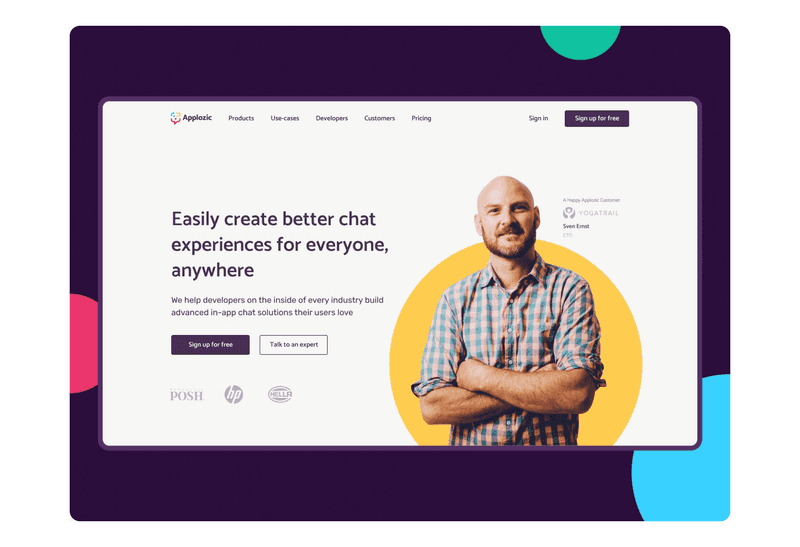
With our design’s help, our client could increase conversion and brand awareness. Applozic is used and loved by customers and developers over 50+, from online marketplaces and eCommerce to on-demand services to Education Tech, Health Tech, Gaming, Live-Streaming, and more. However, the product owner made a deal with Khoros, and Applozic has a new holder. It is a new stage of its development.
Satya Ganni, CEO at Applozic, left us a positive review that claims: “Eugene and Valentyn were able to understand our expectation and meet our stringent timeline without compromising on quality, good job by team Axicube.”
Conclusion-
In this case study, we talked about how we did business branding and a corporate website redesign for Applozic. Our team has done a great job creating the b2b brand strategy and designing the corporate website.
This cooperation was a valuable experience for our client and an excellent opportunity to grow his product and business. Business branding and redesigning a corporate website is an ideal move for any business owner. After all, both create a first impression for customers, which can affect their desire or not cooperate. Yet, we increased brand awareness and conversion, leading to a successful deal with Khoros.
Whether you and your business need a breath of fresh air in the form of a business branding identity or a corporate website redesign, our team is here to help. We have a positive experience in creating a design for the digital sphere, and we are always ready to gain new experiences and participate in new projects!

