Today, more and more people are starting to do workouts. It has become prestigious and fashionable both among young people and adults. There are many ways and places to go for sports, but a wide range of people choose to do sports at home in the new realities.
COVID-19 has affected this, as many people have been forced to stay within four walls during the quarantine. So how do you get out of this situation? Home fitness equipment allows you to monitor your health without leaving your home. And mobile applications will enable you to track the correctness and quality of workouts.
According to a new report by Grand View Research, Inc., The global mHealth apps market size is expected to reach 149.3 billion dollars by 2028 and is expected to register a CAGR of 17.7% over the forecast period. As you see, creating your fitness app is a compelling idea for a startup or business promotion. If you want to know more about this type of app, read our article about it, where we analyze in detail all the subtleties of creating such products.
How to Create a Superb Fitness App Design
But let’s return to our main topic. Our client makes home workouts more pleasant and effective. For over 20 years, their SportPlus brand has made great home fitness equipment for regular exercises at home. First, however, the stakeholders wanted an app to help their customers use the equipment’s full potential to the maximum and better understand their audience. Because, as you see, the progress does not stand still, and there are much more requirements for modern simulators. Now they are expected to have an intelligent approach and a modern interface, which the mobile application can help with.

The goal was to create a design for a sports app that connects with their fitness equipment, making the workout more efficient and helping stakeholders collect information about clients and their preferences. So, this is how this SportPlus app design case study was born. Interested to know more? Read on!
Project Overview
We have worked on creating a fitness app design for their company with our client. They develop modern fitness equipment, and that’s why they wanted to increase conversion rates and customer loyalty. They make the right sports equipment or gadget, so their customers can stay fit in their own four walls or the office. From dumbbells to rowing machines, they offer their clients a wide selection for their gym.
Yet, the stakeholders wished to understand their audience to provide customers with a better experience. So they came up with a solution to launch an app that would meet the requirements of both the marketing team and the customers. With it, the full potential of the SportPlus equipment will be unleashed.
The app’s essence is to combine training programs for all the company’s devices. Yet, it can gather feedback about the equipment and data about the users to develop more relatable products for their customers.

The app should also provide customers with clear instructions on how to use the devices at home and what workout program to choose to make the training more efficient. But let’s move closer to the problems the SportPlus app solves.
Goals to Reach
As mentioned above, a mobile app should make a business more efficient but at the same time bring benefits to users. Yet, to correctly measure the success level, you need to define goals. For example, the product had three tasks and a specific business purpose.
Users Goals
Users don’t like digging into the settings for a long time. They like it when they can download the application and immediately start the workout. Therefore, the main design goal was to make the interface simple but pleasing to the eye. Also, it was necessary to consider the brand book that the stakeholders gave us. The app should fit well with the rest of the SportPlus ecosystem.
So, one of the tasks was to increase the efficiency of workouts with the equipment by providing an app that would connect to them and show correct statistics. If a person uses a client’s equipment, they can find pre-prepared programs for the workout or create programs themselves and view the statistics of their exercises.
The next task to solve was to make the usage of their equipment more accessible and enjoyable. It means that, for example, having bought equipment, a user can read the instructions but still not understand what modes there are and how it works in general. And with the help of the application, we can give additional information about how the programs work, how to switch the speed, etc.
But let’s move to the business goals equally crucial in creating fitness app design.

Business goals & Solutions
The customer’s main request was to identify the audience. The client manufactures its equipment and sells it effectively via e-shop and online platforms. But they don’t know who buys their products, and why, because of lack of feedback. Thus, our client doesn’t know how to increase sales and grow. Yet, it was crucial to make devices and applications inseparable from keeping in touch with users through the app.
To make it, we decided to collect data needed for other marketing analytics at the stage of user registration. The user can’t skip filling in this information, and therefore the company will understand exactly who their buyers are. For further connection between the client and the user, we placed in the application blocks for subscribing to the newsletter, social networks, support, and answers to questions to be in touch with the brand.
In addition, the app can increase usage of the equipment because people like ready-made workouts and the ability to see results. And by expanding the involvement, brand awareness would also rise, which is vital for the business.
Let’s go further and find out how we coped with the tasks.
User Research
It is how every project starts. The biggest reason to do user research is that it’s the only way to understand the people who will use the design. The better you know your users, the more relevant design you can create. But this is not the only reason to conduct it. In our previous article, we’ve talked about the importance of this stage and the types of user research methods.

Essential UX Research Methods For Your Business
The main task for business was to identify the target audience. Who buys SportPlus devices? What is the further use of the device? We’ve analyzed the customers to divide them into a few user groups:
-
The newbies
The first group consists of customers who use predefined programs. For this group of users, we prepared ready-made programs.
-
Freestylers
The second one is the users who practice freestyle training without ready-made programs. To satisfy this part of the audience, we have provided the opportunity to perform a workout at their discretion.
-
Solo
The third one is people who have their program and schedule. For such users, we have given them the opportunity to save their workouts and the ability to track the duration, intensity, and regularity of training.

We also determined that most people have only one piece of equipment. In this regard, we assumed that some people would repeat the same workout. For this case, we added a button to repeat the previous training.
Considering each group’s patterns of behavior and needs, we’ve made different case study research design for them so they both are comfortable using the product. Yet, we’ve done domain research to understand the whole market and make an excellent app.
SportPlus App Design Process
After studying the audience, we can proceed to further design process steps to create an application. These include creating information architecture, user flow, wireframes, prototyping, and the actual design. Want to know more about the design process? Read our previous article about it! There we thoroughly analyzed each step of the process.

How Do the Perfect Design Process Steps Look? Everything You Need to Know
But we will go on and see how our team coped with the design process activities while working on the SportPlus fitness app design.
Informational Architecture and User Flow
Firstly, we made Informational Architecture (IA) to plan the structure and understand the main features. We needed to identify the primary users’ needs and the functionality of the equipment to build a list of necessary options in the future application based on this. A well-designed and intended IA is the key to fewer users’ time-spending and efforts to find what they need.

After compiling the information architecture, the next step is user flow. It will bring us closer to the best fitness app design. At this stage, we had to find an answer to several questions. For example, what is the easiest way for users to reach their goals in the app? The user may have a specific request in the application, or will it be a beginner who does not yet know what they need?
To answer this question, we needed to prepare user flow. However, this method is not complicated and doesn’t require the complexities of visual design. To make it, we took into account different models of user behavior and compiled detailed user flows for a few cases.
But these steps are not enough to make the UX part perfect. So, what’s next?
Wireframes
Wireframing is an essential communication tool between designers, developers, and product owners in any web project. It allows all parties to explore the app’s structure without distracting design elements such as colors and images. In addition, we believe that building a simple framework makes the development and design process more straightforward.
If you want to know more about the communication process between designers, developers, and product owners, read our previous article about it. Then, we discuss the crucial aspects that need to be considered for the workflow to occur without problems.

A Love Story Between Developers, Designers, and PO. How to Organize the Design Process to Archive a Happy Ending?

In this project, we needed to fit a lot of information on the screens. Wireframes help sketch out the app’s overall look to understand how to do this. So, we’ve created detailed wireframes for each page of user flow. Then, there was a stage of making a screen map based on the cases we’ve defined.
Thanks to these, developers were ready to start developing an app before the final version of the UI.
User Interface
As a rule, this is the brightest and most fun part of the project. But our client already had a well-designed brand book ready, which made it easier for us to think over the fitness app UI design. Nevertheless, our team still had to work hard to make the application fit the mood and look of the company’s website.
-
Colors
We’ve chosen the colors from the brand book and tried to use them wisely. For example, in yellow, we decided to emphasize essential design elements to catch the eye of the user immediately. These are such elements as buttons, icons, some statistics elements.
-
Icons
Icons are needed to reduce the amount of text and captions on the screens. We decided to use neutral icons not to distract the user’s attention and fit precisely into the overall visual.
-
Typography
We took the fonts from the brand book provided to us earlier. Here our task was to work well with the typography and make the texts readable and contrast enough, but at the same time that they look good with the rest of the design elements. It was challenging because the client’s font family wasn’t variable. But our team managed to solve this problem and make an excellent, readable interface even with a small number of font styles.

But good UI design doesn’t end there. Want to know what other exciting details we have thought of?
Other UI Solutions
To make the design more enjoyable, convenient, and intuitive for the user, our team has developed some attractive solutions:
- To distinguish available workouts from non-available ones, we made the second ones in black and white and the available ones in color. This made them more intuitively distinguishable.
- The app’s main interface is white, while the screen with the running workout timer is black. Thus, we use a color code to distinguish between the workout search and the workout itself.
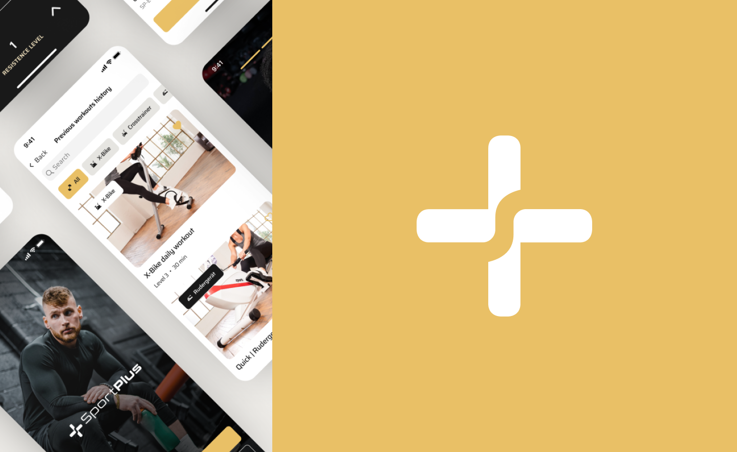
- We made a tricky home screen. To not show a blank screen for new users, it has two states: the initial state, when the user has just created an account, and the state when the user has been using the application for some time, so there are statistics, training history, etc.
- To make watching workouts more convenient, we made a landscape mod.
Now, we’ve discussed all case study design and methods we used during the SportPlus app creation. But there are no projects without challenges. So let’s take a look at some of them and find out how we dealt with them.
Challenges We Faced
Challenges are not what scares our team. Instead, this is what makes the fitness app design process more enjoyable.
-
Accounts switching
It was essential to provide the ability to use one piece of equipment by different people and the ability to change accounts. Every family member wants to track their progress and reach their own goals. And it was essential to provide the ability to use one piece of equipment by different people (and also understand how many actual users we have). So how can we do this comfy for users? Easy! We provide the ability to switch accounts in a few clicks.
-
Statistics displaying
The app should show training statistics on the equipment. So, for example, if a person uses a client’s treadmill in our app, they can find pre-prepared programs for the track or offer the program themselves and see their training statistics. Unfortunately, one of the project’s difficulties was that we could not know precisely how the technique we developed for the app worked.
The range of products is enormous - there are many types of observation, cross-trainers, etc. But unfortunately, our team has no understanding of finding related characteristics that vary with all kinds of equipment.
We examined each product in detail on the client’s website, searched for descriptions and photos of screens, looked at the characteristics of all the equipment, and deduced the average indicators for all simulators.
- Workout history displaying
The app should show the general statistics of previous workouts and count their frequency. We decided to place this on the app’s main dashboard so that when a user opens it, they can immediately see their previous progress. -
A lot of information
When we understood what characteristics were needed, we were faced with the fact that there is a lot of information for one screen, and then there were many options and versions of how to place it compactly.
On one screen, we needed to show at what minute of the prepared workout the user is, how and when the change in the training program will occur - for example, in two minutes, the track will go to the fifth difficulty mode, and now it is on the fourth. In the same place, we had to allow the user to change the level of complexity themselves if the prepared program is easy or difficult for them.
And with all this, we had to give information about users’ current indicators statistics, which is already too much data for one screen. So we decided it this way - when a person scrolls the screen, the round player collapses into a horizontal one, freeing up space on the screen for statistics.
-
Creating community
Our client wanted to build a community of people who use their devices. To do this, we decided to place catchy banners with links to their social networks on the app’s main dashboard.
-
Simplifying the devices
When buying equipment, the user may still not fully understand using it. The analog interface on the equipment is more complex and requires more cognitive effort than the analog interface on a phone or tablet.

After overcoming some obstacles, we got an excellent app and a nice design case study. But let’s review our final work anyway!
SportPlus Mobile App Design Case Study Result
As a result, we got a ready-made fitness application that fits perfectly into the overall ecosystem of our client’s brand. The app is designed for two types of users: advanced users and those who have just started practicing.
By accessing the application, the user can see the statistics and details of previous workouts. If the user just downloaded the application and did not start training, we developed a separate welcome dashboard with hints on where to start the exercise to avoid confusing users with a blank screen.

On the workout page, the user can see its duration and parts when the workout will become more intense or, on the contrary, easier. It is also possible to start a quick movement, choose a ready-made training program, or customize it yourself. And also, the user can select the duration of the workout and the degree of load. In addition, on each page of the exercise, the user can see the device’s status. For example, is it connected, the training statistics, etc.
This project has been an excellent experience for our team. Despite some challenges, it was interesting to work with fitness app design.
Conclusion
Statistics indicate the number of people using fitness and nutrition apps is set to rise to 825.7 million in 2020, a 26 percent increase in a year. In addition, the number of users in the wearables segment is forecast to grow 24 percent year-on-year to 441.5 million.
Contributing to the fitness app industry is not only about money but also about helping people. Therefore, this is a profitable undertaking and a noble one. Our team took on the task of creating a SportPlus app with great pleasure. And we are happy to take on such an adventure again!
By investing in fitness apps, you can get a long-term perspective of earning and growing your business, and our team will help you along the way.