Everything starts with a plan. Creating any web product also begins with planning. This stage includes some steps with brainstorming and processing ideas. It is crucial to do before starting design and development. One of the planning techniques is wireframing.
You’ve probably heard the word “wireframes.” Wireframes are an essential part of the web product design process, but what are wireframes, and why are they important? In this article, we’ll walk you through everything you need to know about wireframes.
Yet, if you are interested in learning more about the design process in general, read our previous article. In it, we analyze all stages of this journey, from the birth of an idea to the final touches on the finished product.

How Do the Perfect Design Process Steps Look? Everything You Need to Know
We’ll start by learning the definition and continue by looking at the anatomy of a wireframe, from what it is to how it fits into the product design process and then to what features it includes.
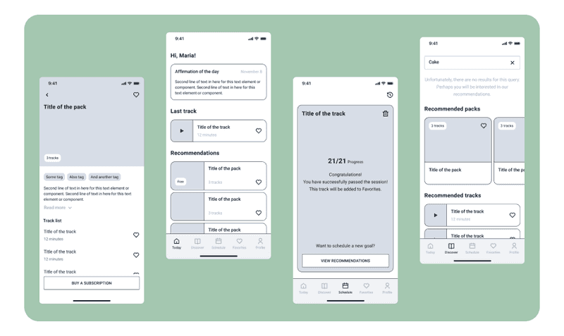
Wireframe Design by Axicube
What is a Wireframe
To understand this topic, let’s start with the wireframe definition. A wireframe is a schematic representation of a web page or app. Wireframes clearly show page structure, layout, information architecture, user flow, and functionality. Since it usually represents the initial concept of the product, style, color, and graphics are kept to a minimum.
UX designers most commonly use this practice. This process allows all stakeholders to agree on where and how the information will be placed before developers create an interface with code. So, for now, we know what is a wireframe in web design. But what is the wireframing process?
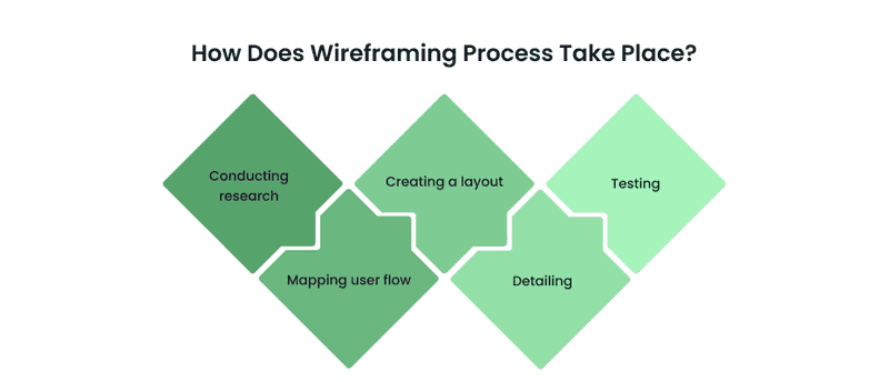
How Does Wireframing Process Take Place?
So, how to wireframe? Wireframes can be created by hand, and UX designers often do this very early in the design process when thinking about possible solutions. But almost always, further iterations are done by software. It allows to create more accurate designs, speeds up the process, makes it easier to make changes, allows designers to work together on one project, and much more.
Basically, wireframes can be created with any tools designers use for making UI. It is just one step in the development process. Skilled UX designers can create a framework that guides users to the company’s desires.
Yet, some tools can be used only for creating wireframes. These are, for example, wireframe.cc, Axure, Balsamiq, and Marvel. Perhaps designers don’t need such tools because they can create wireframes in any software for UI, but all this can be useful for stakeholders. With the help of these tools, they can quickly sketch their idea visually and thus simplify communication with the design and development teams.

At the same time, the interests and desires of the user will be taken into account. When designing wireframes, designers can foresee possible problems that may arise during the use of the product. It will allow them to be resolved even before launch.
Working on the design, we go from the general to the particular, gradually detailing everything. It also applies to wireframes. There are five steps for creating wireframes:
-
Conducting research
To create a wireframe, you first need to define the primary goal of the project and the business philosophy to meet the stakeholders’ expectations. User research is then conducted to determine user needs and understand them.
Based on this, the primary user scenarios are determined. In the end, an analysis of competitors and the market is carried out to understand what features can stand out from other products and what is typical for a particular industry as a whole.
If you want to dive deeper into the topic of user research, read our previous article. We talk about all user research methods used for different goals.

Essential UX Research Methods For Your Business
-
Mapping user flow
User flow is the basis of the future wireframe. It includes all user interactions with the future product from the very beginning of the journey to the final touchpoint. When planning a user flow, designers think about all the user paths within the development, and thus, it will be much easier for them to understand which elements should be included.
-
Creating a layout
At this point, designers need to create a basic structure that outlines which elements will be on the page, which element will be placed there, which tabs will be included, where text fields will be placed, and where multimedia elements will be.
The idea is to create a skeleton web page in such a way as to satisfy all the needs of users and businesses.
-
Detailing
After defining the main elements in the layout, designers can start some detailing to create a medium and high detail wireframe.
-
Testing
When the details are filled in, the wireframe is ready for testing. But, first, it will need to be tested to see how user-friendly it is, i.e., if all the interface elements that the user might need are present.
Testing will also help identify any essential items that may be missing, bugs, or any additional requirements that need to be considered.
We know what wireframes are how they are made, but when are they needed and why? So many questions and so few answers, right? Keep reading to find out.
When Do You Need Wireframing?
Wireframes usually take place in the early stages of the design process. And we can say with confidence that they are always needed to draw up a clear plan of action. But we have prepared several more specific cases where this practice helps in creating a product:
-
Define features
The low detail of wireframe design allows focusing on the product’s main features. In addition, depicting characteristics on a wireframe will enable designers to visualize how they all work together and may even spur them to remove some of them that don’t feel quite right with the rest of the page elements.
-
Identify pain points
Conducting user testing early in the wireframing allows the designer to get honest feedback and identify key pain points. Also, suppose testing is carried out in the early stages of development. In that case, it will be much easier for users to give feedback since they will not be distracted by visual components but will look into the very essence of the concept.
-
Keep everyone on the same page
When designers share their ideas with clients, they may find that stakeholders lack the technical vocabulary to understand terms like “hero image” or “call to action.” Wireframes can help communicate how the future product will function and its purpose between stakeholders, designers, and developers.

Just above, we mentioned that wireframes help to communicate between all interested parties. Read our previous article to learn more about how designers, developers, and product owners share. We have analyzed all aspects of this issue and given some tips that can help make communication more effective.

A Love Story Between Developers, Designers, and PO. How to Organize the Design Process to Archive a Happy Ending?
But let’s return to the matter in hand. What are the types of wireframes? And how do they vary?
Types of Wireframes
There are three types of wireframes. The main difference between them lies in the level of detail. But still, let’s look at each type:
-
Low-fidelity
Low-fidelity wireframes are visual representations of a web page’s main features and layout and are typically the starting point of a design. As such, they tend to be quite rough, created without any sense of scale, grid, or pixel precision.
Those wireframes skip any potentially distracting detail and include only simplified images, block shapes, and dummy content such as placeholder text for headings. As a result, the low-fidelity wireframe is excellent for navigation or mapping the user flow.
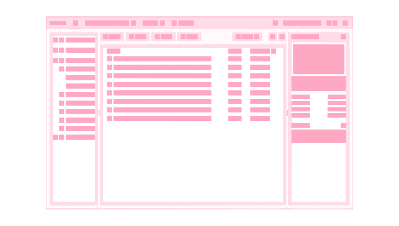
Low-fidelity Wireframe Design by Axicube
-
Mid-fidelity
Of the three, the most commonly used type of wireframe is the mid-fidelity one. This is because they provide a more accurate representation of the layout. While they still shy away from distractions like images or typography, more detail is given to specific components and features differentiated.
Different text styles can also be used to separate headings and body content. While these wireframes are still black and white, designers can use different shades of gray to convey the visual value of individual elements.
-
High-fidelity
This type of wireframe may include actual images and related written content. The extra detailing makes high-fidelity wireframes ideal for learning and creating complex concepts like menus and so on. As a result, high-fidelity wireframes are typically reserved for the last stages of the product design cycle.
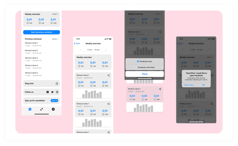
High-fidelity Wireframe Design by Axicube
After we figured out the types of wireframes, let’s find out what they include.
What is Included in the Wireframe Web Design?
As we mentioned earlier, the number of elements and features included in a wireframe design largely depends on whether it is a low, medium, or high fidelity one. However, elements commonly found in wireframes are logos, search boxes, headings, share buttons, and placeholder text (Lorem Ipsum).
Low and medium-fidelity wireframes should not contain typography or pictures. But, designers can use text of varying sizes to indicate the content hierarchy and show where the heading will be. High-fidelity wireframes can contain navigation, typefaces, actual content, and so on.
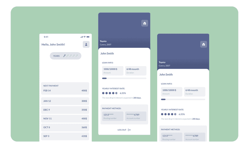
Wireframe Design by Axicube
But what if you want to adapt your website for all devices? Do designers need to create everything from scratch for each viewport? There is also a solution for this. It is called responsive wireframing. Typically, wireframes are static design artifacts created for a particular viewport (desktop, tablet, or mobile).
By contrast, a responsive wireframe is a simple web page created with HTML and CSS that uses responsive web design principles to illustrate layouts. In addition, responsive wireframes are dynamic, so it takes less effort to make changes. All that is needed to change is to update the page source code and reload it in the browser.
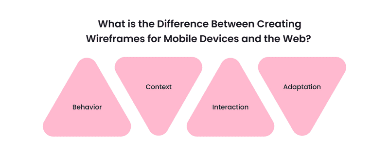
An HTML wireframe is suitable for building a website and app. What happens when designing wireframes for mobile applications? And what is the difference between creating wireframes for mobile devices and the web?
-
Behavior
The user can use the mouse or trackpad to navigate the page on the website. Yet, they can also click on some aspects of the website, hover over to reveal more information or open a menu.
-
Context
Users can use the apps everywhere: on the bus, running on the treadmill, lying on the bed. In contrast, websites are used primarily statically.
-
Interaction
User interaction with content on the website and mobile app are different. For example, swiping pictures is only suitable for mobile applications. On websites, users tend to scroll, so work on wireframes can vary.
But on the mobile app, users will have to touch the screen to open the feature. So when creating wireframes for mobile apps, designers need to think more carefully about encouraging users to press a particular button to achieve a specific goal.
-
Adaptation
Designers need to adapt to different operating systems (iOS, Android) on smartphone applications. And on the web, we adapt to different screen sizes.
Perfect, now we know about responsive wireframes and the difference between wireframing for mobile and web. So what’s next on the way to a complete understanding of the topic?
Website Wireframe Examples of Screens Map
A sitemap wireframe is a diagram of a website or app that shows how pages are prioritized and how they are related. If the user flow is like street view details, the sitemap is like a bird’s eye view.
Sitemaps are used early in the UX design process, right after the discovery phase. Typically, designers create a sitemap wireframe after researching user personas, user paths, and card sorting. Designers should conduct a UX audit or content inventory for an existing website before developing a new sitemap. By the way, if you are interested in discovering what UX audit is and how it can boost the product’s performance, read our previous article on this topic.

How to boost performance with UX audit (and who can do this for you)
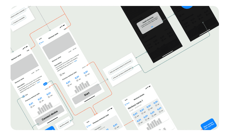
Screens Map design by Axicube
You might be wondering how this is done and what it looks like. So: each page has a link number and a tag, and pages from high-level categories are linked to other specific pages. A UX screen map allows you to plan for usability whether the design team is working on a new website or a redesign. It provides a complete overview, which then helps teams simplify, trim unnecessary pages, and keep what’s important.
The UX screen map also helps see if the related pages are user-friendly and SEO friendly. Finally, designers can understand how to place content where users can easily find it strategically with a screen map.
But let’s continue the topic with one more important question that also needs an answer.
Why is a Screens Map More Critical Than a Clickable Prototype?
Sitemap wireframe serves as the base or foundation of your digital product. Building a website is a process. Wireframing is one of those parts of the design process that shouldn’t be skipped, just like you wouldn’t make a house without a blueprint. Therefore, it is essential to do them correctly and thoughtfully. In addition, they give an overview of the design and concept of what is being created.
Clickable prototypes are more of a visual representation of your product. We can say that this is a practically formed product. It is not the final version of the product, but it can be shown to other people and given a try.

Since wireframes for websites or apps are like the point of departure, paying more attention to them is essential. After creating good wireframes, there is no problem making clickable prototypes for testing on real users. The screen map helps evaluate the work done on the product from the technical side. It also helps to understand how the product will function as a whole.
It is crucial for the technical component of the product and the user experience in general. It is a Helicopter view for the development and possibility to see the interaction and functioning of all parts.
Testing with real users is an integral part of the product design process. In this way, weaknesses or errors can be identified and corrected before creating the visual aspect and transferring everything to development.
The prototype is more about the visual part and must demonstrate the concept to stakeholders or particular users. A clickable prototype is like a cherry on a cake. It simply provides an opportunity to visually see what the final version of the product will look like. As you see, these are different things, and one does not replace the other. At Axicube, our team believes that the screen map is more important.

If you still do not fully understand the advantage of creating wireframes before making a visual at this stage of reading the article, then the next section is for you.
What are the Advantages of Creating Wireframes Before Designing the Visuals?
As we explained earlier, any project starts with a plan. And wireframes are a great way to plan the project road map. But what other specific advantages does this way of visualizing a concept have?
-
Save time and costs
Due to the absence of aspects such as color, typography, images in wireframes, the work speed is higher since the fixes are based solely on content and functionality. Also, the design team can identify usability issues and shortcomings at the wireframes stage, which will be much cheaper and faster to fix in the early stages.
-
Explore the idea
It’s much quicker to consider multiple ideas in the wireframe stage than in later stages. Why? Because it’s pretty easy and fast to jot down a few ideas and evaluate them, rather than working out each one in detail just to see if it works or not.
-
Easy communication
Wireframes are an excellent way for designers to show clients and stakeholders the structure of an idea without getting distracted by colors and images. If the purpose of the meeting for designers is to ask clients what elements should be on the page and how they will work on the site, the absence of colors, images, and stylized pages will significantly simplify the task.
Also, wireframes simplify communication between a team of designers and developers.
-
Push usability to the forefront
When starting the design process, it is easy to get carried away and forget about usability and functionality for users. By eliminating color, images, and other details, it becomes possible to think only about the layout and functionality of each element on the page. As a result, designers will only focus on the structure needed for a better user experience.
-
Make the design process iterative
Wireframes are a way to make the design process more iterative. First, low-fidelity wireframes are created and discussed with stakeholders, then they change and become more complex depending on the result of the iteration.
This is much easier to work with than doing the whole design at once and then fixing everything at once, isn’t it?
-
Focus on the content
Wireframes are a great way to prioritize content by designing a hierarchy of elements on a page. Being able to pre-render the ranking on the pages and start visualizing the space constraints will save a lot of time later when it comes time to create the visual of the pages.
Designers need to gather feedback on the wireframes from stakeholders, quickly make changes based on the feedback received, iterate again, and repeat until the intended goal is achieved.
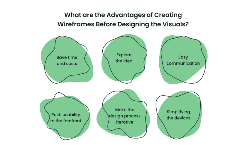
Wireframes are a fantastic tool - while they can take a while, they help visualize and make the design process more iterative. This tool allows designers to focus on content, not just aesthetics, which improves usability. Wireframes are a great starting point for any design project.
After the wireframe stage is done, it is time to create the visual part of a project. Interested? Read our next article about it!

Take My Money: Visual Design vs UI Design as a Method to Make Selling Product
Summary
So here is everything you need to know (and a little more) about wireframes. They may seem simple enough to be ignored. But you should not do this because you need to understand that the design process must occur sequentially. Still, wireframes will allow you to gain important user, customer, and stakeholder approval for the layout and navigation of crucial product pages.
Armed with this endorsement, you can move forward with the confidence that your customers and users will love something you are developing. And oh yeah, wireframes save tons of time and money in the long run!
Our highly qualified team is at your service if you think about creating your product. In our work, we use the best traditions of building web products, thanks to which your startup will be launched at the highest level.


