“Problems with visual design can turn users off so quickly that they never discover all the smart choices you made with navigation or interaction design.” — Jesse James Garrett, UX Designer & Co-founder of Adaptive Path.
Visual and UI design are the two often interchangeably used terms in web and app design. And it is understandable. Both of these are about the look of the product. Because of it, these terms are often placed together and viewed from the surface, it seems like they describe the same thing. But what is the difference between UI and visual design?
Today we would like to discuss the step that goes right after the UX part of the product creation. Firstly, you need to create wireframes to understand the structure of your future product. In our previous article, we discussed this topic and the importance of this stage in the design process.
What is a Wireframe and Why Do You Need it in the Design Process
The next step after wireframing is about the visual part. People like beautiful things. If your UX is great, but the final product doesn’t look pretty, customers won’t notice it. However, it doesn’t mean you should give up on UX and concentrate only on visuals. To make a selling product, you need to use both of these elements.

In this article, we will find out the difference between UI and visual design and how to make a good-looking product that would be selling.
What is Visual Design?
According to studies, it takes about 50 milliseconds (ms) (that’s 0.05 seconds) for users to form an opinion about the visuals. This fact reflects the intuitive level of the design—in other words, the user’s first impression or reaction to the visual. As a result, they are more likely to leave if they don’t like what you show them at critical moments.
It is a mistake to believe that designers include attractive elements just for beauty. Instead, designers create and organize elements to draw the user’s attention to the element’s functionality and make the aesthetics consistent. For example, designers compose and arrange website content according to the purpose of each page and are careful to ensure that the content provides the right visual cues for the user.

Thus, visual designers should always show users the right things in the right way. It is necessary to eliminate the uncertainty of the user. If users stop thinking about the design, they won’t trust it or the product. So, the visual design should focus on the essential aspects and balance a fresh, robust design and what users expect to see.
Visual UI design focuses on the aesthetics of the site and related materials by strategically arranging images choosing the right colors, fonts, and other elements. A successful visual design does not distract from the content on the page or feature. But how do designers achieve these goals?
Principles for Creating a Visual Design
The successful visual design applies the following principles and combines them effectively to make sense. The following principles are usually taken into account:
-
Unity
This principle helps establish harmony between page elements so that they appear to be related to each other and users are not distracted by misaligned layouts.
-
Gestalt
It is a group of principles for how people perceive objects and determine how users interpret the design.
-
Hierarchy
It’s about using placement, font, etc., to show the degree of importance of different elements.
-
Balance
This principle is used to distribute elements evenly.
-
Contrast
Designers use differences in color, shape, etc., to highlight elements.
-
Scale
Such a principle is used to emphasize elements, to establish importance or depth.
-
Dominance
Using an object’s size, color, etc., makes it stand out. This way, it is possible to draw the user’s attention in the right way and show what element is more critical.
-
Similarity
It refers to creating continuity in a design without direct duplication. Affinity makes parts work together and help users understand an interface or image more quickly.

These are the basic principles of design. Visual design is about composition and a beautiful picture. But if you layer it on user experience, you get visual UI design. So let’s take a closer look at this term.
What are Web User Interface Designs
“UI design is about using typography, images, and other visual design elements to turn a basic interface into something digestible and usable. A UI designer focuses on how the colors, typography, and images of a design connect to the brand of a product.” — Jonathan Widawski, Maze CEO & Co-founder.
User interface (UI) design is the process of creating interfaces with a focus on style, aesthetics, and interactivity. The goal of a user interface designer is to create an interface that the user finds easy to use and aesthetically pleasing.

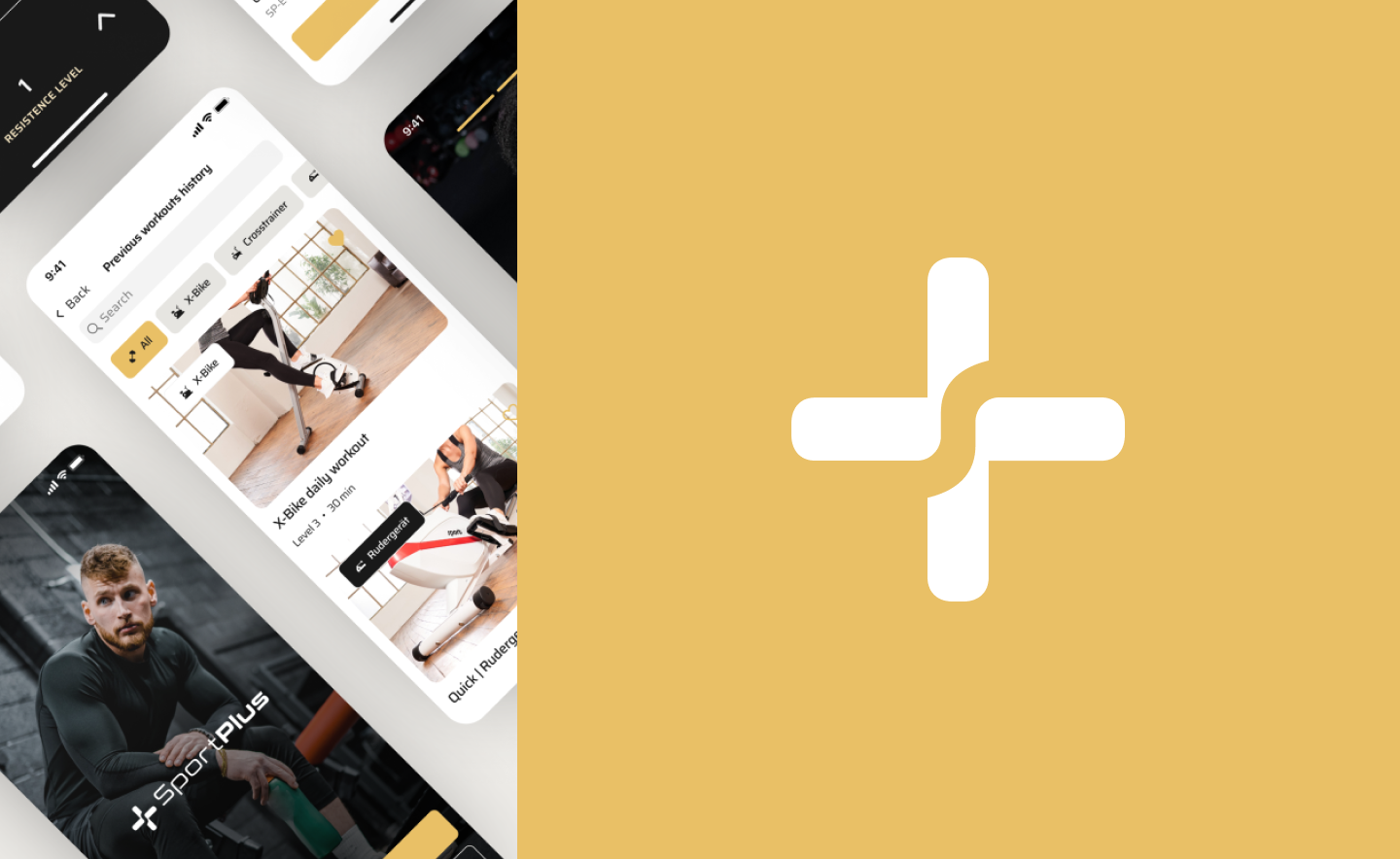
UI Design Example by Axicube
When discussing UI visual design, we discuss the designer’s choices when creating the product appearance. For example, buttons, images, menu bar, or footer. All of these elements affect interactions the users make when using the product. However, while making the aesthetics, the designer should focus on users’ needs, not only on the visual appearance.
But how to make a good UI design? Well, there are some valuable principles to follow. So let’s find out what these are.
UI Design Principles
Creating a successful user interface requires applying a set of UI principles. There are various well-known UI guidelines to keep in mind:
-
Be user-centered
As always, the first principle of user interface design is to focus on people (or, as we all say, “users”). Therefore, a good UI is easy to use and doesn’t confuse the user on the way to their goal.
-
Strive for clarity
A human interface design aims to allow users to interact with a website or application (or, more broadly, any product). Therefore, avoid anything in your design that confuses people, distracts them, or doesn’t help them interact.
-
Make it simple
Simplicity is the ultimate sophistication. Think of a little black cocktail dress: it’s simple yet elegant and never goes out of style.
The visual UI design should also be simple and elegant. Thus, it will be relevant for a longer time. Of course, you shouldn’t ignore trends, but you shouldn’t get too carried away with them either. Trends come and go, but classics and elegance are always relevant.
-
Reduce cognitive load
Basically, don’t make users think too much. For example, you can increase easily recognizable elements — generic images and icons help users identify functionality.
Think of the bell icons (usually used for notifications) and other commonly used icons that recall existing memory. It also means that you should not take a widely used icon that most people understand to use it to mean something else. You will just confuse people.
Yet, break actions and information into chunks. Most people can process seven plus or minus two pieces of information. For example, splitting phone numbers in the usual way 311-31-3 rather than a sequence of 10 digits results in fewer errors.
-
Make it accessible
Human interface design should take into account accessibility issues. For example, it means that people with visual impairments can access and use the product.
Do not forget about color blindness. Approximately 1 in 12 men (about 8%) and 1 in 200 women (about 0.5%) are colorblind to some degree. Use color to emphasize and highlight something, but don’t rely entirely on color to convey information.
-
Make design flexible
Create a user interface that works great across platforms. Of course, it may need to be configured depending on the form factor of the device and its operating system (for example, Android and iOS), but it should be flexible enough to work on anything. It doesn’t matter if it’s your grandfather’s old computer or a brand new smartphone.
-
Visual structure
Keep a consistent visual structure to create recognizability and remove potential user confusion. Do not use too many different elements in the design, a small number of fonts, and colors so that the design does not look sloppy.

UI Design Example by Axicube
As you may have noticed, UI design overlaps with visual design. At Axicube, we believe that one cannot exist without the other. However, there is a slight difference between UI vs visual design roles. Do you want to know which one?
Difference Between UI and Visual Design
Even though visual and human interface design are pretty similar and complement each other in many ways, they are also different. What is the difference between UI and visual design? To begin with, it is worth saying that visual design is only about aesthetics. UI design uses the principles of the visual one, but it is not only about beauty but also about usability.
The human interface design stage comes right after the end of the UX stage. It builds on what was laid down at the user experience design stage. By the way, if you are interested in learning more about the design process, read our previous article about it. In it, we analyze all stages of the design process.

How Do the Perfect Design Process Steps Look? Everything You Need to Know
Visual design is what most people think about design because it is the easiest to observe. Such designers choose colors, images, and perform other visual tasks. This type of design is similar to what most people consider “art.” If the visual design is an art, then user interface design is a science. UI designers figure out how software and users interact with each other. For example, when a user submits a form, what happens? How does the system notify users of errors? Does the form navigate to a new page or submit while staying on the current page?

UI Design Example by Axicube
Great visual design means the software looks beautiful. Excellent user interface design means the software is easy to use. Of course, one cannot exist without the other, so you should not neglect visual design rules when designing a UI. But to create not just a picture that is pleasing to the eye but a product that people want to use and that sells, you still need to rely more on the UI.
UI Best Practices that Sell
There are some things to pay special attention to when designing a user interface. It may seem like a small thing, but it’s the little things that make a big difference. So your design won’t be just beautiful, but also be selling.
-
Visual demonstration
You can provide users with demonstrations via implementing illustrations and animations into your UI visual design. It works great on the onboarding stage in the apps or like images on the website. For example, if you sell something, it is crucial to show your items clearly by using good-quality photos.
Moreover, images are noticed and recognized by the user faster than words. Therefore, they will be the first element that grabs the user’s attention. Pictures or animations represent that content that is both informative and emotionally engaging.
-
Clear description
The text of the description should be short, simple, and speak the audience’s language. It should answer the main questions that the user may have. For example, what is this function, how does it work? If this is a fitness app, there should be a brief description of the exercise.
There is even a profession at the intersection of design and copywriting: UX writing. A UX writer creates micro texts in apps, websites, and other digital products that users need to navigate the product.
And it’s better to do it from the first lines, which have the highest chance of being read than to do lyrical introductions.
-
Readability
Good readability can make content stand out. It makes the interaction between users and the web product smooth. To achieve good readability, designers need to use visual hierarchy rules.
Figuring out the logical relationships between elements is the basis for creating a clear visual hierarchy in web user interface designs. The introduction of several factors, including font size, font-weight, color, opacity, proximity, and similarity, can help achieve this goal.
-
Scannability
As a rule, users do not read all the text and content. Instead, they scan the page or screen looking for what they need. By knowing eye-tracking patterns, gestalt principles, and the laws of visual hierarchy, designers and information architects can place critical data and interactive elements in high and natural visibility zones.
-
Visible call-to-action elements
Calls to action (CTA) should be immediately noticeable. However, when the entire interaction and transition path is laid out for users, and the CTA element is not apparent, inappropriate, or poorly designed, there is an increased risk that users will become confused. In addition, it would require extra effort to achieve their goals which is annoying.
Consequently, the risk of poor conversion and poor user experience increases. At the same time, calls to action should not be too intrusive. Find the golden mean.

-
No info overloading
Users can be intimidated by a long canvas of text. Try to keep text blocks short. If there is still a lot of information, and it is pretty complex, it is difficult to summarize everything shortly.
A good solution would be to divide the page or screen into several thematic blocks with separate interactive elements (buttons, fields, links, etc.). It would allow users to get more information or help get information quickly on another page.
-
Be consistent
Mike Gilfillan, Technical Lead Developer at Edge of the Web, says, “Consistency is key - multiple colors, fonts, and styles can create confusion, while consistency creates familiarity.”
A consistent human interface design means using similar and recognizable patterns, identical terminology in prompts, menus, and screens consistent in style, and compatible commands throughout the interface. The user should not feel complicated in such things.
-
Use familiar UI elements
It is a reference to the intuitive design. The hamburger menu is the best example: the user knows what it is and how to open it once noticed. Don’t get carried away showing off your creativity. The form must follow function, remember? Instead of impressing your users, you should help them do something quickly and easily.
-
Use color and texture strategically
Use color, texture, contrast, and light wisely to draw the user’s attention to key elements and essential information on the screen. Also, remember that colors have different meanings and affect people psychologically differently.
-
Intuitive navigation
Every button, link, and card design can make a big difference in the conversion rate. It is imperative to remember that in the fierce competition we now have in almost all areas, users are not ready to wait or spend their time on unnecessary operations or efforts to understand where what they need is located. If your website or app is too complex, they will look elsewhere.

-
Provide feedback on every user action
Ben Shneiderman says: “For frequent and minor actions, the response can be modest, whereas, for infrequent and major actions, the response should be more substantial.”
For example, when a user needs to create a password, a good UI design should offer information about how strong it should be, either by giving an example of a strong password or by using characters that demonstrate how strong the user’s current password is.
-
A clear next step
Include a clear next step the user can take after the interaction. It can be as simple as a pointer to additional information. Help the user achieve their goals with the next step.
-
Make actions reversible
Allow users to undo their actions. However, it adds tension when the user realizes that he will not be able to refill any form in case of an error or return to the previous screen.
-
Fewer clicks
Remember the rule of 3 clicks: if users can’t find what they’re looking for after three clicks, they’re likely to become frustrated and leave the website or app.
-
Engaging animation
Animation makes human interface design more attractive and attracts the attention of users. Sometimes it’s much better to convey information through animation. Thanks to this, you can use less text and make the design more interactive.
-
High load speed
According to Google, the probability of bounce increases 32% as page load time goes from 1 second to 3 seconds.

So we figured out how to make the design not only beautiful but also selling and bringing high conversion rates. To finally understand the topic, it remains only to solidify the understanding of the difference between UX design vs visual design.
Visual Design vs. UX design
UX and visual design are interconnected. UX design serves as the foundation for visual and UI design. At the wireframe stage, designers plan the overall structure of the future product, which determines the visual and content layout.
The difference between UX and UI and visual design is that UX design is about functionality. During the user experience design phase, designers do not use colors or graphic elements. At this stage, everything is focused solely on making the product usable. But at the stage of visual UI design, designers can bring beauty and make the product attractive.
UX is about layouts and usability: load speed, elements placement, and so on. But UI visual design is mainly about visual perception, aesthetics, and convenience. But in this sense, comfort is for visual perception.

Example by Axicube
At the UX stage, designers approve the logic, and developers can start preparatory work. Then, a visual concept with software needs to be approved so that the product meets the expectations of the business.
By the way, the relationship between designers, developers, and PO is a separate issue that requires attention. To learn more, read our previous article about it.
A Love Story Between Developers, Designers, and PO. How to Organize the Design Process to Archive a Happy Ending?
We will repeat ourselves, but we will say that all the above-described parts of the design process are interconnected and cannot exist in a vacuum separately from each other.
Conclusion
The UI design process complements the UX process by turning your early wireframes into working prototypes that delight and inspire users to enjoy your product. If your product is good on the technical side but looks unattractive on the outside, users are likely to go and choose something, albeit less convenient but beautiful.
Don’t discount aesthetics. Many studies proved that visual appeal could improve the perceived value of products for consumers (Charters, 2006; Venkatesh and Meamber, 2008). Yet, first impressions are 94% design-related. And as you know, first impressions decide a lot, and if the first impression was terrible, it is challenging to fix it later.
If you have an idea for a product, our team is always ready to help make it the best way to lead the design process. We know how to bring beauty.