The first thing you need to know about mobile UX is that users can tell a good design from a bad one. And with 7.1 billion mobile users worldwide, the problem of bad mobile UX design becomes increasingly acute.
The matter is that user experience design principles directly affect how users perceive information and, as an outcome, how they make decisions on whether to use the app or quit it.
‘A killer UX creates deeper customer engagement and loyalty,’ as Alex Robbio, President and Co-Founder of Belatrix Software, puts it.
So what is user experience design? In fact, UX is how we feel about the interaction with the website or app. Moreover, user experience can be evaluated according to certain criteria: the value, the function, the usability, and the general impression.
If you want to know more about mobile UX and tips to make your app or website better, we recommend you check this article.

5 Check Points of Website and Mobile Design: Help Your Digital Business Prosper
88% of users will not return to a website or app after a bad user experience. © Toptal
If the UX is poor, users leave your app no matter how good your product or services might be. Therefore, as a part of the whole mobile strategy, mobile UX design takes a leading role at the first communication stage.
This article will tell you how to make your UX better, share some UX best practice cases, point out design trends that you should implement in your mobile app this year, and give useful tools on how to verify the effectiveness of application.
8 tips to improve mobile user experience design
Ignoring user experience is no longer an option for business. In 2019, about 25% of mobile apps have only been used once. If you want to stay fit in your market, you need to invest in a good UX.

Back in 2016, Forrester’s research proved that every $1 invested in user design experience brings $100 in return.
Fortunately, a good UX has some rules that we must obey to make our mobile app shine. Here are eight basic tips in user experience design that will help you easily:
- Help users in reaching their goals. Users do not navigate to as many parts of the mobile app as the company would have liked. According to user experience best practices, they pursue certain goals and expect your website to reach them quickly. Rather than clicking from section to section, allow users to find what they’ve been looking for with the minimum interactions. Therefore, determine the major goals of the users, and put one goal per one screen.
- Simplify content consumption process. Everything that your users are doing on the website is based on content consumption. Main actions should be available right on the first screen before a person starts to scroll the page or an app. Choose the font’s right size, provide adequate contrast, choose a suitable typeface, avoid unfavorable color combinations and special style texts. The size of the gadget directly affects how a person uses an app or a website. For example, it’s recommended to put key control elements at the bottom for the phones with a big screen.
- Use navigation UX patterns. Menu bars, tab bars, search should be easily accessible. Moreover, users should easily move between the most important sections of the app. Use common Android and iOS ux design patterns to simplify the usage of your app.
- Collect information correctly. If you use forms on your website, make sure they are short and clear for mobiles. UX best practice insists on simplifying contact forms as much as it is possible. We’re sure you don’t need a 6-page form to collect the key information about the user. Ask only what you need, use only a single-column layout for a form, keep labels outside of the input fields so that a person could always see them while entering the information.
- Mind the accessibility for everyone. Over 15% of the global population suffers from some kind of disability. Remember that mobile app ux design should also be good for those who cannot fully use it. All texts should be readable with up to 200% zoom. Dynamic font size, VoiceOver, amplified contrast will help you improve the mobile accessibility of your app.
- Be consistent with the standards. Your app should incorporate the features in the ways users expect. Define the paradigms for your app and follow them. All the elements, icons, and UX texts should be familiar to the users.
- Be ready for changes. You cannot create one design that will be good forever. Both IOS and Android ux design trends change, and you should always keep an eye on those changes.
-
Mind social context. UX is always about the context in which the product or service is used.

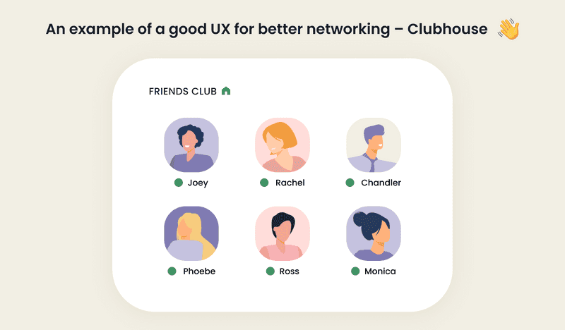
One of the greatest examples of changed context is Clubhouse, a social audio app for better network in the reality of COVID-19 and the lockdown. Face-to-face networking became impossible. At the same time, camera-on meetings became too irritating. We all got tired from being ready to turn the camera on at any moment. Clubhouse has solved this problem by implementing a new format of a room-based audio app with a distinguished mobile app ux design. No more cameras - you can either speak or just listen to others with no need to show your face.
In March 2021, the number of app downloads crossed 10 mln (as of February 1, the number of downloads was 3 mln). However, this number could have been even more impressive. The matter is that the app has a developed ios ux design, but it is not available for Android. We’re sure, as soon as an official android app ux design will appear, Clubhouse will become the main competitor of top-rated social media apps.
How to Boost Your App Performance with Best Practices for Mobile UX app Design
We have already answered the question ‘What is user experience design?’ It is the key tool at the first stage of communication. So why do users meet poor mobile experience? The reason is quite simple: most website or app creators ignore the trends in user experience design process.
Therefore, to improve user experience, we need to tailor our mobile UX. Here, we don’t need to be over creative and rethink the whole system. Otherwise, we are to implement these best practices in our products - and get better results.
Top recommendations for mobile user design experience upgrade
Here’s the list of trends and tips for mobile UX design that you need to consider if you want to improve user experience design process results:
- Personalization is a must. Use UX as a key to show users that they are special. Add to the interface as many personalized elements as it is possible.
- Add motion to interface elements. Power up your app with motion! Each button, tab, or icon can be easily animated. By adding motion, you can drive attention to certain app features and keep users engaged.
- Make a big step into the AR. Facebook already announced the launch of “the next step on the road to augmented reality glasses.”
- Use VUI. Voice commands are a new black. Our smart home devices have already been using VUI, so why don’t you introduce it to the app?
- Enhance your app with sound design. Even simple sounds can become a transforming tool for your app. Add sounds to interactions to improve app UX!
UX Design Tips for Smartphone Usage
Focusing on UX app design, we eventually start to think about how things work. But also we start to think about how people interact with these things.
Steven Hoober noticed that people interact with their devices differently, and ux design tips and tricks should include these interactions in app development. For instance:
- people hold and touch their mobile devices in different ways (cradled, hold and touch, two hands - landscape, one hand - first order, one hand - second order, two hands - portrait)
- people change the position of their hands as well as their movements for different types of interactions (for a long scroll, they may: cradle, hold and tap, or use hand and thumb)
Taking into consideration various ways of holding and using mobile devices, we should remember these UX design tips:
- Types and sizes of devices are different.
- People work with their devices in various ways.
- Users prefer to touch the center of the screen.
- Your working field for the main actions is the middle half to 2/3 of the screen.
- Never user to small elements.
Mobile App Better User Experience: Points to Remember
Whether creating a better UX design android or ios-oriented, you should make it simple and easy to use. The basic rules are common to both operating systems.
We’ve collected the top 5 points that will help you upgrade mobile app better user experience:
- Avoid ambiguity. Use language and visuals to make onboarding fast and easy.
- Provide night and day mode. It reduces the strain on the eyes and allows the use of an app around the clock.
- Adjust UX design to any mode. Make it uncomplicated and straightforward for those who use it while walking or sitting on the sofa.
- Synchronize with other services (calendars, mails, etc.). Introduce functions that make the user experience faster and easier.
- Minimize the need for typing. Allow autofill option. It will simplify the communication with the users and increase the chance that they will leave you some information.
How to Verify the Effectiveness of Application
User experience is about permanent improvement. IOS and Android ux design patterns change, and we should change our UX according to them. Besides, the users’ behavior may also change, and you have no right to ignore these changes.

The following tools will help you keep an eye on your UX:
- Hotjar uses interactive heatmaps of users’ clicks and actions, recordings of their sessions, and gathering their words from a survey.
- Maze is integrated into the prototype or existing design to collect insights about customers’ experience. With user testing, you can figure out whether the design performs with actionable metrics.
UXtweak gathers information about users’ behavior and conducts usability studies to improve UX design.
To gather feedback from your product or service users, use Google Form or SurveyMonkey to run professional surveys or NPS to get feedback about customers’ experiences.
Creating an effective UX is not an easy deal. At some point, you may need someone to help you. At Axicube are always ready to help you create a user-centric mobile design for your mobile app and implement the best practices to meet your business goals.
Feel free to contact us whenever you want to create an effective UX for your mobile app. Let’s make your UX better!


