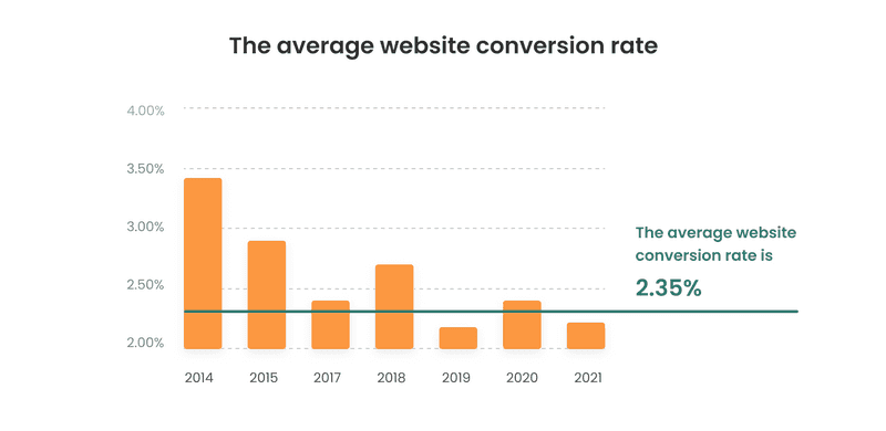
Every business that has already jumped into a digital landscape has its around-the-clock salesman, a website, or an app. The average website conversion rate is 2.35% across all industries. It is a powerful asset that helps your efforts transform into desired outcomes.
However, new technologies and continuously changing digital trends can make adjustments to your website workflow. Now and then, its interface and usability may become old and outdated.
“Good UX practitioners should always balance their analysis by pointing out things that are working well in any experience. Look at the high points in the journey — the interactions that users are happy with,” states Kim Salazar, a Senior User Experience Specialist with Nielsen Norman Group.
How to improve your website’s user experience and keep it up with trends? The answer is simple: optimize and give it a new look. Instead of googling ‘facts UX improve conversion,’ continue reading!
User Interface: How to Improve a Website
First and foremost, you shouldn’t underestimate the role of a website in business growth. Poor design and usability could be a reason for the conversion drop. For instance, your customers may face difficulties with complicated forms or blockage of the data entered. These are just a few issues why you may lose customers.
Let’s get down to some nitty-gritty and learn more on how to improve your website then.
Check out some helpful ideas.
Traditional Structure
Every website has different sections that respond to the well-known structure. The latter, undoubtedly, depends on the industry the website is working in. It boosts recognition and lets visitors quickly get an idea of what kind of business this is. For instance, you will distinguish a legal firm from a real estate agency or a PR studio by looking at their online presence.
A good UX design relies on thorough research. So, before creating a mockup:
- Study the ways people may use your website or application.
- Understand typical use cases (let’s think, you usually order an Uber ride while in a hurry, so the design should let you do it as fast as possible: big and distinct buttons allow a user to call an Uber in a couple of taps.)
Such common behavioral patterns help visitors easily navigate the web page or your app, and thus you get the required conversion.
For instance, the Uber team has recently redesigned its app. The goal was to make the experience of using their app better and seamless. These changes came to life because of the users’ feedback and additional research to define typical bottlenecks that could be solved by fine-tuning the app design. Here’s what they’ve done:
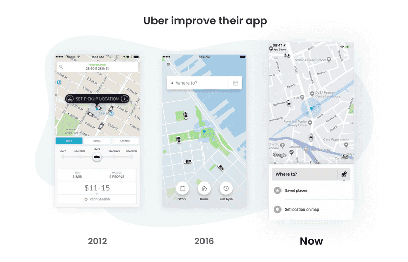
- Centered headline, adjusted to the overall design. Uber made it visible for each client despite their device use.
- Reduced the number of CTA buttons and put them in the right places.
- Shortened the page not to make users bored. So, they won’t miss some crucial elements.
Page Loading Time
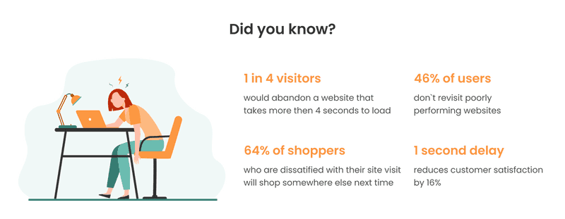
3 seconds. It is precisely the time more than half of your users are ready to wait for your website to load. If it is more, they’ll think it is too slow and move on, states the 2018 Research by Google. Slow loading time is the prime factor that frustrates users and creates an adverse experience.
Of course, you have to take care of the hard- and software sides of the issue. Optimize all the processes and use a reliable website hosting server, so you can use up-to-date graphics and illustration, which wouldn’t slow down the page. But a quick website loading is not just the responsibility of developers. Design can be of great help too.
For example, do not use rare fonts and be careful with social media buttons and plugins–they tend to ‘weigh’ a lot. If your website has large text blocks, you should consider using accordions to segment them and make your page look neater. Should your website be indeed ‘heavy,’ don’t get a user bored! Progress bar animations are a good idea. Also, think about entertaining a user while they wait (small text jokes or humorful explanations of website loading may serve you well). A good UX design always thinks about users and does everything to keep them satisfied.
Sensitive Data Request
Give your website a credible look and guarantee security to your users’ data. Request only information you need and use small icons and symbols to ensure that their data is on a secure site. And one more thing, autocomplete the fields to save users time and allow them to get back and fix their information.

Exquisite design
Many delude themselves thinking that design results in conversions. Not necessarily. Think Amazon, eBay, Craigslist. Are they cockeyed? Well, yes. Do they generate profit? Doubtlessly! Indeed, it’s significant to use your brand colors and images. Use only high-quality images and icons to convey the desired message. For instance, use a flash icon for instant delivery, etc.
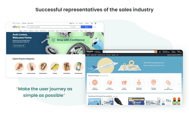
It is worth noting that excellent UX design doesn’t necessarily equal beautiful design. Think about Amazon again. It is hardly an eye-pleaser, but it has everything to ensure a quick purchase. Keep that in mind while creating your website. At first, try to analyze industry leaders and aim at their standards, from fonts to colors. It will help a user to trust your website during his first visit.
In general, make the user journey as simple as possible. Be clear and consistent, avoid hard-to-understand icons and symbols. Aim at universally good signs, like an envelope for email, shopping cart–well, for online shopping cart. The less a user has to think about their actions, the higher is the chance they’ll stay with you.
Text and Layout
Don’t overload your website with useless information, and use text instead of icons with short and simple sentences. What’s more important – stick to your company’s tone of voice.
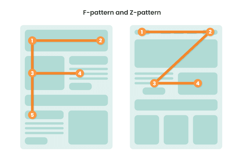
Layout is, perhaps, even more significant. Hardly every user will read all the texts you have prepared. Think design here and use it to control the usual flow of users’ attention. In this case, two well-known patterns come in handy.
- The F-pattern. This one suggests that users will first read (or scan) the page in a horizontal direction. Then, they scroll or move down the page, covering the second flat block. Ultimately, website visitors scroll down, paying attention to the left side of the content. According to this visual hierarchy, build your landing page to ensure visitors go through your page and click the CTA button. (Have a look at the Hootsuite landing page.)
- The Z-pattern. In this scheme, your users’ eyes move following a Z-shaped path: upper horizontal line, diagonal skimming, lower block. Thus, put what you want visitors to focus on first in the top block. Along the diagonal line, place any information to lead to your CTA button. The bottom one has to make an accent on the CTA. Have a look at this LinkedIn page to get the idea.
- When choosing a pattern, think of your ICP and their content consumption habit. Also, F-patterns are usually good for more content-heavy pages, but it isn’t a strict rule.
What else should you know to improve your experience on the web?
Storytelling for User Experience: Crafting Stories for Better Design
People noticed long ago how storytelling helps them interact with large audiences by invoking their feelings and appealing to emotions. By deploying narration and metaphors, they walked people through different situations to give them a lesson.
How can storytelling help you reach your business goals?
When creating UX design, storytelling is your major tool throughout the entire process. You should apply it to spotlight user needs and demonstrate the value you want to give those users.
Once you’ve created a persona buyer and know everything about their pains and desires, you start transforming this insight into design and tell a story about those people. You emphasize their needs and explain how you’re going to meet them.
When storytelling underpins the whole project, from an idea to a final result, then you can be sure your story reflects your product value. Simply put, project creators start to empathize with users and thus create a design that matches an initial story.
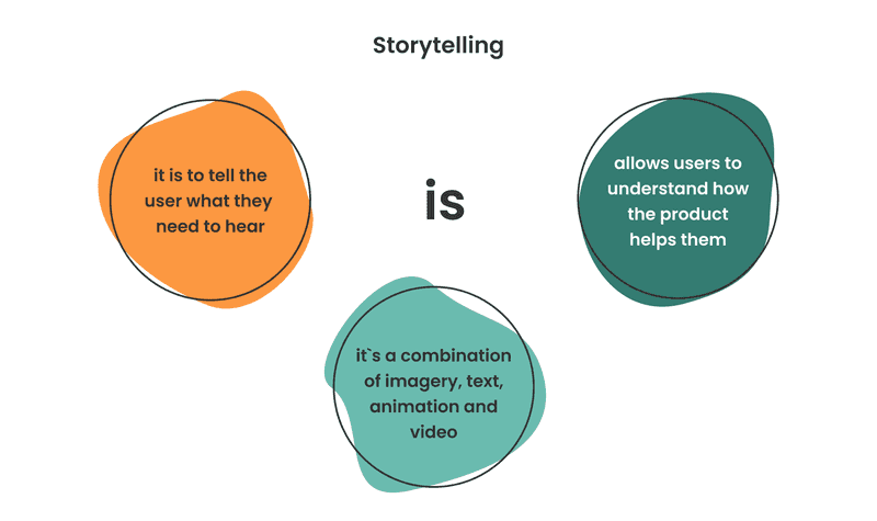
For that, your users may need help understanding how your app, site, or product can benefit them. Storytelling in UX design tackles this issue and creates a better experience on your application or website. People love stories–so give them a visual one! Combine imagery, texts, animations, and videos, all of them or just some.
Why does your business need storytelling, you may ask?
With storytelling, you create settings for your products and services and show your customers when and where they can be used. For example, on desktop, people usually compare certain goods more often than on mobile. However, while shopping on a smartphone, users tend to look for a specific product.
Thanks to UX design, you lend a hand to your customers. Use visual tools to communicate that your product leads to a problem-free life, and its utilization is easy-peasy.
Let’s say you have a healthy food subscription-based application. Josh, the athletic dad of three and a successful lawyer, lacks time between work, spending time with kids, and going to the gym. Should he abandon fitness? Tell him a story about an alternative.
- Don’t merely write several paragraphs describing how your service can help him.
- Create an infographic or a gallery of images showing busy people improving their lives with your food delivery, embed a video with someone sharing a positive experience about your customized meal plans and better time management.
Sounds simple? Yet, beyond a great story, there are massive efforts and solid research.
- Get to know your users better.
- Think of how you can make their interaction with your website or app as seamless as possible.
- Keep in mind 4 P’s, People, Place, Plot, and Purpose.
- Designers create personas to represent target users and add conflict to stories that reflect their user journeys and problems.
Design that provides better user experience results in desired target actions of the users. From this perspective, you can create different experiences. As our expertise shows, the more improved user experience design, the more effective interaction with your audience.
A story you convey encrypts a message in graphics, pictures, or videos. So, your website visitors or app users can easily understand what actions to take.
Simple storytelling ensures that people will complete their path, to wit, subscribe or make a purchase. You should strive for improving user experience.
Lean UX Principles
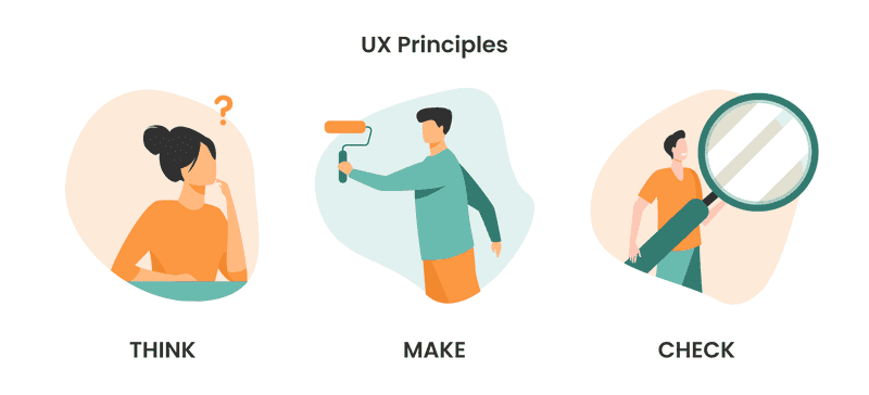
Well, this process entails three stages: think, make, check.
- Think. In the first phase, the team is supposed to define a problem statement and then decide on improvement areas. Therefore, specialists may use a Job to Be Done (JTBD) principle to understand better your users’ motivation, aka what makes them choose your product or not. In a nutshell, a JTBD is a design scheme that takes a customer through a short mental journey to understand what they lack in life, what can change it, and lead to the answer–your product or service. Here’s a great example in LinkedIn UX design.
- Make. Next, the team suggests solutions to an existing problem using a value proposition canvas. This framework ensures that a product or service fits customers’ values and needs. It comprises two main blocks, a customer profile (their pains, potential benefits (gains), and customer jobs) and a company’s value proposition (how you create improvements and relieve customer’s pains with your product or services.) WordPress landing page shows how a value proposition can be simple yet powerful.
- Check. Finally, specialists step into customers’ shoes and test a website or an app from a user’s perspective. Customer journey mapping comes in handy at this phase as it spotlights how to improve UX for e-commerce and incline your audience to make a purchase.
Lean UX Case
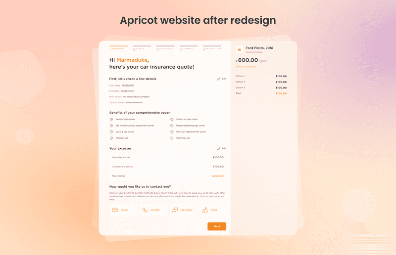
Let’s look at one of Axicube’s cases and figure out how to improve user experience. British car insurance company has asked our team to help them with upselling extra benefits that are not included in the basic service package. Besides, they wanted to increase sales of additional services with UX design.
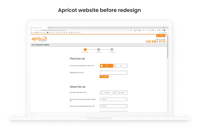
What steps did we take?
- Our team analyzed a website page, shortened the text for the sake of brevity.
- Then, we referred to the Wizz Air website and examined it in detail. We analyzed pages with main and extra services, focusing on sections’ visual representation with information about a country where customers buy tickets, purchased services, and other additional services.
- Together with our client, a British car insurance company, we decided to redesign by analogy with Wizz Air. So, we left the right to choose their customers. All of them could select whether to purchase an extra service or not.
- Our team enlarged a CTA cards size for buying additional services and vice versa. We made other buttons smaller. Thanks to these visual changes, we spotlighted the main areas urging customers to take desired actions.
Takeaway
After UX redesign, sales of additional services increased on 30%
Ready to get more useful tips for UX in mobile? Go directly to our recent article
Tips and tricks on how to improve your mobile UX design
If you’ve noticed low lead flow from your site or app, think of creating a better user experience. In Axicube, we will mark out weak sides and suggest feasible solutions. We begin with an expert assessment of your site by using such approaches as heuristics, cognitive walkthrough, user interview, or expert review. Our team knows how to make user-centered design and minimize input. We offer a full-packaged service and support at every stage of the project.

