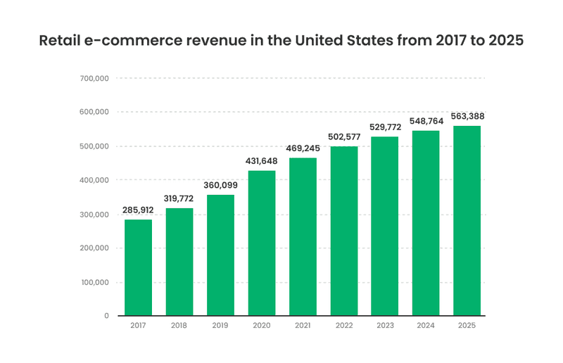
People use the Internet for socializing, having fun, and researching. Shopping has also become an integral part of the Internet According to statistics, 43% of shoppers use the internet and social networks to research products before purchasing, and by 2024, eCommerce revenue will be worth $476 billion in the U.S.
The growth of eCommerce brings a lot of benefits for businesses. For example, it can be difficult for small startups to reach their customers by having only an offline store. eCommerce better understands its client, collects more information, and therefore can create accurate target advertising. Yet, eCommerce is available 24/7 and, paired with email marketing, becomes a great tool for business.
Another thing worth mentioning is the impact of COVID-19 which means that more people are shopping online. It is used among all age groups, although digital shopping is more common among Millennial internet users, with a penetration rate of 86.2 percent as of May 2020. Consumers increasingly rely on their smartphones and mobile apps for shopping activities. At the end of 2019, nearly six of every ten survey respondents in the U.S. had used a mobile app to look for more information about a product or a service.
As you see, creating your eCommerce website lets you control every aspect of your customer experience. But where to start, what processes are needed, and which factors in e commerce website design are crucial? This article will help you to start your way.
What is eCommerce About?
eCommerce or eBusiness is a concept that includes different types of financial operations over the Internet. It is believed to be a major industry in the global economy. The impact of eCommerce on retail is unimaginable. According to new studies, worldwide retail eCommerce sales will reach a new high by 2021. eCommerce businesses should anticipate a 265% growth rate, from $1.3 trillion in 2014 to $4.9 trillion in 2021. This shows a future of steady upward growth of eCommerce business with no signs of decline.
eCommerce online stores are growing in numbers, procuring users with different goods and services. But, it’s fair to signify that eCommerce is not only about stores. Ticket purchases online, booking cars, or online bankings are eCommerce too. So, anytime you decide to make an online purchase, you are participating in e-commerce. And if you sell some goods online, you have an eCommerce business.
Types of eCommerce
If you are planning an eCommerce business, it is important to choose the type of it. Depending on it, you’ll be able to build the right business strategy. So, eCommerce can be divided into four types by functions they fulfill.
-
Business-to-Business (B2B)
It means that some companies may sell their goods or services to other businesses. For example, a restaurant buys foodstuffs from a food distributor company. According to Digital Commerce 360, B2B digital sales in all channels grew by 10.9% in 2019.
-
Business-to-Consumer (B2C)
When a company sells something to consumers. It can be for products or online courses. For example, you buy shoes from an online store. By the way, according to Statista, it has been confirmed that e-commerce is rapidly growing popular in the B2C arena, with sales amounting to more than 1.2 trillion US dollars in 2013 alone. At the same time, retail sales attributable to the Internet are also booming.
-
Consumer-to-Consumer (C2C)
When a person sells a product to another person. Good examples of this are websites like eBay, OLX, Etsy, Taobao, etc. According to Statista, in 2021, eBay had approximately 159 million active buyers worldwide, a slight decrease from the 161 million recorded in the same period of the previous year.
-
Consumer-to-Business (C2B)
When a person makes content, product, or services that may be useful to businesses. For example, freelance designers make logos for certain companies. Websites like Upwork, Fiverr, and Scripted help freelancers to connect with different companies for selling their services. According to the Freelancing in America report commissioned by Upwork and Freelancers Union, 57 million Americans - that’s 35% of the U.S. workforce - participated in freelancing projects in 2019, and the numbers continue to grow.
Each type of eCommerce has individual characteristics. Understanding all of these will help you in building business processes. You can always learn something from anyone’s accumulated experience.
eCommerce Website Builders to Use
Building a website for your eCommerce business is a big deal. But you need not just create a website, you need to make it effective. It is important to mention that 94% of first impressions relate to a website’s design. Moreover, 75% of website credibility comes from its design. So as you see, you need to take a responsible approach to this issue. Fortunately, there are now some solutions that can be used to build an eCommerce website: you can make it from scratch or go and use a website builder. Some builders provide users with ready-made templates, so you need only to add your products.
-
BigCommerce
This is a SaaS solution with many features like bulk pricing rates and customer groups. It also has 24/7 customer support and multi-layered security which keeps data safe.
-
Shopify
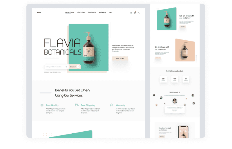
Shopify is popular and used by thousands of online stores worldwide. It is another SaaS solution that is quite quick and easy to set up. It has many free and premium themes that you can customize according to e commerce design trends. This platform is known for its ability to handle lots of transactions per minute
Dribbble shot by Shopified
-
Magento
It is a self-hosted solution which means that you have more creative freedom for creating a nice e commerce website design with this. But, you need to take full advantage of the platform.
-
WooCommerce
WooCommerce is a free and open-source e-commerce plugin designed specifically for WordPress. It is a great platform for a store of all sizes. WooCommerce has a whole host of features such as different shipping and payment methods, custom product types, and more. WooCommerce is flexible and is easy to customize which is important when creating an e-commerce website design.
-
Wix
Wix is among the most popular website-builder platforms. It has a drag-drop feature so it is easy to use even if you are a beginner. It provides different plans for eCommerce, which will give you a free domain for one year, visitor analytics, and unlimited bandwidth.
When deciding to use one of these platforms or create an eCommerce website from scratch, keep in mind that website builders are more suitable for small sites without innovative sales approaches or new technologies usage.
Reasons to create a custom e commerce design from scratch
A unique website will require more resources and investments. But it will not depend on the limitations of the system: you can easily scale it, adjust it to the needs of your business and customers. You will have the opportunity to apply unique features, better control what information about users to track and how to use it. Yet, you will be more flexible in adding new functions. This will facilitate website promotion and make the marketing strategy more independent and authentic.
As you see, developing a custom eCommerce website has many benefits compared to website builders. To begin with, it’s worth mentioning that the platforms mentioned above have a limited set of tools so you will be bound in choices when creating your e commerce website design. Moreover, if you use website builders, your design for ecommerce website won’t look unique and match your target client personas. To build a brand, it is important to stand out so that customers will remember you. Yet, you’ll still need a developing team if you want to use website builders.
So why not initially make a custom website? Custom eCommerce websites would meet all requirements of the business. If you develop it from scratch, it will be possible to use a modern tech stack to handle the high traffic loads. According to statistics, $2.6 billion is how much revenue gets lost due to slow-loading websites. As you see, this already can be a decisive argument in favor of creating a website from scratch.
In addition, you can provide a user-friendly and unique design for e commerce website when developing it from scratch. It will be possible to add as many features as you want, just like comparison, favorites, gamification, a system of bonuses and rewards, etc. Yet, you can adapt your website to different device sizes so it will increase the conversion among users who prefer to use only smartphones.
Before creating an eСommerce website, think about which method suits you best. Of course, creating a website from scratch has more advantages both in terms of design and marketing. But there are still some things to consider when building an eCommerce website.
Things to Consider When Creating an eCommerce Website
If you have decided on how exactly to create an eCommerce website, then this is only half the battle. Here we have collected several topics for thought:
-
Safety and security
An eCommerce website stores tons of data about products and users that register on your site. So it is crucial for an eCommerce website to be totally secure. Yet, a pure secured site will be given a bad reputation on Google, which will affect the number of your customers.
-
Positioning and niche
Positioning helps provide more sales tools your business development team needs to maintain to make more sales. Unique brand positioning increases company awareness and grabs the attention of potential customers and helps to avoid competition. Yet, you can’t just start selling clothes. Firstly, you need to conduct comprehensive research to find a niche.
-
Target audience research
You need to define who you sell for. With this knowledge, you will be able to provide better customer service which is important for a successful business.
-
Customer service
If you want to succeed, you need to create a customer-centric company. Define customer demands and needs, so you will be able to provide them with a great customer experience. If you build good customer service, you will increase loyalty and trust towards your company.
-
Marketing strategy
You need to use all ways to promote your new eCommerce website. Try email marketing, social media marketing, content marketing, and other types of promotion. Your goal is to attract as many people as you can.
-
User-friendly interface
This means designing a clear and easy-to-use visual interface that will simplify buying goods. For example, clickable images so the user doesn’t need to read the text above. Or provide autocomplete so the user doesn’t need to type the whole word to find what is needed.
-
Mobile devices adaptation
According to statistics, 74% of users are more likely to return to mobile-friendly websites. Moreover, there are people who prefer to use only smartphones. 70% of Internet time gets spent on mobile devices. With statistics like these, adapting your website to mobile devices is necessary.
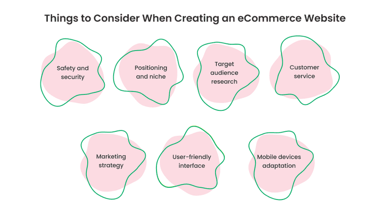
So as you see, there is a lot to consider when creating an eCommerce website. It is not easy even if you decide to use Shopify or Wix. But if you think over all of the above points well, it will be possible for you to create a high-performance online store.
Ways to Monetize Your eCommerce Website
When you consider the main points about creating an eCommerce website, you need to think about monetization methods that will give you more profit.
-
Fees
It can be a good profit for B2C type eCommerce. You can provide a fixed fee for each item sold, or a shipping fee.
-
Ads
You can sell free space on your website so other companies will be able to buy it for advertising placement. Another option suggests enabling sellers to launch native product ads. Buyers, on other hand, will receive personalized recommendations of products.
Once you have learned the basics of e-commerce, you can move on to further research.
CRM Integration With Your eCommerce Website
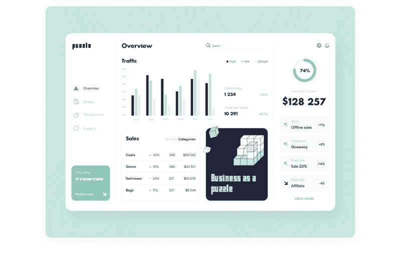
CRM stands for customer relations management. This software product helps automatically collect and process data that customers submit on your website. With this, CRM can manage your existing customer base and add new leads. Yet, it can help in building marketing and sales strategy.
Dribbble shot by Arounda
CRM integration means unity of its software and your website’s CMS (Content Management System). Finally, you’ll get a great tool that will give you an advantage in a clear understanding of the sales process. With CRM integrated into your eCommerce website you will be able to see all incoming data and use it to get better results.
To sum up, what you’ll get from CRM integration, there are a few points:
- CRM gives you a clear report on your prospects and leads;
- Connecting different processes into a smooth workflow that would increase its efficiency;
- Compounding sequence of pre-sales and after-sales to increase customer’s satisfaction;
- Increasing sales by making the whole process shorter. The leads are already in the system, so your sales team has better data for working with this.
If you want to know more about what benefits could provide CRM system read our article.

How to boost performance with UX audit (and who can do this for you)
Must-have Features for eCommerce Website
Each website is unique in its own way. But there are certain features every eCommerce website should have to be all the rage.
-
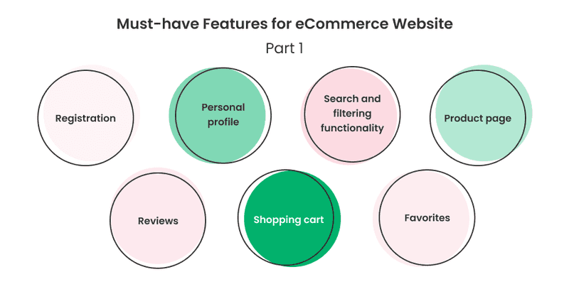
Registration
You can let users navigate through your website without registration and then if they buy something, they need to create an account. Registration has some benefits, like saving the shopping history. Let users make it easy — provide registration via social media or by filling the minimal form with their name and phone number.
On the other hand, people also have lots of accounts and it is useless to create an account for a one-time purchase, so you can add a guest checkout feature to your website. If you don’t want your customers to forget your website address, you can add it to the order packaging.
-
Personal profile
It may contain personal information, payment details, shipping address, and purchase history. This data allows you to speed up the buying process for customers. Otherwise, there can be buyers accounts, which will contain product information, payment methods, and shopping details.
-
Search and filtering functionality
It is much easier to use a website that has a search feature. We would even say that this feature is necessary for an eCommerce website. You can also improve this feature by adding a possibility to search by photo, or by color, type of product, or add autocomplete feature.
-
Product page
It is like a profile for a product. It should contain all information about it, photos, reviews, price, etc. In addition, there you can put similar product recommendations and related products.
-
Reviews
Customers’ feedback will make your website trustworthy. You can provide written feedback, or let users upload video reviews. Consider adding a comment carousel on the homepage of your website with links to the products.
-
Shopping cart
There, the user will be able to see all the products he chose to buy. It is important to let users change the number of items chosen, the total amount of the order, remove something, or add something.
-
Favorites
The user may see something they like but are not sure if they will buy it at that moment. In this case, they usually add it to the shopping cart to not forget. So why don’t make a feature which lets users save liked items? They may review it later and buy it when the case appears.
-
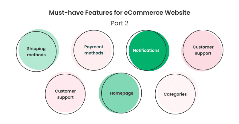
Shipping methods
Here should be the information about the delivery method, its duration and how to pay for it.
-
Payment methods
Use reliable payment methods. According to Hostgator, the most popular payment methods are PayPal, Apple Pay, Amazon Pay, Google Pay, American Express, Stripe, Square, Visa, Masterpass, and 2Checkout. If you add several payment methods, it will the number of purchases on your site. Because customers with different preferred payment methods will be able to do shopping.
-
Notifications
With it, you can notify your customers that they will all change their profiles or orders. Yet, with the notifications feature it will be able to tell customers about new products on your website. There is another type of notification. Here they are made via email and are called abandoned emails. Sometimes the user adds items to the cart but leaves the website without paying for them. In order to remind the customer about his products, you can send such an email with a reminder.
-
Customer support
This will help customers with different issues like shipping issues, return, or else. For now, people value personalization, so it is important to provide live chat support.
-
Supportive articles
Another thing to consider is supportive articles about the use of your website and policy to follow. Sections with FAQ, return policy, shipping and privacy information, use of cookies are necessary.
-
Homepage
The homepage of your website is like the face of your business. This is the first thing users see when they come to your website. It should be greatly designed and easy to navigate. With this page, you can display your unique value proposition and key information.
-
Categories
Provide categories on your website, so it will be easier for users to find all needed items. Correctly compiled categories and product lists to speed up the process of finding the desired product by the user and increase the number of purchases and reduce the number of misclicks. With this feature, customer loyalty will be increased.
The must-have features are the foundation of your website, which makes it good. But if you want your eCommerce website to be awesome, you need to think about what additional features can be added there.
Extra Features to Add When You Are Building eCommerce Website
Some extra features will make your website outstanding. Here we collected some of them:
-
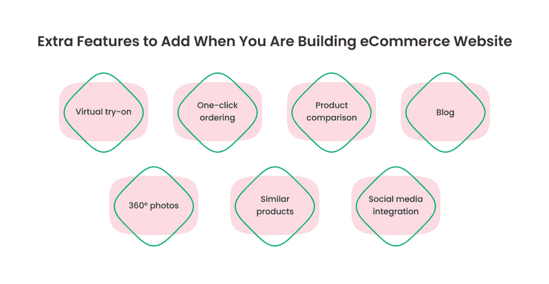
Virtual try-on
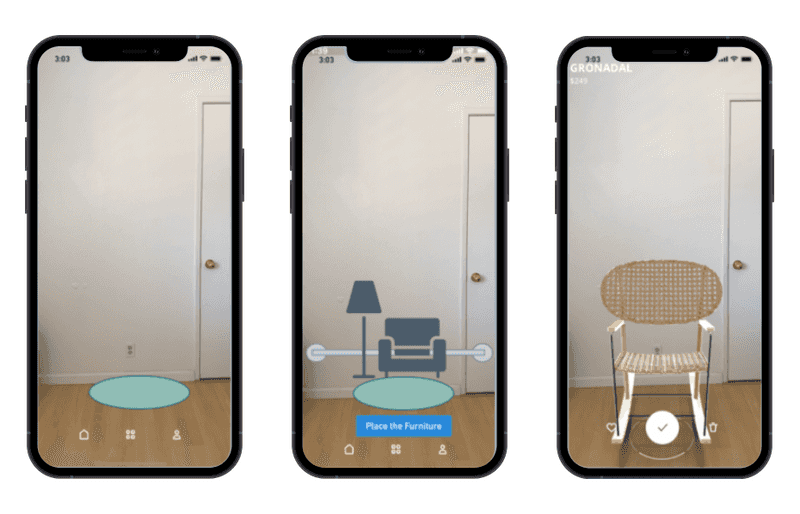
Some users do not buy clothes online because they cannot try them on. This can be implemented via photo upload or augmented reality (AR). With this feature, you can dispel the user’s doubts. For example, like IKEA did: with the IKEA PLACE app, users can project IKEA furniture directly into the room using their mobile phones.
-
One-click ordering
For example, on Amazon, the user can choose the item, decide which payment method is suitable for them, fill in the address information, and then just click one button. After this, they can just sit back and wait for their purchase to arrive.
-
Product comparison
This is useful when the user cannot decide between two or more products. You can allow comparing prices and main characteristics of the products.
-
Blog
With this feature, you can brand yourself as an industry expert which will attract new customers to your business. Your blog can contain tutorials or tips which may be interesting to your target audience. Yet, you can place announcements on updates there. The blog can also increase conversion on your website. More people will find your site organically.
-
360° photos
This will provide your customers with an in-store experience. They can look at the item from different sides which will increase convenience. This feature simplifies the process of decision-making.
-
Similar products recommendations
This can let users choose one product over another. Just like when you go to the local store and the sales clerk recommends something to you. The product recommendation feature may increase conversion on your website.
-
Social media integration
Let users share liked items to their feed. You can also show photos of people with your products which were posted on social media. Don’t forget about a new age of eCommerce: today it is important for any business to be represented on Instagram, Facebook, etc. This can increase conversion for your eCommerce website. Thus, social media integration is a must-have feature for modern brands.
Once you have thought about all the components of your future eCommerce website, you can step into UX design for e commerce.
eCommerce UX strategies
Conversion visitors into customers is the biggest challenge for an eCommerce website. You need to ensure you provide great products and services that your target audience wants. It should be easy and fast for your clients to find what they need on your website. And they also should be able to buy in quickly. But how to make a customer’s journey pleasant?
The UX strategy can help you to aim this goal. User experience strategy is like a plan that helps to ensure that the business vision and user’s needs are aligned. It helps to translate the intended user experience to every touchpoint where users interact with business products and services. UX strategy influences e commerce website design because it even affects points such as typography, design, product photography, etc.
Let’s see how UX strategy works on every key point of the user journey on an eCommerce website.
Homepage
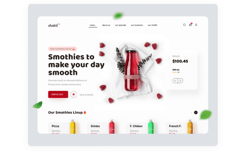
The homepage is the first point of user interaction with your website. When creating it, keep in mind that users form their impression of your website in the first 50 milliseconds. The homepage should quickly grab attention and clearly show what this eCommerce website sells.
Put timely content and catchy call to action (CTAs) on your homepage. Large banners work well for it. Consider making it with a good quality image that would display what is your business about and appropriate CTA that would help users to take the next step in their shopping process. Avoid using vague phrases like “get started”, because it doesn’t tell users what’s next.
Remember, that initial page represents the whole branding and sets the mood for the whole website. That’s why it is important to pay lots of attention to your e commerce design for the homepage. Everything should be readable, good-looking, and consistent with brand tone-of-voice.
Dribbble shot by Shopified
Navigation
Navigation helps visitors to find what they need without getting lost while searching. Good navigation reduces the time a person spends on the site and also improves conversion. It starts with the homepage. It should be clear and understandable. The categories should be recognizable and the search bar should be put in a visible place. A good feature to add there is “breadcrumbs” which may allow users to get back to any point of their search, and on the other hand impact SEO metrics. Yet, don’t forget about the brand logo. It should always be in sight. If the user clicks on this, it should always lead to the homepage.
When creating navigation, you can stick to some e commerce design trends in it:
-
Hamburger menu
It is recognizable and makes the whole design clearer. It is usually placed in the corner of the screen.
-
Fixed navigation bars
This type of navigation is usually placed statically to some parts of the screen on the top of it. The fixed navigation bar doesn’t disappear when you scroll the page.
-
Vertical sliding navigation
It is expandable and can make you different from other competitors of the eCommerce market, who usually use horizontal navigation bars.
-
Fullscreen navigation
This can be a stylish solution, but it is too large. To hide it, the user needs to do one more click, which might be overkill in the user’s journey.
-
Bottom navigation
It is clean and leaves more space for content. Bottom navigation can be especially useful for the mobile version of your website because it is easy to reach with the thumb.
The point of navigation is closely related to product search, so let’s dive into this.
Product Search
It would be impossible to sell a product that customers can’t find. Search is an important element in building a website. According to research, 85% of users searched on one or more websites. So it is not enough just to place a search bar on the top of the page. It is crucial to think about how to optimize it as much as possible.
Visitors can easily get lost on a first visit to the website. To prevent it, make the search bar visible. You can put it on each page of your website. The exception is the checkout page. Here, the search bar would distract users from completing their purchases.
It should be easy for users to find anything, so think of providing predictable search and error tolerance for typos. Brand or product names with typos should not come into 0 search results.
Search suggestions should also work well. Provide discovery mode for “browser” type of eCommerce shoppers. This type of user doesn’t have a certain product to look for. They can visit your website just to kill time or for inspiration. In addition, users can see something useful while searching for the exact product and buy this too.
Dribbble shot by Stano Bagin
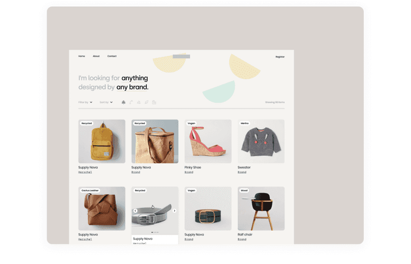
Yet, you can provide faceted search with different filters. Let users sort products by color, price, brand, and other characteristics. When the user applies filters, it should be visible in the UI.
In the next step, it is important to provide relevant search results. The results should be sorted according to the query. People don’t want to scroll through several pages to find exactly what they need in their search. To prevent this, provide top-5 relevant results.
After the process of searching for the desired product, the user goes to the product page. So our next point will be the product page.
Product Page
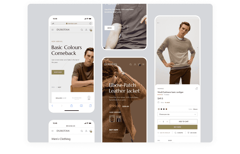
The customers should have clear information about the product they want to buy online. An effective product page consists of a combination of text and images, product availability, price, and information about delivery. The user should never have difficulties in understanding how to buy a product. Display this action like visible buttons “buy it now” or “add to cart”.
To present a product effectively, use high-quality photos and detailed descriptions. When it comes to photos, add the ability to zoom, switch between alternate views, and details. Use visual hierarchy to place all information in the right way so the user’s attention won’t be distracted. Break long descriptions into sections, or even add expanded navigation.
Dribbble shot by Logan Cee
To build strong customer trust, add social proof. People tend to be influenced by the behavior of others. You can increase customers’ confidence by adding reviews, ratings, and comments. For example, on Amazon, customers can sort products by rating.
The next user’s step in their shopping journey is the shopping cart.
Shopping Cart and Checkout
A shopping cart is a part of a website where all items the buyer has chosen. Users can compare items after adding them to the shopping cart.
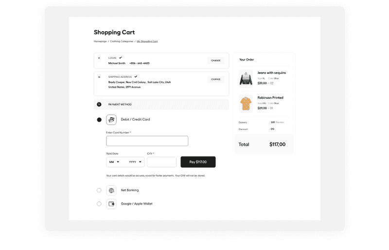
Let users see a clear order summary with items purchased, their quantity, and prices before they complete their purchase. Provide users with the ability to edit or delete items in their order. Make information about the final price and the list of products visible all the time so the customer does not have to go back to previous steps.
When it comes to the checkout process, add a progress bar, so users will see where they are in and how much is left to complete the purchase. Avoid elements that would distract users in e-commerce checkout design. One of the last steps in the shopping process is purchase payment. Allow users to use different payment methods. You can add the ability to pay with PayPal, which may increase conversion among users who don’t want to fill in their card information.
Dribbble shot by DStudio
Order Confirmation
When a customer completes the purchase, provide them with a final look at their order. The confirmation should include payment processing and delivery details. Yet, you can send a confirmation email in addition. This can be helpful for users who made a purchase as guests and don’t have the ability to check their purchase with their account. If the user has abandoned an order, save information about them and then email them to remind them about the uncompleted order.
All these touchpoints provide an understanding of the baseline user journey through the eCommerce website. With knowing these basic principles we can go to the next step where we will be talking about e commerce UI design for websites.
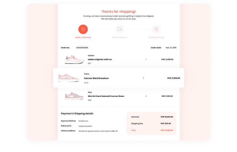
Dribbble shot by Loisy Salvacion
E commerce UI Design Considerations
A custom e commerce web design is a good chance to make a good impression. In the eCommerce market, a good website design may show users the value of products. The design may be the reason why people use a particular website. E-commerce website design affects how much time people are going to spend there, and how many products they are going to buy. “First impressions are everything,” says Jeff Torczon, Founder & CEO of InfinityHR. “Research shows us that 94 percent of people notice the look-and-feel of a website or application first, then decide from there if they will continue to navigate through it or move on to another with more visually appealing aesthetics.”
Combined with good marketing and UX strategies, it can skyrocket your eCommerce business. That’s why it is very important how to design for e commerce to convert visitors into buyers. Let’s take a look at a few points to follow to create a successful e commerce UI design.
-
The visual hierarchy
It is one of the main factors in e commerce website design. A clear visual hierarchy is a way to the understandable structure which will drive users in the right way. The most important website elements should be located at the top of the page. If you choose CTAs rightly, the person will know where to click to get where they want. You can draw the user’s attention by using colors and typography accents.
-
Keep it simple
An e commerce website design should be simple and clean to make it easy to browse. There should be nothing superfluous, to not distract users from content. Simplicity will help to avoid information overload. Yet, think of choosing proven patterns, so nothing will go wrong. In this case, it is better to make website design for e commerce simpler, so every segment of the target audience will understand it.
-
Make it attractive
The main idea of this point is that if your e-commerce website design is simple, it doesn’t mean that it should be bereft of personalization. The photos on your website should be high-quality and create some emotional connections. The text should be made in a certain tone-of-voice, which depends on the target audience.
-
Attention-grabbing words
You can whet users’ interest with attention-grabbing banners or annotations. Words like “discount”, “bestseller” and “out of stock” grab the user’s attention and push them to buy faster.
-
Stick to branding
E-commerce web design should represent the products that are sold there, create emotions that will be associated with this product. When designing a website, make sure that you use the same fonts, colors, and patterns that you use in branding. With this, you will increase brand recognition.
-
Colors
Colors powerfully affect individuals. So you should choose it carefully when thinking about what colors to use for branding and e commerce website design. It also can increase your brand recognition by 80%. Color psychology can help your business to become closer to its target audience. Remember that colors have different meanings depending on the cultural differences of the target audience. Yet, try to choose a limited palette of colors to keep your design clean.
-
Adaptive main page
The idea is to show on the home page the product, that may be interesting to a specific user. This encourages the user to stay on the website longer and look at the rest of the categories. For example, you can show special headphones and keyboards to gamers, and so on by user category.
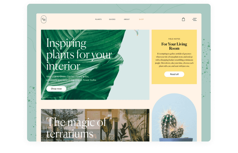
Dribbble shot by Tubik
The Challenges of Creating a Superb E-commerce Web Design
Your eCommerce business success depends to a large extent on the website design. People like pretty things and they usually choose the websites by the way they look. What challenges can be faced while creating clean e commerce UI design?
-
Responsive design
According to data from our 2019 eCommerce Year in Review infographic, 63% of traffic to retailers and 53% of sales happen via mobile. That’s why it is important to adapt your website to a mobile version. The challenge in it is to rearrange design elements and data for different screens so it will be still understandable.
-
Make website informative but fast loading
An eCommerce website usually is loaded with tons of data. You should think about how to make it work quickly. People like websites that work fastly. Focus on UX to organize information compactly and not overload the server.
-
Original texts
If you fulfill your website with great content, it will make your marketing campaign. Remember, that texts that appear on your website should appeal not only to search engine bots but to real clients.
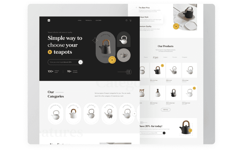
Dribbble shot by Odama
-
CTAs design
CTA can tell users what your website is about. Yet, it can drive the user’s attention. The basic CTA’s design is choosing catchy fonts and colors. But you can also use it for buttons for better customer interaction. Using buttons with CTAs increases conversion.
-
Navigation design
People don’t like to deal with lots of options. So, when you are creating website navigation, you need to think about how to make it clear. To reach this, you need to create a visual hierarchy by using design patterns, eliminating distractions and maybe letting users identify some options with only colors or clickable elements.
An e commerce design can be challenging but yet interesting. However, we’ve shown some tips that will help you to overcome these difficulties.
Conclusion
When you design for e commerce, it is not enough just to make the website good-looking. Your design should convert passive shoppers into paying customers. From our experience, we know that there are many factors in e commerce website design. You need to consider all features and nuances to build a great and effective eCommerce website. If you want your business to skyrocket, you need a great design team that will help you to bring the idea to life.

