Every traveler knows that it’s hard to find a more frustrating experience than landing in the wrong place. In this case, precious time and effort are wasted searching for the right place just when you are full of pleasant expectations and ready for the best.
Unsurprisingly, this story is no different when users take a virtual journey across the Internet with specific goals. So, today we’ll discuss how to make their landing soft and practical.
We will talk about a topic at the intersection of design, marketing, user research, psychology, and other areas dealing with people, their behavior, and solving their problems. Today we are talking about landing pages.
This powerful marketing tool transforms ordinary users who view the page into leads. A lot of responsibility for a one-page site, isn’t it? Selling landing page design can be used at different marketing funnel stages and perform various functions. It helps to reach the right audience and actually sell the product.
After all, people buy with their eyes and love beautiful things very much. Therefore, the visual presentation of a product is of utmost importance.
This article will outline the fundamentals of a selling landing page, landing page ideas, including essential elements for any product or software landing page design, and steps to create a landing page on your own. So let’s move to the point now!
How Does the Landing Page Work?
But the first small thing: What is a landing page? It’s similar to a website but usually lacks navigation or links. Instead, it often features a bold action-oriented headline and, upon scrolling, some key points to emphasize the value of a product or event. Sounds simple right?
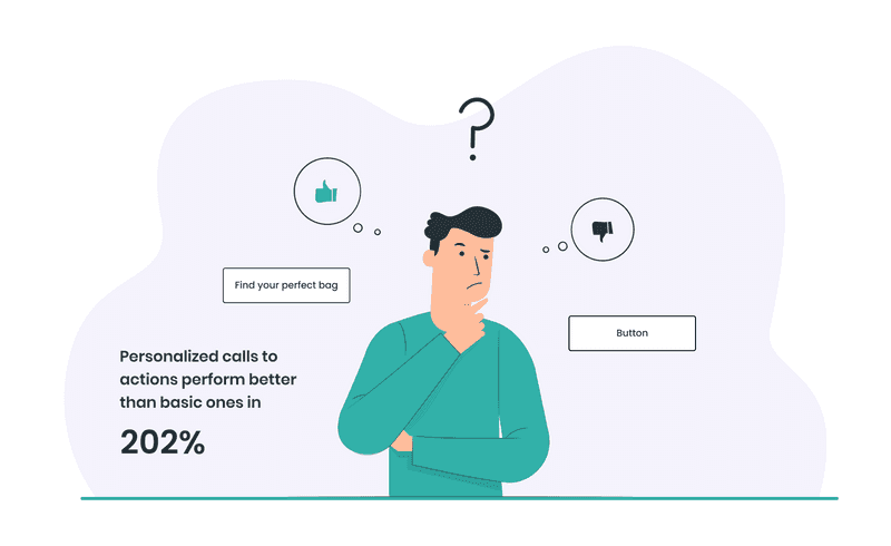
How does the landing page work? First, a user lands via advertisement, email, or any other link. Then, if the landing page has a clear, personalized CTA, a user clicks the button. Adding personalized calls to actions is essential, as they perform 202% better than basic ones. The next step is to fill in the form. After that, a user becomes your lead, and you get all the information you may need.
Now that we have defined how the landing page works, let’s look at why and how businesses use this tool to increase conversions.
How and Why Use Landing Page Design for Your Business?
Imagine a business has a new product. It would be nice to make sure that customers know about it as soon as possible, right? A landing page is one of the channels for promoting a product. And to make it as effective as possible, they use aesthetic design solutions that catch users’ eye and do not leave them indifferent.
Custom landing page design is a great way to drive traffic, improve your SEO and build your brand. It can also form part of an effective PPC strategy. Approximately 68% of B2B businesses use landing pages to generate leads for future conversion.
- Better SEO ranking
With lead generation landing page design, the page gets higher in search, becoming more visible to a client.
- Promoting upcoming products or services
If you plan to hold a promotional campaign, a landing page will help you attract more prospective clients or demonstrate the benefits to existing customers.
- Effective purchases or subscriptions
A business website does not consistently demonstrate the performance that matches business goals. However, it can be fixed with an effective landing page that helps to ensure more purchases or subscriptions.
- Lead generation
Your business won’t grow fast if people do not know about it. Generating high-quality leads is vital for further business development.
Landing pages are the heart and soul of an inbound marketer’s lead generation efforts, so why are they still underutilized? MarketingSherpa cites that the number one reason businesses don’t use landing pages is that their marketing department doesn’t know how to set them up or they are too overloaded.
How to Design a Landing page: 10 Elements of Effective Landing Page Design
A simple landing page design should contain the key elements that make landing pages effective. Always remember: your landing page is about the idea of the product or service. Do not add all the information you have.
Landing page optimization best practices outline the importance of demonstrating how your product or service can help solve clients’ problems. It can be achieved by adding the following elements to the page:
-
Visuals
It’s no secret that most people are visually oriented and scan a web page in a couple of seconds, perceiving images much faster than text. And in the web world, where tons of pages compete for user attention, every second counts.
So, the best landing page design must have high-quality images and animations that well emphasize the central theme of the page. Visual effects make a landing page more attractive and should support the main message and idea.
-
Text
Probably, you’ve already heard that landing page optimization tips always focus on killer headlines. However, only headlines are not enough - all texts should carry a clear message and be persuasive.
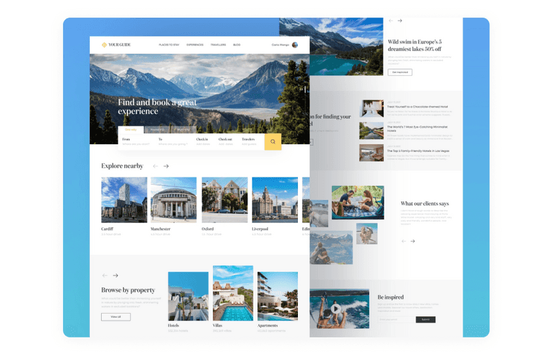
Dribbble shot by Axicube
-
Readability
All texts should be framed into a clear visual hierarchy. Pay more attention to sizes and placement of copy blocks, microcopy for buttons, the brevity of CTAs, and headlines and taglines to be easily scannable.
-
Clear CTA
What should the visitor do to get what they are offered? First, formulate the action with a precise word or phrase and place it on a call-to-action element immediately noticeable in the web page layout.
The CTA element can be a button, a link, a contact form, an opt-in field, etc. It represents the strategic interaction element of the landing page, as it is where the conversion occurs. Therefore, it should be immediately visible, which can be done with a contrast of color or shape. Also worth doing is the call to action is informative, which can be achieved with a small subtitle, icon, or both.
A Shoelace can give an excellent example of nice landing page graphic design elements and compelling CTAs. As witches say, if you want a wish to come true, you must repeat it three times. Of course, a landing page is not about three times, but we can see how good repeating can work. By repeating the same call to action on this landing page (“Start the conversation”), Shoelace keeps the desired action in mind. It reinforces the visitor’s next step at the end of each benefit section.
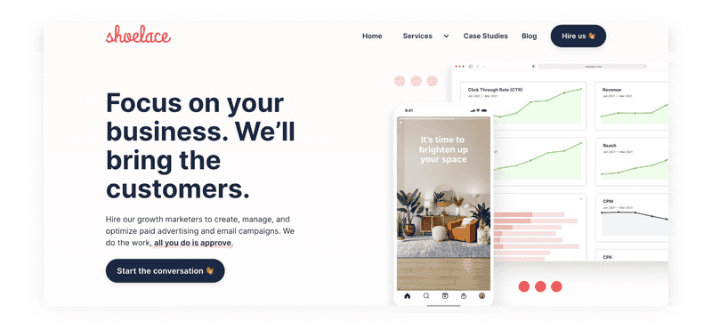
Shoelace landing page design
-
Focus
An effective landing must contain only one idea. In this way, your clients will easily understand your message. Make sure that you cover this idea with one clear CTA. Wix can give you a tremendous creative landing page example where you can see one consistent message through the whole page, engaging visuals that contain only one idea, and clear CTAs that emphasize.
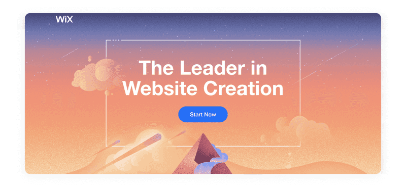
Wix landing page design
-
Case studies and customer reviews
When creating the best landing page design, leave some space for customer reviews and case studies. This information will help to prove the quality of your products or services.
Life360 is a good example there. Because they focused on real customers explaining how a car crash alert helped them in a moment of crisis, Life360 highlights the importance of the product directly and authentically. The page also invites potential customers through a CTA to see more stories about how real people have used the product.
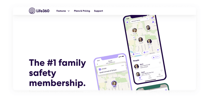
Life360 landing page design example
-
Pain points and solutions
To get an effective landing page website design, and clear the client’s problems and pains. Once clients land on the page, they need to understand that your problem or service will help solve their problems.
Then, your users should understand how the landing page tools and services can help them solve their problems. Finally, give details on how the product can help them.
Here, Muzzle will give you a landing page idea with clear pain points and solutions for them.
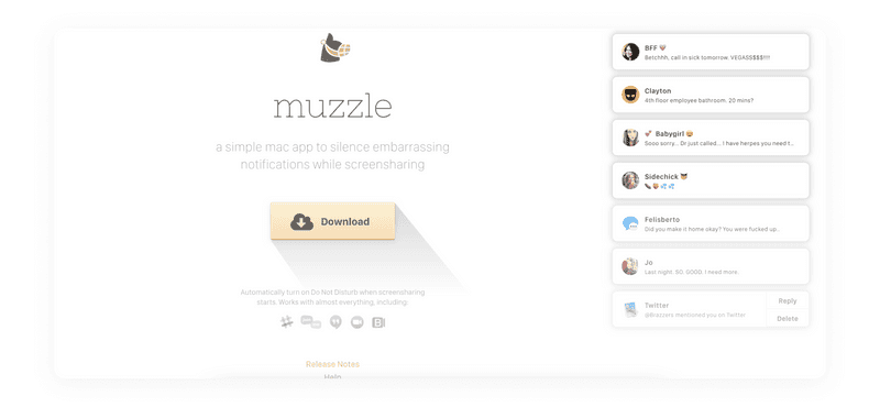
Muzzle landing page design example
-
Distinctive features
It will help you to show why you are better than any of your competitors. Provide users with more details about your products and services. Explain how they may change their lives and influence productivity when they become your client.
If you a looking for a good example, then you need to see Webflow’s landing page. It is filled with good copy about their advantages. Yet, this is successfully backed up by a customer review, which inspires confidence and desire to try their product.
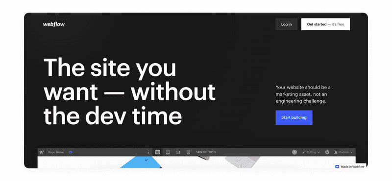
Webflow landing page design example
-
Responsiveness
Every year people increasingly prefer phones and tablets to surf the Internet. Therefore, for visitors to work seamlessly from any device, it is imperative to make the design of the landing page mobile-friendly. Tools like Google PageSpeed, and Mobile SEO Page Analyzer can help you get mobile landing page optimization and analysis.
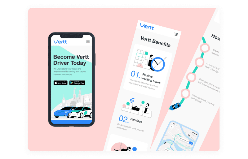
Responsive design example by Tubik Studio
-
Z or F pattern
Research shows that most people’s eyes move around a website in an F or Z pattern. Therefore, the best landing page design usually takes these patterns into account. Along with this strategy, visitors to your page will automatically come to the call to action button that you place according to the visual pattern.
In this paragraph, we have considered the must-have points that make a landing page design user-friendly and effective for the business goals. Next, we will find out what design strategies and trends can help make the landing page eye-catching and not outdated so the users would be impressed.
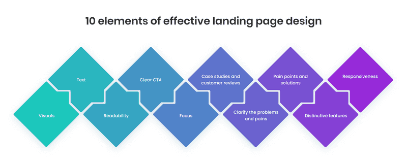
Landing Page Ideas and Design Strategies to Follow
Let’s see examples of creative landing page design that can increase conversion rates. First, you will see some helpful design strategies to follow. Of course, all the projects are highly individual. They require specific solutions, but there is a basis of creative practice that can give you general landing page ideas that will work.
-
Functional minimalism
Attempts to overload the landing page with everything in a row often lead to a negative result. In most cases, a minimalist design based on core functionality and visual elements that effortlessly draw the user’s attention to the CTA turns out to be a good approach.
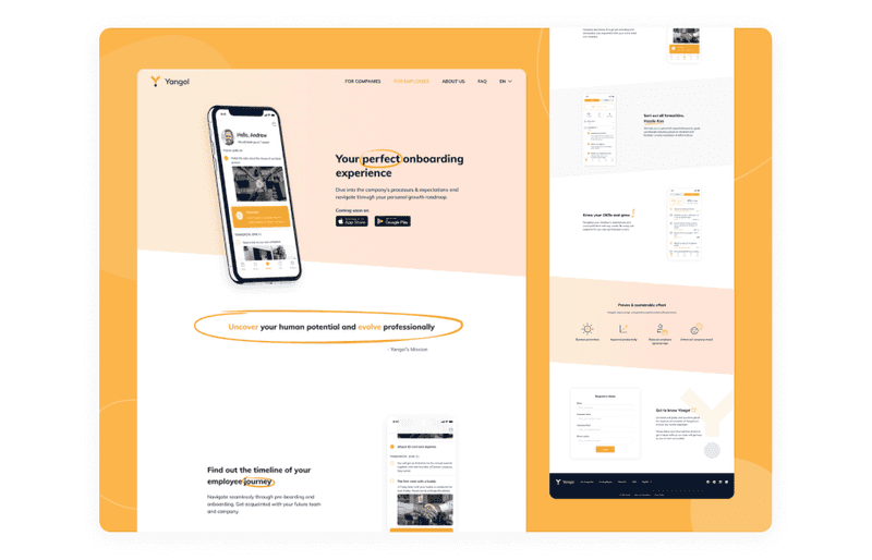
Dribbble shot by Axicube
-
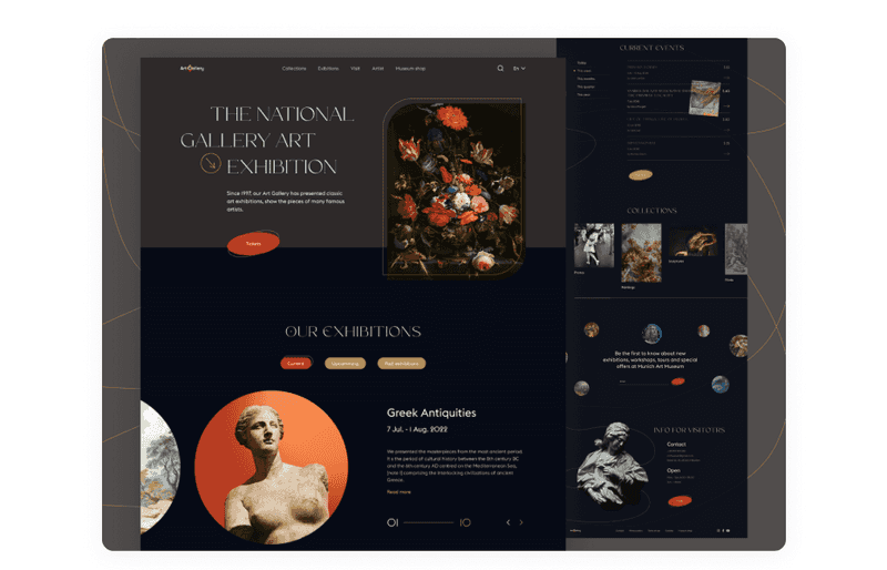
Dark design
Landing pages with gray and black backgrounds and accent splashes of color can create a mysteriously cool yet elegant effect. Their boldness makes them ideal for brands that want to stand out from everyone else and appear more luxurious.
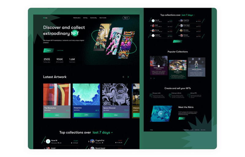
Dribbble shot by Axicube
-
Collage
Not many people enjoy reading long texts and product descriptions. Therefore, you need a creative landing page design that speaks visually and intuitively for such cases. One way to achieve this is to use a collage or cut and paste image style. In other words, product-specific images can be combined into a “surreal” environment explicitly created for the product or event.
The juxtaposition of these images creates a deeper meaning that the user can understand without too much accompanying text.
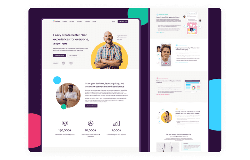
Dribbble shot by Axicube
-
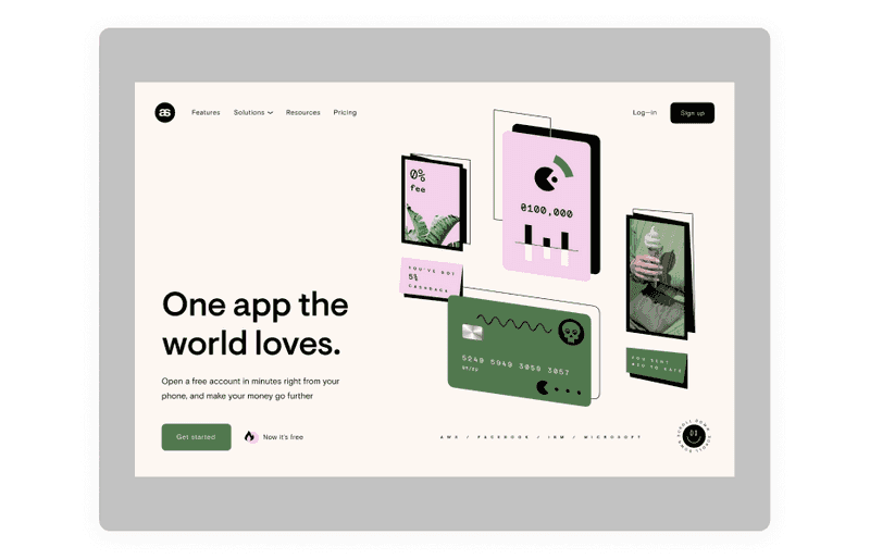
Illustrations
Anything from 3D illustrations or line art to freehand drawings can be used to create a friendly, colorful yet stylish design. With the help of various illustrations, it will be effortless for you to express your brand’s personality. In addition, you can use fictional characters to get more like from your users.
In general, if your brand stands for affordability or your service, remarkable convenience, and friendliness, an illustrated landing page might be the way to go.
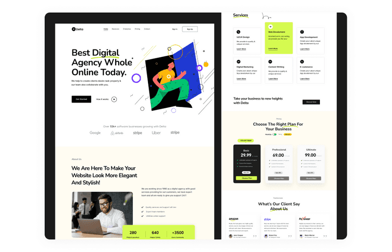
Dribbble shot by Piqo Design
-
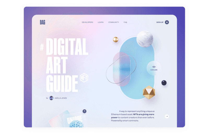
Gradients
Gradients are a great way to add dynamics and color to your designs. This way, you won’t overload your creative landing page design with an abundance of graphic elements so that users’ attention won’t be distracted. But at the same time, you should pay attention to the contrast so that your CTA button does not blend into the background and remains noticeable.
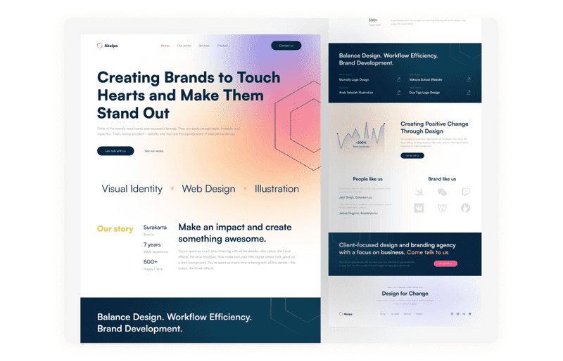
Dribbble shot by Vektora
-
Engaging and attracting scroll animation
As Matt Eller says, “Animation can be used to make transitions more obvious, so it’s clear what happened between where the user started and ended up.” Scroll animations can do more than just make your landing page more engaging.
With this technique, you can draw more users’ attention to the CTA button or keep them busy during the page load so that it flies by faster.
-
Promotional video
Eyeview insists that a video can boost conversion rate up to 86%. In addition, you can use videos in your app landing page design to drive attention to your mobile application.
If you are looking for landing page ideas, then Filmora will give you one. You will see an excellent example of using a promotional video that adds credibility to the whole page and showcases the product.
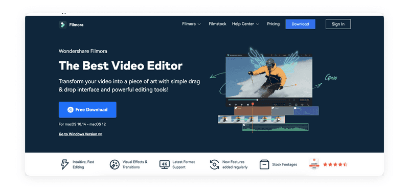
Filmora landing page design example
-
Large typography
Using just the font and no images seems like the easiest solution, but it produces some very stylish converting designs. This design style sends a straightforward message and will appeal to clients who think logically and methodically or those who value explicit messages.
Dribbble shot by Axicube
In landing page design, it is essential that the design is not only beautiful but also selling. Therefore, focus on the examples of design strategies and techniques we have given above to achieve the desired effect. Moreover, you can read our article on how to make a selling and beautiful design.
Take My Money: Visual Design vs UI Design as a Method to Make Selling Product
Steps to Create Converting Landing Page Design
How to design a landing page that will be attractive and effective? Well, our team has a stable plan for any project. However, some steps can’t be skipped when you want to build a successful product. Read our article about these steps, and you will have a perfect plan in your head. Then, who knows, maybe you will conquer the world with it.

How Do the Perfect Design Process Steps Look? Everything You Need to Know
But today, we will outline the essential steps specifically for landing page creation. Follow these, and you will get what you need.
-
Landing page website design competitive analysis
To create the best landing page design, conduct a competitive analysis. It will help you define the main elements to add and the idea that will help you stand out from other competitors. Also, it helps to find some product landing page design inspiration.
-
Analyze your audience
Your landing page won’t be effective unless you understand your audience and the most painful things that trigger them. So, understand your target market to ensure that your landing page will interest them.
-
Determine your USP
USP, or unique selling proposition, is the fundamental feature of your product that makes it worth buying. When you know your USP, it gets easier to define the basic idea for your landing page.
Dribbble shot by Halo Lab 🇺🇦
-
Create nice CTAs
After determining USP, it will be easier to create CTA that would drive visitors’ attention. CTA helps to focus on your USP and deliver it to the visitors. However, there are specific rules for creating a call to action, and it’s important to obey them.
The main ones are: CTA should be short and noticeable; it should be in places where the visitors can easily see it (website screening patterns will help you with it); the color choice of the CTA button should be wise.
-
Design it
Here you have two options: create a custom landing page or just find a landing page builder, choose a template, and design there. Each of these methods has its pros and cons. If you want to use a landing page builder like Kickofflabs, Unbounce, or Leadpages, you will be able to choose a template and work with it.
This option will help you get the results faster without spending much money. But if you create a custom landing page, your design won’t depend on pre-made templates.
Thus, neither your idea nor your content will depend on templates, and you will also be able to use a more advanced set of analytical and marketing tools.
-
Follow SEO strategies to drive traffic
Your landing page needs to be public, so make sure it can be discovered by people entering specific search terms into a search engine like Google. By following some basic SEO strategies, you can get as many people as possible to see your landing page.
You can understand in which direction to move with the help of the following tools. With Google’s Keyword Planner, you can find ideas for keywords to incorporate into your landing page copy. Yet, you can run your landing page through Google Search Console to check crawlability.
Dribbble shot by heartbeat
- Test it
A/B testing will help you better understand the message or the idea that converts. Test landings as many times as it is possible. It’s one of the most effective web or mobile landing page optimization approaches. To conduct A/B testing, you can use Google Analytics or Optimizely. Both help runs different tests and uses their results for new campaigns.
If you stick to this plan, then you will be able to create a converting landing page that will help you achieve the business goals that you set for yourself.
Applozic Case: Product Landing Page Design Inspiration
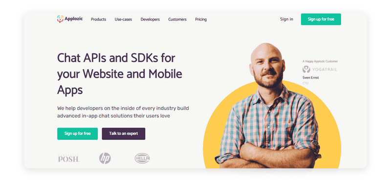
How about seeing an actual case study on how our team created the landing page? For Applozic, we created a converting landing page to improve website metrics and increase the number of leads. Here’s what we’ve done to reach the desired results:
-
CTA creation
We have worked out the main idea of the landing page in detail to translate it into each section. For CTAs to work as efficiently as possible, we also implemented this basic idea in them and created catchy texts.
-
Increased confidence
To increase the confidence of potential customers, we have added a block with reviews and reviews. People are more willing to buy something if they see that others have already tried it successfully.
-
Highlighted the solutions
To influence potential customers’ decision-making more effectively, we identified their main pains and offered solutions.
-
Expertise showcasing
Also, to reinforce confidence, we decided it would be great to show our client’s expertise.
-
Features describing
To better show users the value of the application, we have described the main features that distinguish this application from thousands of others.
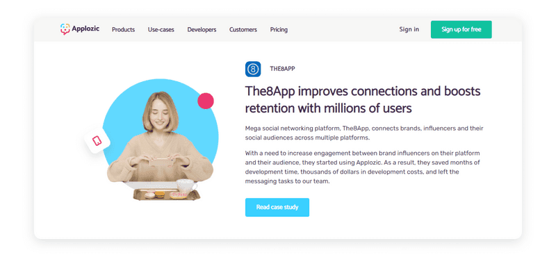
As a result, we got a beautiful, most importantly, well-functioning landing page, which has become an excellent tool for attracting leads to our clients.
Solutions to the Most Common Challenges You May Face on the Way to Converting Landing Page
The landing page is not significant in size and can give the illusion that it is effortless. But in fact, there are some challenges that you will have to face. But don’t worry, we’ve already answered these questions.
-
No traffic
To get the most out of your landing page, you need to rethink your advertising and marketing campaigns to make them relevant. It is also worth reconsidering the correctness of your SEO optimization. If all these points are taken into account, then traffic should increase.
-
Poor conversion rate
But what if people still get to the landing but do not fill out the form? Well, there can be two solutions. First, perhaps your application form is too long, asks for too much information from the user, or even seems complicated.
Or the user, in the end, does not understand the benefits they will receive from your product and therefore does not fill out the form. Thus, the solution to this challenge is to review your texts to see if you are good enough to express the product’s value and rethink the way you composed the form to fill out.
Dribbble shot by Masud Rana

How Do the Perfect Design Process Steps Look? Everything You Need to Know
So, above, we have presented the main challenges that you may encounter. Now you know how to work with them and will be fully armed.
Do You Need Some Help With Landing Page Optimization?
It’s not easy to create a landing page design. And it’s even more challenging to create a landing page design that converts leads. There is too much important information that you should not omit. Moreover, you need to find the most effective ways to present it.
Product landing page design will differ from software landing page design. And if you have no idea how they differ, hiring a professional team to help you develop a landing page is better.
We at Axicube believe that every business deserves a converting landing page. Contact us if you want to boost your marketing campaign and improve the quality of leads or their number. We can help you create a landing page that will make you reach the desired results faster.
