Imagine yellow. What associations does it evoke? Perhaps your first association was lemon. Not surprisingly, when people see a yellow-colored drink, they think it is likely sour. Colors evoke strong associations in people and can influence the product’s overall impression and the user’s decision.
Each color has its meaning and character, which affects the user’s behavior much more than it seems. What is color psychology? How do colors affect people’s emotions? What does each color mean? What color attracts the human eye most? What is the symbolism of flowers in different cultures? What is the meaning of colors in psychology? Each tone and shade is associated with people with certain feelings and thoughts.
In this article, we will get acquainted with the basic concepts of color psychology and give you some tips on using the influence of color in branding and website design and the best button colors. Finally, you will learn how to apply the knowledge of this science in practice.
What is Color Psychology?
The psychology of color studies its influence on mood and human behavior. The fact is that the human mind reacts to colors, although we usually do not notice this. Color even affects our perception of the speed of time. For example, sites in cool UI/ UX colors seem to load slower. There is research currently being done to study the features of these reactions, and there are already many theories that are useful to explore. The psychology of color is helpful in many industries, including business, marketing, and design.
The success of a product largely depends on the colors chosen for design and branding. Choosing the right colors that attract customers can help create a mood in users that encourages them to take action. A study by Colorcom found that it takes just 90 seconds for people to judge a product subconsciously, and 62% to 90% of that assessment is based on color alone.
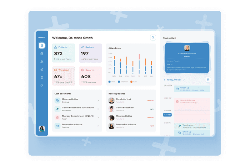
Dribbble shot by Axicube — an example of a good color choice for conveying the right message
People have specific associations and expectations about colors. For example, when visiting a website related to medicine, a user is likely to expect to see light colors and green or blue accents. Therefore, making a medical site in black and yellow will most likely disappoint the user, and the site’s conversion will decrease. And these are just a few examples of hundreds of studies that prove that coloring not only evokes specific associations but can also affect perception.
So, basic knowledge of color psychology can be helpful to increase the conversion of your product by choosing the right colors that attract customers. In addition, well-chosen colors can enhance the usability of a product. That sounds interesting, right? So, let’s find out the connection between people’s emotions and colors.
Color Preferences: What Color Attracts the Human Eye Most?
To begin with, it is worth noting that visual perception is individual, and it is impossible to find a single recipe for colors that attract the eye. Moreover, people’s color preferences change with age, just like tastes in music, food, clothes, etc. It is due to mental and physical changes in people. For example, many children like colors such as red, yellow, and orange, and with age, these preferences change. There is a confirmed pattern in this.
Faber Birren explains it in his work Color Psychology and Color Therapy: “With maturity comes a greater liking for hues of shorter wavelength (blue, green, purple) than for hues of longer wavelength (red, orange, and yellow).” One of the differences between younger and older audiences is that children may change their color preferences frequently. At the same time, adults’ tastes are more stable. Therefore, designers must consider age when choosing colors for websites and apps.
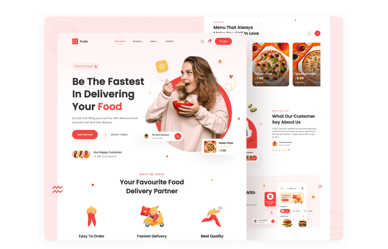
Dribbble shot by One Week Wonders — an example of a good color choice for conveying the right message
In addition, designers should consider many cultural differences when choosing UI/UX color palette for future designs. Sometimes cultures define colors differently. For example, in Western countries, white means happiness and purity, while in some Asian countries, it symbolizes death.
It is just one example of how cultural differences can affect color perception. But even this is enough to understand that the product’s culture and geographic location can significantly affect what colors will be present in the palette of the future development.
Besides age and cultural differences, gender also influences color preferences. Therefore, a deep study was conducted, during which it turned out that men and women prefer different colors. We’ve defined the most notable things from the research to share with you:
-
The preferred color is blue
Both men and women of all ages consider blue their favorite color. This is surprising because marketers continue to impose pink things on women. And women also love such shades of blue as azure, beryl, cornflower blue, and sapphire.
-
Brown and orange are in dislike
Men dislike the brown color, and the orange is less favorable to women.
-
Cool colors are preferred
Men and women like cool color tints in general. These can be blue or green tints.
-
Women like tints
When men prefer pure or shaded colors, ladies are good with tints.
-
Men prefer neutral colors
White, black, and gray are achromatic colors, and men are keen to choose them.
Next, you can see diagrams with colors that attract attention by gender.
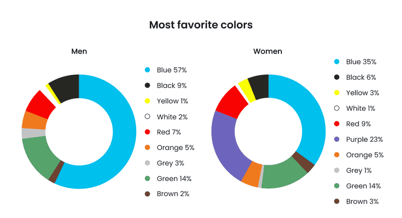
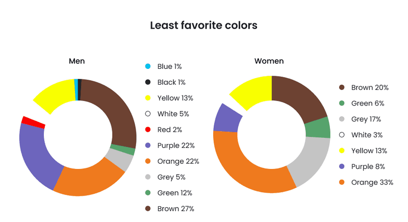
If you thought that the choice of colors depends only on the beautiful combination of the palette, then at this part of the article, you probably already gave up on your judgment. As you can see, a lot goes into deciding which colors are best for your branding or website. Conduct good research so that your color scheme does not cause unnecessary associations.
So, no particular colors attract people’s attention the most. But there are some tips for choosing the most suitable UI/ UX colors for your website. Let’s see.
What to Consider to Choose the Right Business Website Colors That Attract People’s Attention
You might think, why bother with choosing a color so much? After all, content is the most important thing. And that’s true, but that’s not all.
People love content. Enticing information attracts them, but first, you must get their attention. It is where website palette colors come into play. So let’s dive a little deeper into the website color psychology and learn general rules on choosing a color for a design.
-
Know your target audience
Your audience is the key to your site’s high conversion rate. Do deep research to understand what they like, what their primary age, gender, and cultural values are in order not only to understand what colors can be used to hit the target but also to understand what your design should be in general.
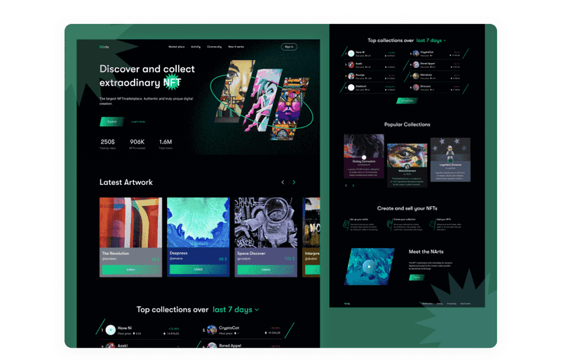
Dribbble shot by Axicube — an example of a good color choice for conveying the right message
-
Create brand recognition
Did you know that color increases brand recognition by 80%? So, making a website is an excellent opportunity to establish your brand. If you already have a brand identity, you have good news. You already have colors for your website. Or, at least you have the primary color.
-
Learn color theory
If you want to make a great UI/ UX color palette, you need to know how the color itself works.
-
Develop a sense of order
Rate colors by importance. With it, you will get main and accent ones, so you will be able to enhance the content on your website.
-
Keep it simple
Don’t try to make your UI/ UX color palette too wide. It is better to choose a couple of primary colors, an accent, and some shades. Remember that, for example, if you are making a mobile version of a website, then on a small screen, many colorful elements will look gaudy. Take a look at how Slack handled this task. Their rich purple signature color looks juicy on both the big screen and the small. And since they did not use too many colors, the design looks stylish.

Slack screens
But if you want to know how to reach great converting UI design, read our previous article. Here, we’ve talked about the principles of UI, general rules, and crucial elements. If you combine information from this article and the previous one, you will totally win!
Take My Money: Visual Design vs UI Design as a Method to Make Selling Product
Now, how about looking at the individual elements of the website? For example, there has been a long debate about what color is better for a button - red or green? Dark or light interface? Let’s take a look at the answers to these questions.
Dark or Bright Websites? Which UX Colors are More Satisfactory for Website Background
Bright sites may always look like a safe bet, but dark UI can be the winner in some cases. When choosing UI/ UX color palette, you need to consider many things. For example:
-
Age of your audience
An older audience will prefer lighter colors, which will allow them to use the interface intuitively. In comparison, younger audiences will appreciate the stylish dark tones. But if your audience is children, then bright sites colors and interactive design elements will be a winning solution.
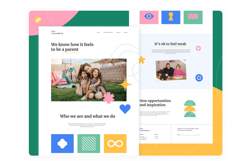
Dribbble shot by Andersen Design
-
Environment
The time you use your app or website - day or night - should also play a role when choosing UI/ UX colors. For example, Netflix is watched mainly at home at night. Therefore, their dark backgrounds work well in dark environments. And the bright sites play well when most of their traffic comes in the daytime. For example, these can be social networks, news sites, or company sites.
-
Design elements
For example, you want the user to pay attention to one bright and significant element on your website. In this case, dark UI/ UX colors would be a better solution. On the other hand, if your website has a lot of small design elements or illustrations, it is better to choose light colors.
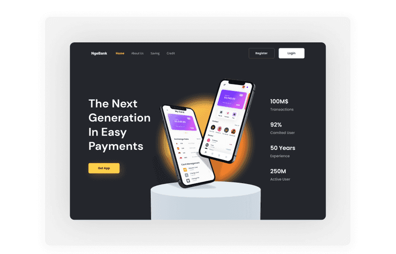
Dribbble shot by Plainthing Studio
-
Amount of text
If there are a lot of images and a little text to read, you can choose dark UI colors. Alternatively, if your website will contain lots of text, we’d suggest you choose a light UI/ UX color palette.
Choosing between a light and dark interface design can be very difficult. Still, if you pay attention to the points above, it may be easier for you. Although sometimes you can not choose, make a light and dark mode of the interface. But note that the dark mode is not just about swapping colors. Perhaps, to make a dark version of your site, you will need to adjust your color pallet: accent colors could look too bright on the dark background.
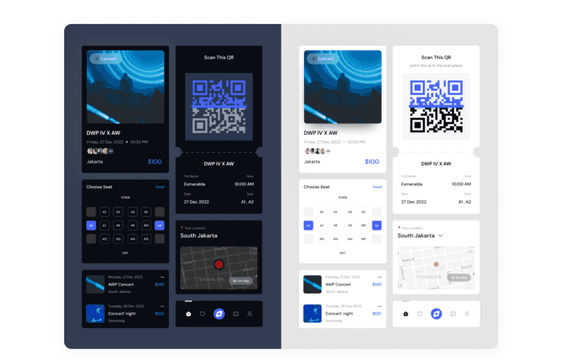
Dribbble shot by Hello Ideologist
And since we’ve already started talking about what colors are best for websites with much text, let’s learn how to choose blog color schemes.
Blog Color Schemes
In 2009, there was a poll about preferable blog color schemes in ProBlogger. The readers were asked what sort of color blog they prefer. Almost half of the readers answered that light background is preferable – and that is reasonable as blogs are traditionally text-driven. Hence, the aspect of readability outweighs the others. However, 10% of respondents answered that they prefer dark backgrounds. More than one-third mentioned that the choice should depend on the blog’s nature and content.
When choosing UI/ UX colors for your blog, you need to keep in mind readability. It defines how easily people can read blocks of copy, phrases, and words. So, if there will be a blog on your website, you need to consider it when planning UI/ UX color palette.
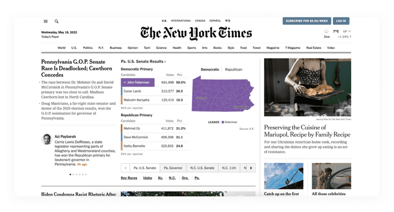
New York Time\*s homepage*
A famous user experience guru Jacob Nielsen mentioned: «Use colors with high contrast between the text and the background. Optimal legibility requires black text on white background (so-called positive text). White text on a black background (negative text) is almost as good. Although the contrast ratio is the same as positive text, the inverted color scheme throws people off slightly and slows their reading slightly. Legibility suffers much more in color schemes that make the text any lighter than pure black, especially if the background is made any darker than pure white.»
Therefore, the conclusion can be that any blog color schemes are suitable. The main thing is that the designer understands the principles of readability and contrast. But where else can contrast be critical? It is a button—a small but essential element on a website that needs to be noticed.
Best Color for CTA Button
So, what is the best color for the CTA button? Red or green? There was a controversy over the years about the best button colors. However, we’ve found interesting A/B testing written by Joshua Porter about it to answer this question. They ran tests for a few days with green and red CTA colors on a client site. In total, there were more than 2,000 visits. Their result? The red button outperformed the green button by 21%.

Did you notice anything that could help make the red CTA color a better choice? Something in the overall design of the page? Green is one of the primary UI/ UX colors of the website! And what happens if you add a green CTA color to the mix? It won’t stand out. Therefore, perhaps the answer to the best button colors for websites will be contrasting ones.
CTAs need to be visible, so you need to choose contrasting button colors that stand out to achieve this. Perhaps it will be green, possibly red, or maybe even azure on your site. There is no best button color for conversion that will be universal for any product. But we have some points on choosing a lovely palette for your website or app. Keep on reading.
More Points to Consider to Make Your Website’s UI/ UX Color Palette Winning
There you will find out some tips and tricks about color usage. With it, your product will get colors that attract customers, and you will win the highest conversion rates.
-
Accessibility
Some people suffer from color blindness - they cannot distinguish specific colors. In our previous article on accessibility, we also talked about accessibility in terms of color solutions. Read this to create more brilliant color combinations.
Accessibility Design Matters: Why is it So Important?
-
Color a/b testing or UX conversion testing
Imagine that you want to change the color scheme of an existing website. The most helpful way to check is to conduct A / B testing. First, you create two versions of your site, one with the old one and the new color scheme.
Next, you send half of the traffic to the old version of the site and the other half to the new one. As a result, you will be able to see which page is generating more conversions and choose the best option. Such UX conversion testing is also suitable if you want to change the color of a button, for example, or if you can’t decide which color scheme will be better.
-
Make sure your design colors convey the right message
Match the chosen colors with your website’s message and its meanings. People already have associations with colors, so don’t disappoint them, or your conversion will drop.
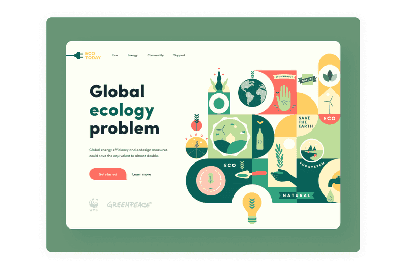
Dribbble shot by Orizon: UI/UX Design Agency — an example of a good color choice for conveying the right message
-
60-30-10 rule
The idea is simple. To balance your design color, use 60% for the primary color, 30% for the secondary, and 10% for the accent. This proportion is considered pleasing to the human eye, as it allows you to perceive all the visual elements gradually. Designers can successfully combine colors without risking turning the user interface into a colorful mess by knowing the proper proportions.
-
Contrast
Contrast colors are colors that attract people’s attention. Contrast is one of the critical elements of any visual composition. You can highlight some elements that the user should pay attention to. For example, it could be a CTA button. But too high a level of color contrast may not always work well. If the text and background color differ too much, the text will be difficult to read or scan.
Therefore, designers are advised to create a moderate contrast level and use high-contrast colors only to highlight elements.
Now, let’s learn about website color psychology and what each color means for people. With it, you will know what the best button color for conversion is and what color to choose to convey the right message of the website.
10 Colors that Attract Customers and Their Meaning
Designers need to understand what colors mean and what kind of reaction they evoke to convey the right message or call users to the expected action. Also, it is worth mentioning that light or pure color shades are colors that get attention, and dark ones give solidity. Vivid colors can be muted for a softer effect - the less saturated the hue and the smaller the image area a color occupies, the weaker its influence.
So, we have prepared a list of the most used colors in the design, explaining what each color means and what emotions it evokes in the user.
-
Red
What color attracts the human eye most? Red can be the answer. This color is usually associated with passionate, solid, or aggressive feelings. It symbolizes good and bad emotions, including love, confidence, passion, and anger. In design, using red is an effective way to capture users’ attention. However, it is recommended to use red sparingly to avoid adverse reactions. Thus, red can be one of the best color for CTA button.
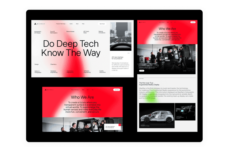
Dribbble shot by Elena Saharova
-
Orange
It is a vibrant and warm color that can bring feelings of motivation, enthusiasm, and love. Designers use color when they need to convey a spirit of creativity and adventure.
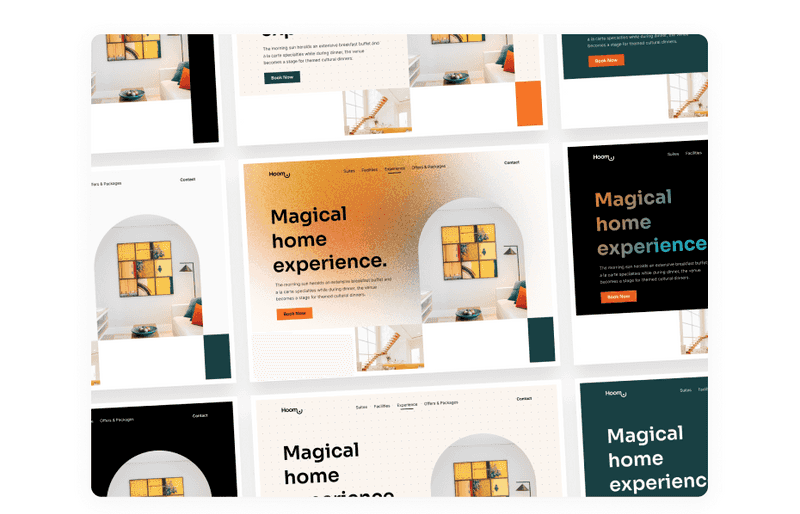
Dribbble shot by ⚡️Agensip UI UX Agency
-
Yellow
It is the color of happiness, which symbolizes sunlight, joy, and warmth. It is believed that yellow is the easiest to perceive visually to be used as a CTA color. However, it must be remembered that too much yellow can cause adverse reactions.

Dribbble shot by Ramy Wafaa
-
Green
It is often called the color of nature, health, balance, and harmony. Green brings calming and renewing feelings. It has more positive energy than most other colors but is sometimes associated with materialism, such as money. Therefore, the design in green tones is ideal for products related to nature and health.
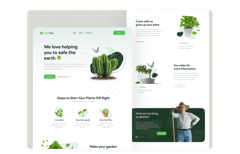
Dribbble shot by Odama
-
Blue
In website color psychology, blue is often used for corporate websites because it is the color of trust. Although, it also means sadness and distance, so designers need to keep it in balance.
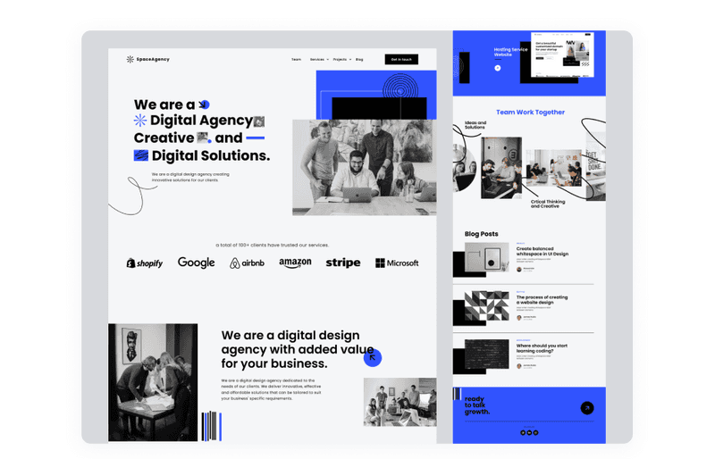
Dribbble shot by Morva
-
Purple
Purple has long been associated with royalty and wealth, as many kings wore purple. Now, the website color psychology helps present some luxury products. It is also the color of creativeness, mystery, and magic. It mixes the energy of red and blue, so it has a balance of strength and stability. However, a high concentration of color can be distracting for users.
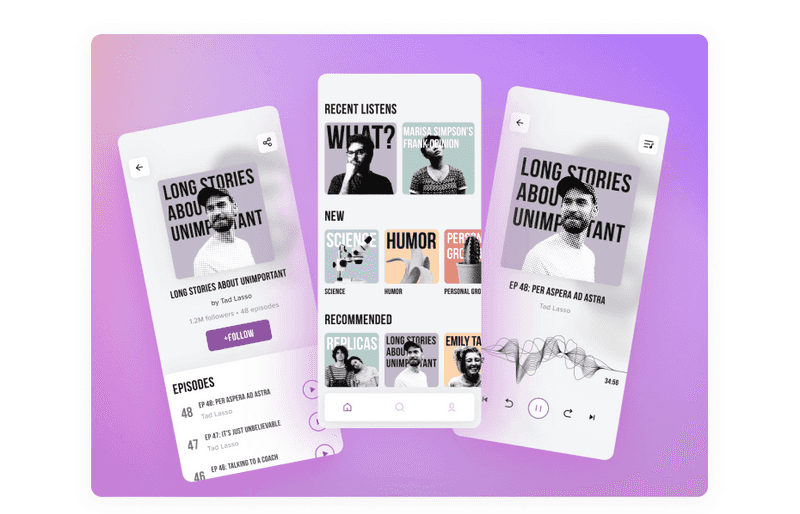
Dribbble shot by Axicube
-
Pink
It is the color of sensitivity and romance. Pink is much softer than red, so it creates a feeling of unconditional love. Pink is strongly associated with youthful femininity, so it can be an effective color if the target audience is primarily girls and young women.
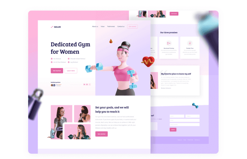
Dribbble shot by Faris Muhtadi
-
Brown
In Western and American cultures, brown symbolizes dependability. Designers usually use brown as a background color in various shades, light to deep. It brings a sense of warmth and coziness to the design.
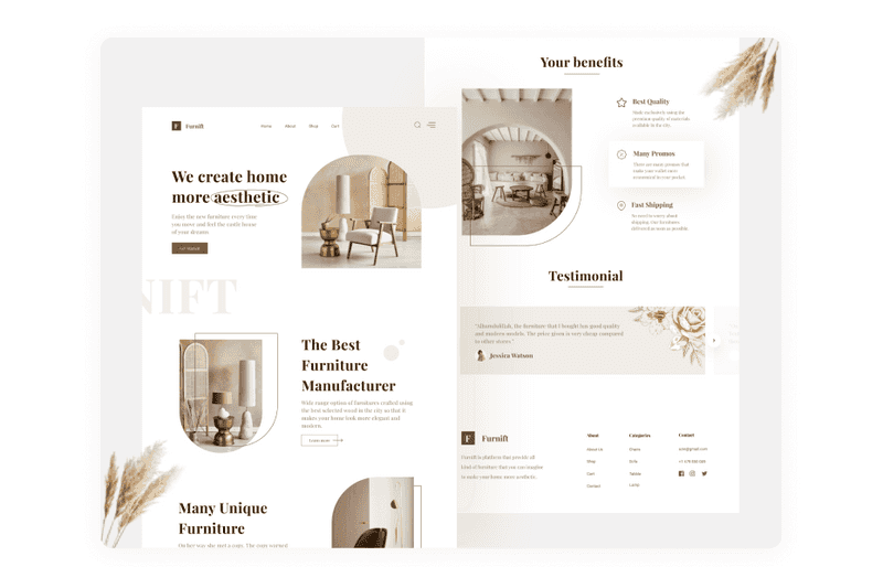
Dribbble shot by Odama
-
Black
For most peoples, black means darkness and death, and for the tribes of the arid regions of Africa, rain clouds, which means good news. In modern European culture, black is not only a symbol of darkness and death but also elegance and aristocracy. Black is good with all colors and can also be used to show the contrast.
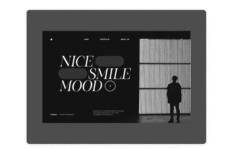
Dribbble shot by Tomasz Mazurczak
-
White
The white websites are suitable for any time. This color does not go out of fashion and does not bother the eye. White is neutral and often used for backgrounds, especially if readability is the top priority for your website—it is associated with innocence, clarity, and purity. However, too many white-colored elements and spaces can cause feelings of emptiness and loneliness.
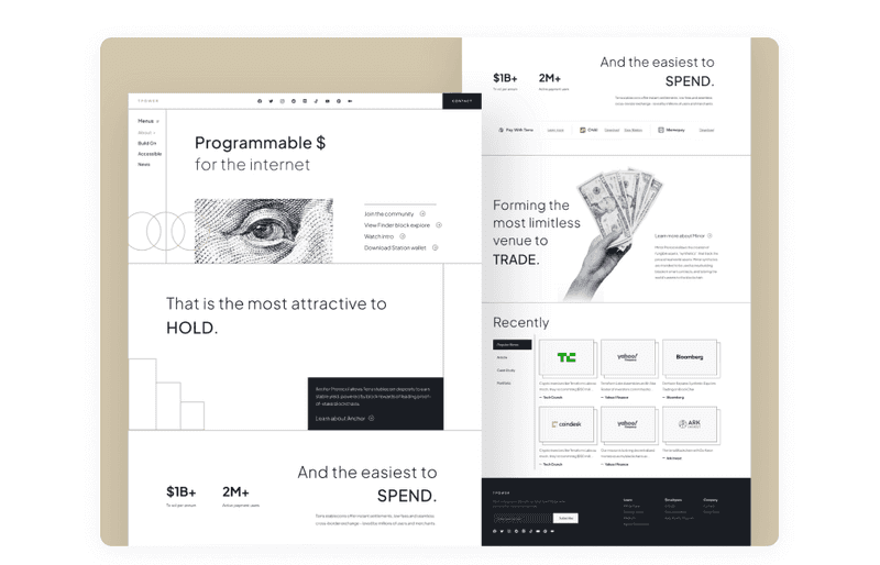
Dribbble shot by Omnicreativora
As we see, red and yellow are the colors that attract the eye. Although, if you use pure shades of any color and watch the contrast, you can get customers’ attention. The color scheme you choose for your website can impact revenue, customer conversion rates, and overall success among your competitors. What seems to be a matter of aesthetics is a well-studied topic.
Yet, if you want to learn more about how to raise your conversion rates with design, it is recommended to read our previous post. We promise that you won’t regret it!

A brief guide on website and app conversion rate optimization with design
Color Meanings in Branding
There are no particular colors that attract customers to your business. To start the color selection process, you need to know who your customers are. As we said earlier, color preferences are influenced by age, culture, and gender. Therefore, before choosing colors for a business, conduct research on the audience.
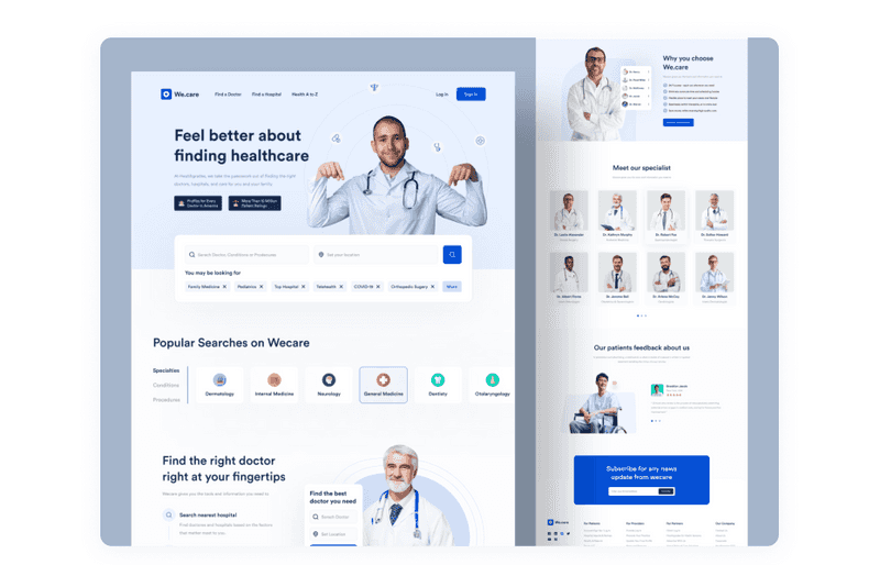
Dribbble shot by Nasim — an example of a good color choice for conveying the right message
Many experts believe that choosing multiple colors in your business is the most beneficial. Here are some criteria to consider when choosing a color theme for your business:
-
Company mission
Your company’s mission is, in other words, its purpose and what message it conveys. Clearly define this, and then it will be easier for you to understand what colors should be used in your branding.
-
Client characteristics
Building a portrait of your average customer is the second key to understanding what colors work best for your business. What gender will this person be? What country are they from? What is their age, and what do they do? By answering these questions, you will create a portrait of your client.
-
Competitors
Pay attention to what branding colors your competitors use. Which color schemes are successful in your market area, and which, on the contrary, repel customers?
Once you’ve decided on these criteria, you may already have a color palette for your branding. So let’s look at what these colors mean in branding and what businesses they suit.
-
Red
In branding, red is suitable for the food industry - Coca-Cola, Red Bull, and the entertainment industry - Netflix. However, it should be used more carefully in security and real estate. It is because it can scare away with aggressiveness. In addition, red denotes strength, confidence, and youth.
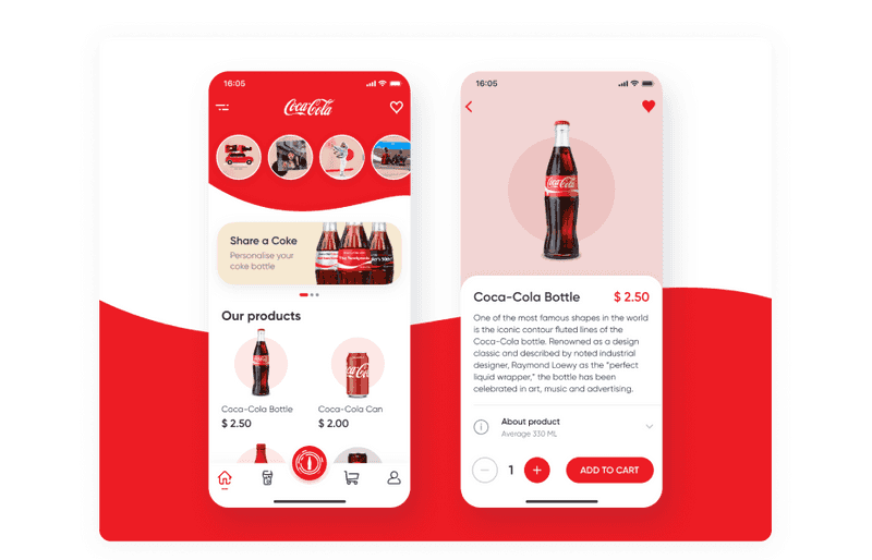
Dribbble shot by Tima King
-
Orange
Playful and bright orange will suit children’s and youth brands. In addition, its shades can look cheap, so this color is also suitable for brands that offer products and services at low prices.
-
Yellow
Some shades of yellow look cheap and, like orange, are suitable for inexpensive products. For example, it harmoniously looks in the logo of the Ryanair low-cost airline, is appropriate in the field of entertainment - Nikon, IMDb, and suitable for children’s brands.
-
Green
This color is associated with health and success. It is also calming and relaxing. Green evokes stability, prosperity, growth, and a connection to nature.
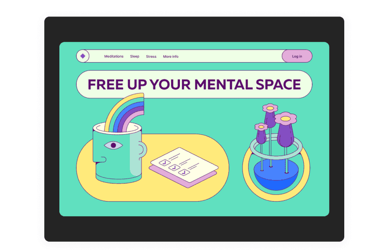
Dribbble shot by Tanya Shegol
-
Blue
Blue is a calm color that can be safely used in medicine’s technological and financial fields. In addition, it is well suited for corporate documents.
-
Purple
This color gives a feeling of respect, freedom, and creativity.
-
Black
This color is suitable for those brands that want to emphasize sophistication and show that the product is expensive. So do the brands Hugo Boss, Chanel, and Camus. Black is also associated with security, strength, and authority.
-
White
Ideal for minimalist brands and for those cases when you need to make friends with many bright colors. It’s like a photographic passe-partout - with the help of white, you can add sophistication to the most vivid color photographs.
Colors affect the perception of the product and the mood or message that the company broadcasts. So make sure you choose the right colors for your branding. If everything is correct, then nothing will stop you!
Final Words
The success of a digital product largely depends on the colors chosen for the user interface. The right colors help users feel comfortable and connected to the product. Designers can create a mood that encourages people to act simply by applying the right color palette. Make your choice wisely.
There are no exact colors that attract customers and give you 100% conversion. There are also no wrong colors. But they can work badly if you use them in bad combinations or in the wrong way. So choose colors wisely because they influence the users, and make sure that your design conveys the right message and tune.
Yet, there is no universally best button color for conversion. Apart from making a call to action blue or red, you should consider its contrast, shape, placement, and copy.
Our article looked at several color-related issues that can affect how users interact with your site or app: traditional color associations, differences between men and women in the perception of color schemes, accessibility, and best button colors for websites. Of course, it’s good to pay attention to these factors at the beginning of the design process. But in the end, the right design decision is what your users think is right. So find out if your color choice affects users the way you expect, and go ahead and create excellent digital products!
