Aren’t we all unique and have special needs? Don’t all our abilities age as we get older and require constant change? If the answers are yes, it’s time to learn and reinforce accessibility design standards. According to WHO (World Health Organization), 15% of the world’s population has some disability. So, knowing about accessibility in design is not an option but a necessity.
It is also worth mentioning that accessibility in web design is not only about people with any disabilities. It is also for those who are temporarily unable to use any functions for any reason. Remember the moment when your computer mouse broke, and you needed to order a new one when you only had a keyboard or touchpad at your disposal. And then you find out: the favorite e-commerce website doesn’t support keyboard navigation. What an unpleasant discovery, right? Universal design accessibility is also responsible for such cases.
Good accessibility in design is critical to the success of your website or app. Designing for accessibility isn’t just required by law in many countries - if you don’t consider it, you’re depriving millions of people of the opportunity to use your product. So, what then is the point if many people are robbed of the chance to use your product?
For example, The ADA (Americans with Disabilities Act) is the most cited law regarding online accessibility compliance. The ADA prohibits discrimination based on disability in public places, and websites are increasingly referred to as public places in court cases.
In our previous article, we were talking about how to make your digital product convert with the help of visuals. Of course, it is vital to make your website or app look attractive, but not less important to think about accessibility in web design. To understand how important is accessibility in web design, let’s see an example. According to the US Department of Commerce, companies without accessible websites are losing $6.9 billion a year to competitors whose sites are accessible. It clearly shows that your product should be not only beautiful and usable but also accessible to people with any abilities.

Take My Money: Visual Design vs UI Design as a Method to Make Selling Product
So let’s break down what accessibility is in UX design.
Universal Design and Accessibility
Many confound Universal Design and Accessibility. Universal design is the design that can be accessed, understood, and used by all people, regardless of their age, ability, or disability. It is intended for absolutely all users and not just for the average user. Things like large color contrast fonts, big buttons on the touch screen of the ATM, and ramps are all examples of universal design.
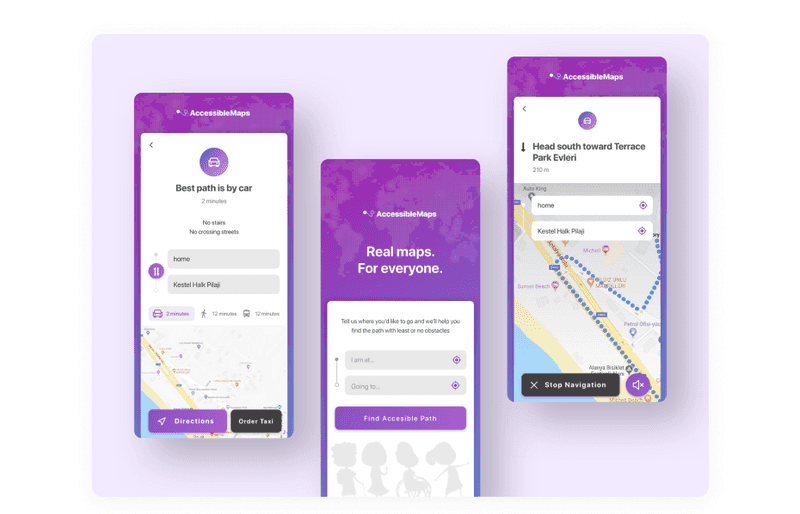
Dribbble shot by Hanan
While the universal design has been a common sight in the physical world for years, the focus on universal design accessibility in the digital realm is still relatively new. Just as buildings with ramps and elevators are accessible to wheelchair users and for people with heavy bags or just for anyone, digital products that follow the principles of accessible design can be used by people with a wide range of disabilities. This approach allows each user to interact with the technology in the most convenient way.
So, what is the difference between universal design and accessibility? Focused on the principle of universal use, universal design dramatically improves the benefit of everyone: children, people with disabilities, the aging population, and everyone in between. However, the accessible design is remarkably personal and can create a unique environment that suits users’ needs.
But there is another term that is often confused with accessibility — interested to know which one?
Inclusive Design vs. Accessibility
Inclusive design is also needed for those who like to work with the keyboard rather than the mouse, those who have old non-contrast monitors, or those who work at night. And accessibility in design also affects ordinary people who are temporarily unable to use some kind of sensory system and people with specific disabilities.
While accessibility design focuses on personalizing products for specific people with disabilities, inclusive design is a broader spectrum focused on creating for everyone. It considers location, situational flaws, people’s perspectives, and anything else that can degrade the user experience.
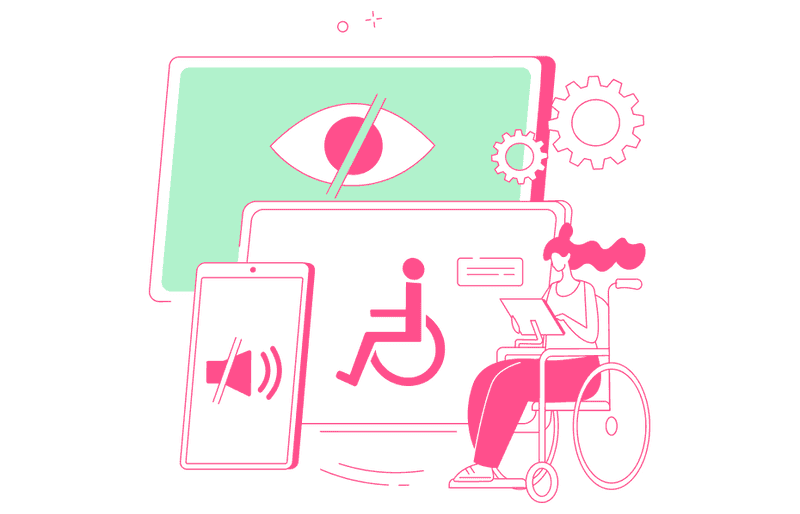
Inclusive design is about creating a flexible environment that can adapt to everyone’s needs. For example, inclusiveness can mean closed captioning for all your videos on websites and apps or having colorblind-friendly toggles.
Inclusive websites enable voice commands, voice screen reader customization, and smart navigation to make life easier for everyone. All these features help everyone without exception.
Accessibility and inclusive design have subtle differences, but they are still there. So, let’s learn more specifically about accessibility to make these differences brighter.
What is Accessibility?
“The power of the Web is in its universality. Access by everyone regardless of disability is an essential aspect.” - Tim Berners-Lee, the inventor of the World Wide Web.
Accessibility means that people with different abilities and ways of technical access can effectively use your interface. The goal of accessibility in design is to remove barriers to perception, understanding, and navigation of your interface and ensure that no one is left behind.
It often happens that accessibility design features help other people, too. For example, video captions that help people with hearing difficulties are also helpful for users who watch videos on mute or in a noisy place.

So, let’s sum up. Accessibility is essential not only for people with permanent disabilities. There are three ways users’ abilities may be limited:
-
Permanently
It is a case when a user has a permanent disability, like hearing loss or visual impairment.
-
Temporarily
If we take the same example with vision impairment, we can imagine that the user has just left the ophthalmologist and dilates his pupils after tests. Thus, the user does not see well, but this is a temporary difficulty.
-
Situationally
Imagine a user is in bright direct sunlight and cannot make out the low-contrast details on their phone screen. It is a situational disability.
Accessibility in design is essential not just for moral reasons but also because with that, your product can reach its full potential. With it, you can make your product usable to all people regardless of their abilities, economic situation, age, device, or geographic location.
Types of Accessibility Issues
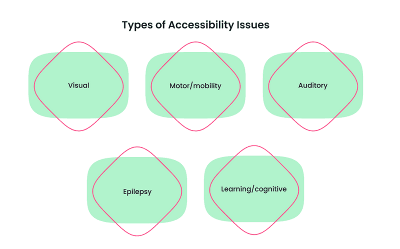
To understand what problems accessibility in design deals with and how to solve them, you need to know what issues users may have. In the age of online content dominance, five main types of physical disabilities cannot be ignored:
-
Visual
According to World Health Organization, at least 2.2 billion people have a near or distance vision impairment. But that’s not all the vision problems people can have. For example, color blindness disability. People with this disability cannot see some colors in the usual way. About 8% of all men and about 0.5% of all women suffer from color blindness (color vision deficiency). It means the chances that your neighbor or one of your co-workers is colorblind are very high. If you want to dive deeper into this topic, check the WeAreColorblind website. You can find articles about colorblindness and helpful design tools for people with such vision impairments.
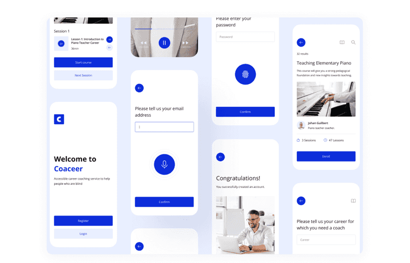
Dribbble shot by Andjela Pantic
-
Motor/mobility
Many types of orthopedic or neuromuscular disorders can affect mobility. These include, among other things, amputation, paralysis, cerebral palsy, and so on. As a result, accordingly to statistics, more than 18 million people have limited mobility.
-
Auditory
According to World Health Organization statistics, over 5% of the world’s population – or 430 million people have hearing difficulties.
-
Epilepsy
Epilepsy Foundation claims that between 4 and 10 out of 1000 people on earth live with active seizures at any one time. So if we talk about web design accessibility issues, photosensitive epilepsy is one of the most critical cases to think about.
-
Learning/cognitive
There dyslexia can be an example. According to statistics, up to 10 percent of the population is affected by specific learning disabilities, such as dyslexia.
In addition to physical limitations, it is worth remembering that users may also have limited technical capabilities. Understanding this involves considering what devices users are using, where they will be accessing your content, and how technically savvy they are.
The following questions are great starting points: Will my users be able to access my website from different devices? What is it like when Wi-Fi is unstable? What if the user, for some reason, did not update the operating system to the latest version?
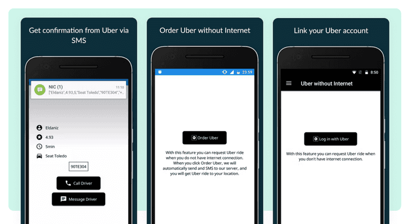
Here we have already got pretty close to understanding what is accessibility in web design. So let’s dive deeper.
What is Accessibility in Web Design?
We have already discussed what accessibility design is. What about accessible websites? Accessible websites are those where people with disabilities can equally understand and interact with content and features. Accessibility features on the website include alternative image descriptions for screen readers or closed captioning for video content.
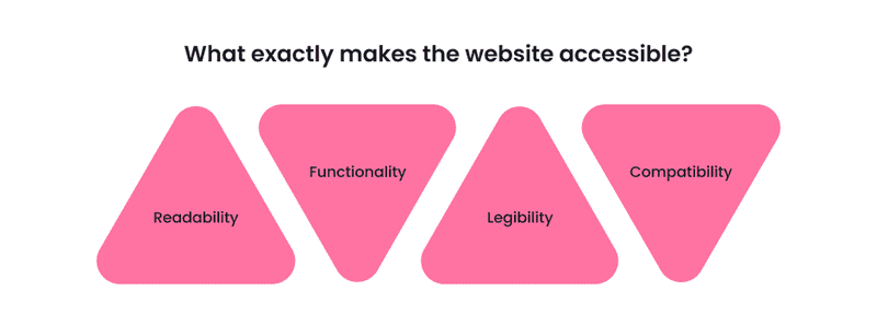
But what exactly makes the website accessible?
-
Readability
The information on the page should be easy to perceive. This often means providing multiple methods for sensing content so that the user does not have to rely solely on sight, sound, or touch.
-
Functionality
It should be possible to operate a website in different ways. For example, the user should be able to navigate a website with a keyboard instead of a touchpad or a computer mouse.
-
Legibility
Every user should understand the information on the website. The actions there should be predictable, and there shouldn’t be unclear abbreviations and jargon.
-
Compatibility
The website should be compatible with all users and technologies, including the newest and oldest ones.
If you consider these points, you will create a web accessibility design for your website, and thus, it will be accessible for all users so that you won’t lose them. It can be even more crucial if you have an eCommerce website. Unfortunately, 92% of top eCommerce websites don’t properly care for disabilities and have short-form field descriptions in their checkout process. Such shortcomings lead to frustration, abandoned carts, and lost business.
Read our previous article if you want to know more about creating an eCommerce website. You will learn how to make it and what perks you may face during this process. If you combine what you learn in this article with tips on creating an e-commerce website, your business will be a great success.

The Anatomy of a Great E-commerce Website Design
We figured out what accessibility UX design is on websites. What about mobile solutions?
Accessibility in Design for Mobile Solutions
As we said earlier, accessibility in user interface design makes your product understandable to any user and works in any circumstances and conditions. For example, the user must understand if they have vision problems or if they are on a brightly lit street. These were just examples. In fact, there are many more web design accessibility requirements.
As one of the core User Experience (UX) principles, accessibility design can help your app attract and retain users. For example, an average smartphone owner uses ten apps per day and up to 30 apps each month.
Dribbble shot by Elliot Haas
The mobile app market is broader than ever before. When focusing on a good user experience, accessibility should be at the forefront. What are the primary considerations of mobile accessibility in UX design?
-
Consider the context
Research them first to provide your users with the most compatible accessibility features. Then, find out what technical or physical disabilities they may have. For example, in fitness apps, a person does actions in a hurry or on the move, so buttons and other navigation elements are better to increase. According to this, think about what you can do to make your interface accessible.
-
Use captions
If your app contains audio or media files, it’s worth considering ways to interact with that content. For example, you can provide transcripts for visually impaired users or closed captioning to help hard of hearing users and those who simply find it more convenient to read than listen to.
-
Add speech recognition
Speech recognition can be used to dictate text, such as sending a message to someone, following links, interacting with buttons, and other controls. It is beneficial not only for people with chronic physical disabilities but also for users who may have temporary injuries or simply for those who have their hands full and cannot hold a smartphone with them.
Your app must have the functionality programmed to implement speech recognition, which can be tricky.
-
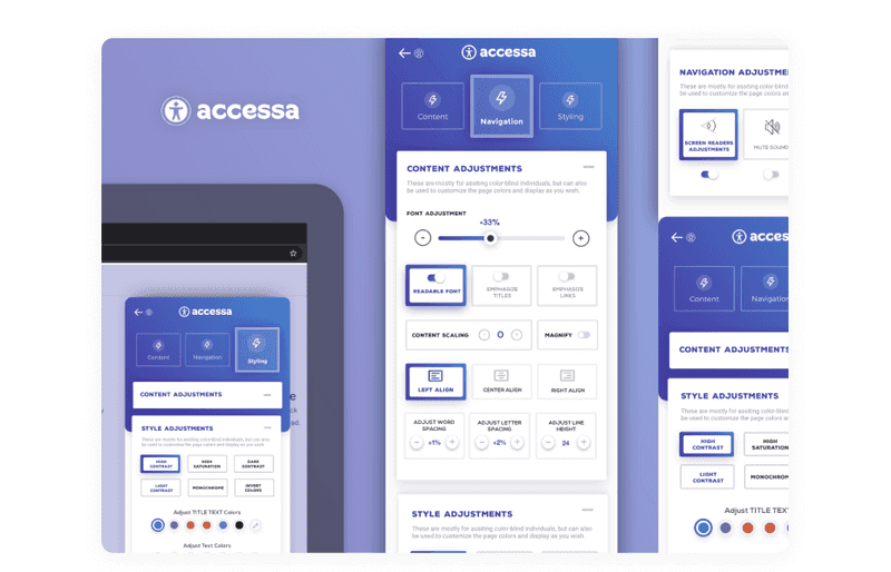
Customization
Let users control accessibility features in your app. For example, you can let them adjust contrast or increase the font size. The more accessibility features you add, the more users will get exactly what they want from your app.
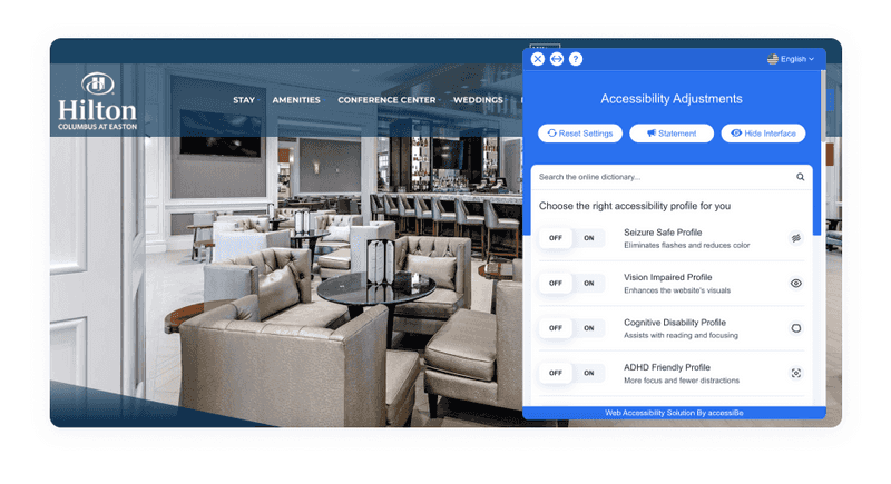
An example of an accessible website
-
VoiceOver/Screen Reader
A screen reader allows you to read out the text in your app and navigational options. Yet, VoiceOver can read alt text and other captions. It will provide users with visual impairments with an excellent alternative for in-app media and images. This software is available on Android and iOS, which is helpful.
This section touched on web design accessibility in mobile solutions and why it will benefit your business. Do you want to learn more about the benefits of accessibility for your business?
Why Accessibility UX Design is a Big Matter for Your Business?
The most apparent reason to make your websites and apps accessible is that it’s just right. People with disabilities have the same right to use online content and services as quickly as anyone else. Creating accessibility in your digital products removes barriers and allows all users to have a positive online experience with your brand.
To understand how important is accessibility in web design for business, let’s see an example. Did you hear that Nike was being sued for unavailability? They were sued in 2017 for not having access to the website for visually impaired users. Their site did not have alternative texts for images, nor was it compatible with readers that help people with vision problems. Don’t wait for the law to ruin the reputation of your business. User trust is difficult to regain in a highly competitive environment.
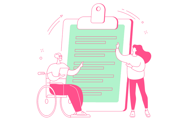
Yet, according to statistics, around 80 million people in the European Union (EU) currently have a disability. It is a large segment of auditory that you can’t ignore. If you pay attention to accessibility in your business, this shows users that you care about them, creating sympathy and positive emotions towards your brand.
No matter how good your ad campaign is, if users don’t feel positive about your brand and don’t care about their experience, it’ll all be useless. According to Click-Away Pound Survey 2016, 82% say they would often return and spend more with a company that provides UX design accessibility.
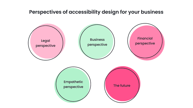
So, let’s sum up all perspectives of accessibility design for your business:
-
Legal perspective
Statistics say that in 2020, digital accessibility lawsuits rose to over 3,500 cases, that’s almost ten lawsuits filed every business day in the United States. However, web accessibility design is required by law, so you won’t be sued for not complying with its guidelines. It is important to emphasize that this is especially crucial for large enterprises and SaaS products.
-
Business perspective
Remember, barriers keep customers away. So keep an eye on accessibility to not let it happen, especially if you have an eCommerce business.
-
Financial perspective
Compliant websites use developments methods that save you money. However, it is essential to create products by accessibility guidelines from the very beginning. Furthermore, because it will be challenging to add accessibility features after launching, you will also cover all categories of people, affecting your income.
-
Empathetic perspective
Making your product accessible is the right thing to do. Thus, you will be socially responsible and show your best side. Your customers will appreciate it.
-
The future
As we age, so do our sight, hearing, and physical abilities. According to WHO, between 2015 and 2030, the number of people aged 60 years and over in the world is projected to grow by 56 percent, from 901 million to 1.4 billion. By 2050, the number of older people worldwide will reach nearly 2.1 billion people. So, we need to care about our future.
You can easily avoid lawsuits based on the inaccessibility of your product and even give your business a competitive edge by implementing simple changes such as adding alt text to images and adjusting the color contrast on your website. Of course, you don’t have to make a 100% accessibility design right away, but you do need to show that you’re putting in the effort.
Accessibility Design Guidelines
In general, accessibility is needed to make the content more friendly for all users. What’s more critical, visual accessibility in graphic design and the web is demanded on a governmental level.
There is even a unique guide that allows to work on better accessibility and provides accessibility standards to follow. It is Web Content Accessibility Guidelines (WCAG).
WCAG is organized by criteria distributed across three conformance levels:
-
A — lowest level of access
These are concepts of the fundamental accessibility of web products. It includes criteria like the ability to navigate with a keyboard, non-text content alternatives, video captions, and when information is not conveyed through shape, size, color, etc., alone.
-
AA — middle-level access
To meet WCAG Level AA conformance, the website is usable and understandable for most people with or without disabilities. It includes such requirements as alt text, consistent navigation, good contrast, etc.
-
AAA — high level of access
Adherence at this level makes your site accessible to the highest number of users and makes this experience easy. One of the special requirements at this level is Sign language interpretation for audio or video content.
Despite that web accessibility design is required by a government, on average, you can find 279 A level and 106 AA level accessibility errors on a page. If you don’t want your website to be included in statistics with accessibility failures, consider using The A11y Machine tool.
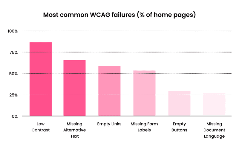
This automated accessibility design tool crawls and tests web pages — and comes back with an automatically-generated detailed report. It checks the pages against the three most common guidelines: W3C Web Content Accessibility Guidelines (WCAG) 2.0, U.S. Section 508 legislation, and W3C HTML5 Recommendation.
Now, let’s look at what rules you need to follow to make your design beautiful and accessible to people with disabilities.
Valuable Tools and Sources for Creating Accessibility Web Design
Instead of creating everything from scratch, here is a list of excellent tools to help you make an accessibility design. Here you can see the instruments, from creating color combinations according to WCAG standards to adding different reading modes to your website - every designer needs it. Take a look at the list to learn about each tool in detail.
Tools for Checking Colors Contrast
-
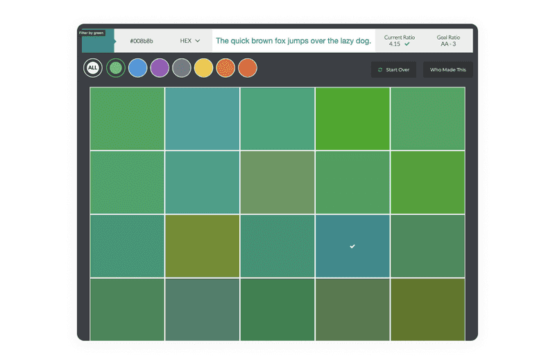
Here the name of the tool speaks for itself. It allows you to create visually beautiful and functionally accessible color palettes for your projects and will enable you to check text and background contrast ratios based on WCAG recommendations.
-
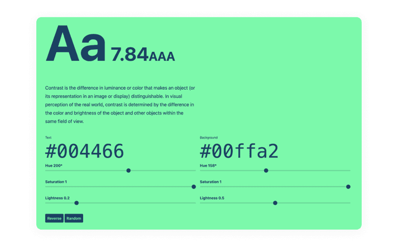
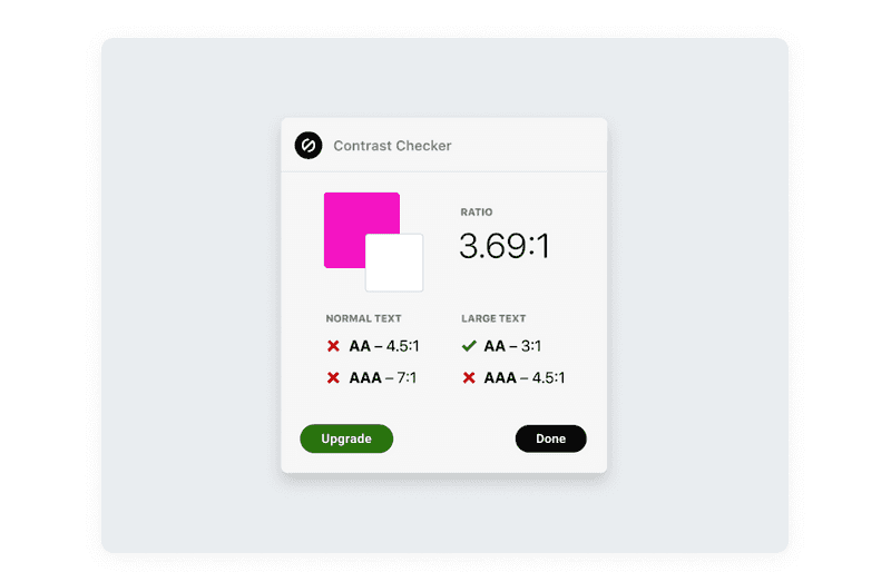
Contrast is a tool that eliminates the manual labor of testing the color contrast ratio and does it quickly and automatically. It provides accurate color contrast information according to WCGA standards and instantly updates the entire application. Use it to achieve UI and graphic design accessibility.
-
Color Review is a simple web-based tool to help you decide which colors and color combinations to use in your UI design, especially when it comes to designing for people with color blindness.
Based on WCAG standards, the tool operates on two levels: AA and the more stringent AAA level. A Color Review app is available for OS X, Windows, iPhone, and Android.
-
This tool gives your design a pass/fail score based on WCAG’s accessibility guidelines. With this tool, you can make your user interface public for users, especially people with visual impairments.
With it, you can take a given color palette and instantly get the contrast values of different types of combinations.
-
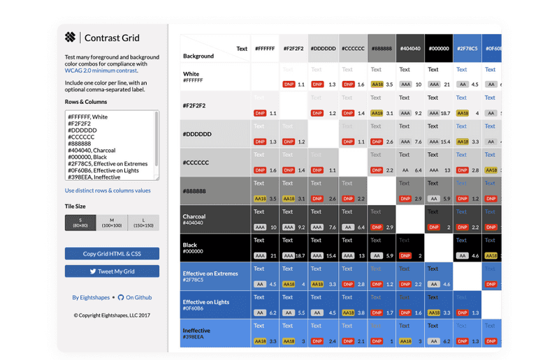
Contrast Grid is one more great tool to achieve accessibility in design. This tool allows you to test a range of color combinations for different UI elements and backgrounds.
The web tool has a simple interface where you can manually enter the different colors you want to use. Then, it will create a mesh that meets the minimum contrast requirements of WCAG 2.).
-
Clrs.cc is a library or repository of various color combinations that give you a good dose of inspiration to create an accessible user interface for colorblind or visually impaired people. Whether you want to design in light or dark colors, you will find many exciting color combinations for any occasion.
-
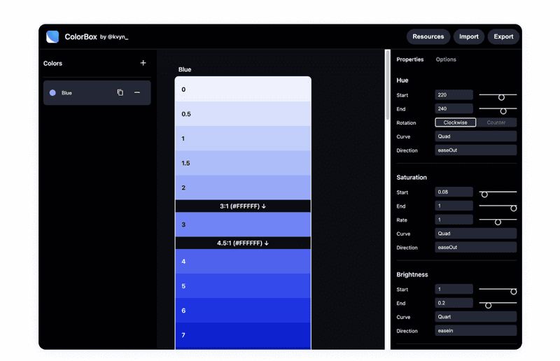
Colorbox is a simple tool that allows you to create color combinations for interfaces. With this tool, you can make your website or app user-friendly for visually impaired users. You can use single or multiple colors and manually add hue, saturation, and lightness values.
The tool also allows you to import color codes to get the appropriate color combination options.
Put Yourself in the Other Man’s Shoes
To achieve accessibility in your web design, you need to know what people with disabilities see. You will put yourself in the other man’s shoes with these tools.
-
Stark is a tool that helps web designers add unique features to their projects, thus making them accessible. So whether you’re designing a product from scratch or need to update an existing one, this tool gives you an easy way to create accessible products at any stage. It is compatible with Figma, Sketch, Adobe XD, and Google Chrome.
You can find a contract checker, colorblind simulation, rapid contrast checking, and more in the Stark arsenal.
-
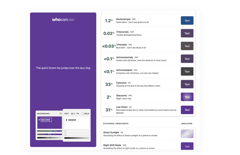
Who Can Use is an exciting tool that helps web and graphic designers understand how different color combinations and color contrasts affect people with various visual impairments. Thus, you can always check how successful the colors you have chosen for your design are.
-
It is a free color blindness simulator. It uses unique algorithms for simulating different color vision impairments, so you can see colors as colorblind people see them.
Other Tools and Sources
There are tools and sources we use to create accessibility design. Let’s look closer:
-
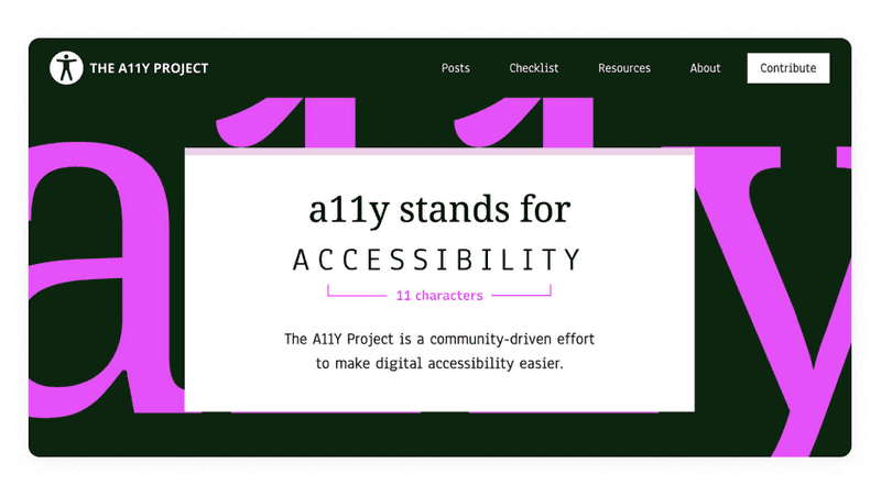
It will help you develop fully accessible products with great resources such as backgrounds, icons, color palettes, and helpful guides.
The best thing about this tool is that a community of talented people constantly updates it. In addition, it is possible to help you audit accessibility with a comprehensive checklist by accessibility design guidelines.
-
WAI-ARIA Authoring Practices 1.2 by W3C Group
It is a document created by W3C Group, where you can read about accessible design patterns for mobile solutions, grids, peculiarities of a keyboard interface, and much more. With it, you will clearly understand the specification of accessibility design issues.
-
A podcast about accessibility by Google
A11ycasts is short for AccessibilityCasts. This podcast is designed to educate developers and designers about the core principles of accessibility and showcase real-life accessibility design issues and solutions to overcome them.
-
If you want to make your eCommerce website accessible, you are at the right place. It is primarily helpful for front-end developers, but you will also find something interesting there if you are a designer.
-
A library of inclusive patterns
It is an extensive library with inclusive design components such as buttons, cards, notifications, etc.
With such an arsenal of tools, you have every chance to create not only a beautiful but also an accessible design that will meet all standards. So next, we need to find out what accessibility design principles you need to follow from the beginning.
Accessibility Design Principles
Accessibility design allows people with disabilities to perceive, understand, navigate, interact, and contribute to the Internet or business. It does not limit design. Accessibility will not force you to make an ugly, boring, or cluttered product. Instead, it will introduce a set of constraints as you consider your design. These design constraints will give you new ideas to explore, leading to better products for all of your users.
Dribbble shot by Stark
To make your digital product accessible, stick to the guidelines from the very beginning of the design. In our previous article, we discussed the ideal design process. Read it to know where to begin.

How Do the Perfect Design Process Steps Look? Everything You Need to Know
Animation and effects
Animation can help make a page or screen more attractive and increase engagement. It also allows direct users’ attention and orients them. However, incorrect use of animation can cause confusion or distraction. Or even more, it can be harmful to some people with seizure disabilities.
Animations that flash more than three times per second can cause seizures known as photosensitive epilepsy. Other effects, such as motion effects, may make some users dizzy due to vestibular sensitivity. But it doesn’t mean that you shouldn’t use animations when designing UI.
To achieve accessibility in design, you need to understand why you use them and how to make them safe. We can give you some tips on it:
-
Know your purpose
If you decide to make some part of your UI animated, there must be a design-oriented reason. There are many ways animation can improve the user experience. It works well in storytelling and demonstrations. If you use thoughtful animations with purposeful movement, you will make them accessible.
-
Be meaningful
Typically, animation UI is context — for example, animation when loading or an animation that shows where the user needs to click. However, determining context becomes more complex as animation becomes more and more common.
Putting an animation in an unexpected place out of context can confuse users or affect their well-being with seizure disabilities.
If you’re not sure the context is clear, adding it explicitly can also be helpful. To simplify things and increase accessibility in design, you can add an indicator of what kind of movement will occur on the site when the user takes some action. It is essential to set user expectations.
-
Give control to the users
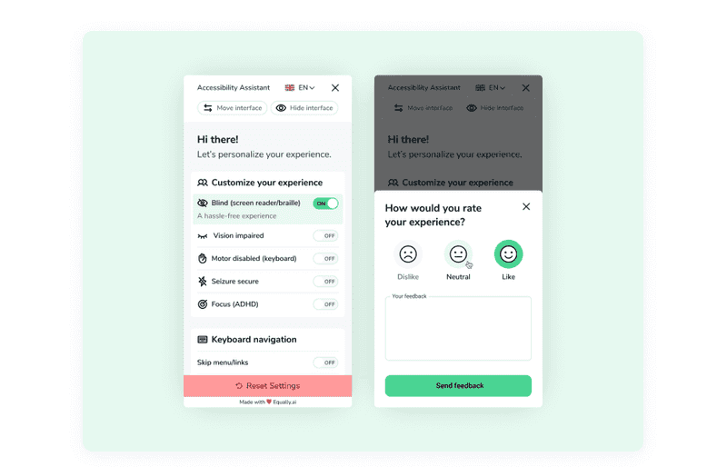
Consider the option to turn off or reduce animation. For example, Slack lets users hide animated images or emojis on a global or per-image basis. A simple toggle will allow anyone who is sensitive to animation to quickly and easily reduce the animation. It can be challenging to develop, but it will make your design accessible.
Dribbble shot by Rob Simpson
So, ensure that your animations are pretty and accessible, ask yourself: Are there any animations that could be preoccupying by frequently moving, blinking, or auto-updating? Is it possible to provide controls or options to stop, pause, hide, or change the frequency of any animations or effects?
If you keep this information in mind, your UI animations will only bring your users a joyful experience of using your product.
Audio and Video
As a general rule, don’t autoplay media. It can distract users’ attention and annoy them. To add accessibility in web design where you want to include the video or audio content, you should provide controls or options to pause or turn off the video.
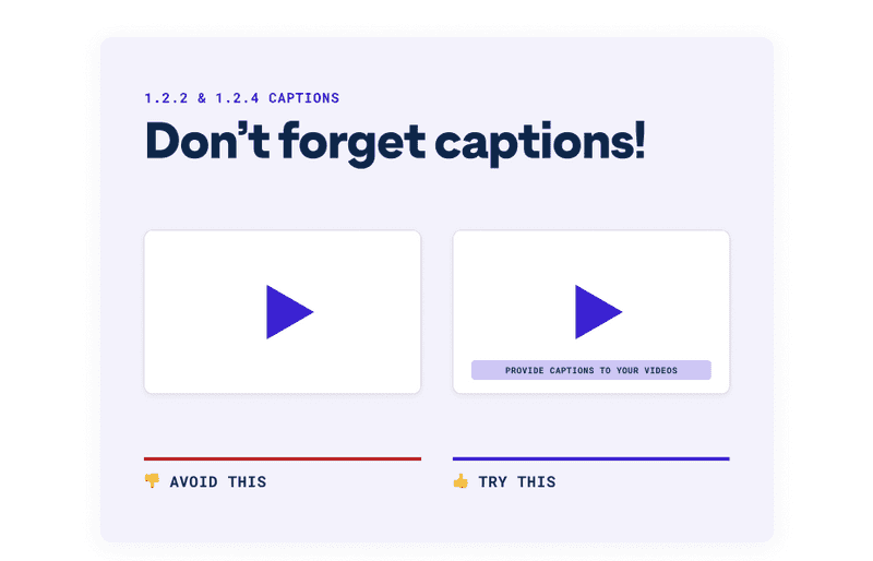
Along with controls, videos should have transcripts or subtitles so that users can use the content in a way that suits them. Users with visual impairments or those who prefer to read rather than watch the video need a transcript, while users who cannot or do not want to listen to the video need subtitles.
Dribbble shot by Stark
In addition to the accessibility benefit, there are business benefits to subtitling. Which? The answer lies in SEO optimization. Google and other search engines cannot watch the video, but they can get information from the text included in your subtitles. In addition, the text used in closed captioning is indexed and increases the depth of the keywords.
Color
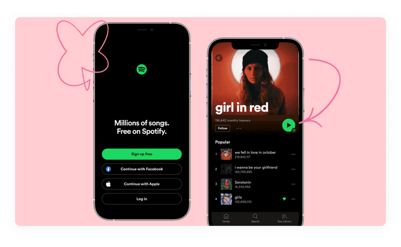
Color plays an integral part in visual accessibility in graphic design and overall design. It evokes emotions and feelings and improves branding. But the power of colors is lost when a user can’t see them or perceives them differently. For example, red-green color blindness is the most common color disability.
Dribbble shot by Mattias Johansson
One more perk is that colors can also be problematic for users with different cultural backgrounds. Red represents something hostile or aggressive in Western cultures, and green means positive trends. But these colors mean the opposite in Eastern and Asian cultures.
So, to make your color palette beautiful and accessible, follow some rules:
-
Add a non-color identifier
Poor contrast between foreground and background colors makes your product difficult to use for visually impaired users, those who use inexpensive or old monitors, or who are in direct sunlight. Make sure that the elements are contrasting and well distinguishable.
-
Be careful with saturation
Oversaturated neon colors, and even just bright yellow, can be unsettling and annoying for some users, especially those on the autism spectrum. You can still use these colors, but don’t overdo it.
-
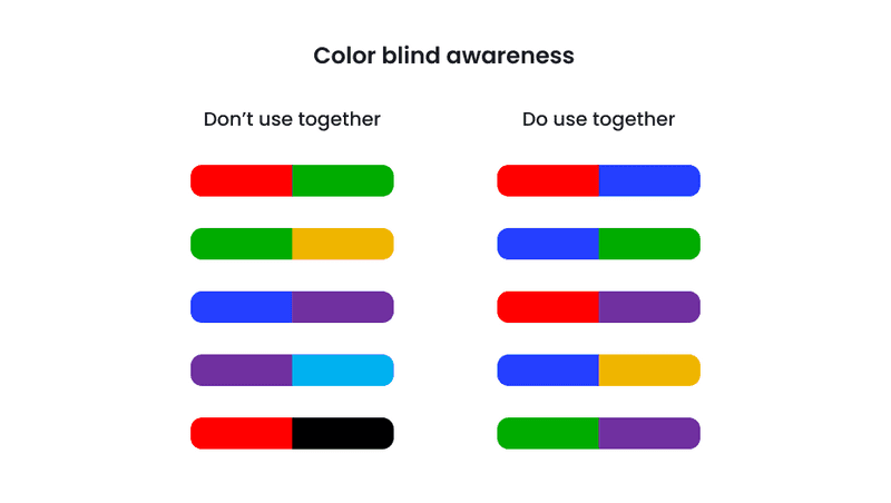
Avoid bad color combos
Choose color combinations wisely. Because color blindness affects people differently, it’s hard to know which colors are “safe” to use in your web design. In general, there are several lousy color combinations.
-
Make it contrast
Poor contrast between foreground and background colors makes your product difficult to use for visually impaired users, those who use inexpensive or old monitors, or in direct sunlight. Make sure that the elements are contrasting and well distinguishable.
If you strive for accessibility UX design, try to provide meaning without using color, keep an eye on good contrast ratio and avoid using lousy color combos. A Stark plugin for Figma and Adobe XD can provide you with a contrast checker and colorblind simulation. With this tool, the color accessibility process will be streamlined.
Control
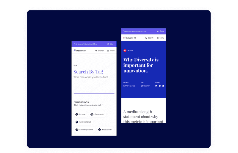
Controls are any user interface elements that the user can interact with. For example, buttons or links. Controls that are too small or too close together can create many problems for users.
Minor controls are difficult to press for users who cannot accurately control the cursor, such as those with tremors, reduced dexterity due to age, or those who use the product on the move. Also, the default size of radio buttons can be problematic for older users. Finally, even when a label is provided that can be clicked instead, not all users are aware that they can do so.
Dribbble shot by Tennis
Controls that are too close together can cause problems for touch screen users. Some users have big fingers, and it’s hard to be precise with them. Also, accidentally touching the wrong control can lead the user to the wrong place.
To increase controls design accessibility, keep an eye on its size and the distance between them.
Font
Previously it was possible to use a fixed font size between 9 and 14 pixels, and it worked. But now, with an abundance of monitors of various sizes, the font, like the design itself, must be adaptive. Ensure that fonts in your UI are no smaller than 9 pt (=12px). At Axicube, we usually use font sizes between 14 and 16 pixels. Smaller font sizes may be illegible on some platforms. The WCAG Guidelines recommend ensuring that text can be zoomed to 200%. In addition, the font needs to be easy to read to give the user a positive reading experience. Styling plays a significant role in this regard.
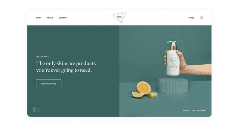
An example of an accessible website
Decorative or cursive fonts are harder to read, especially for users with dyslexia. Also, avoid using too small text. Overall, larger text, shorter line lengths, taller line heights, and increased letter spacing can help users have a better reading experience.
The most accessible fonts are Tahoma, Calibri, Helvetica, Arial, Verdana, and Times New Roman. In addition, slab serif fonts, including Arvo, Museo Slab, and Rockwell, are also accessible. However, these font types are primarily used in headings rather than the body text. If you want to check the accessibility of the fonts on your website, use the Siteimprove tool that will test and identify accessibility issues.
Images and Icons
An image can replace many words or enhance the idea and effect of a design. Like no one else, designers know what this picture means, so they should indicate what should be written in the alt text.
How you describe an image depends entirely on the context. It also depends on whether the image is for decoration only, conveys meaning, or contains the text. Generally speaking, if the image is decorative or if the text surrounding it already describes information about the image, no additional information is required. Otherwise, you must describe the image information. If the image contains text, repeat the text in the description.

An example of an accessible website
Descriptions should be short. It is recommended to use no more than two sentences but aim for one concise sentence whenever possible. This allows users to understand the image without listening to a long description quickly.
Also, make sure that your interface design images are not too aggressive and distracting. When creating icons for your accessibility web design, you should also pay attention to their size and clarity. The user should easily understand what it means.
Keyboard
Keyboard accessibility is one of the essential aspects of accessibility design and one of the most underestimated. There are many reasons why a user would use a keyboard instead of a mouse. For example, screen reader users use the keyboard to read the page. A user with tremor can use the keyboard as it provides better precision than a mouse. Trite, the user may break the mouse, and instead of it, they will use the keyboard.
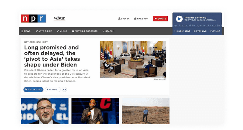
An example of an accessible website
While we are now talking about the importance of keyboard accessibility, it is essential to note that this applies to any way a user interacts with a website without a mouse. For example, devices such as eye-tracking software require the page to be keyboard accessible.
By introducing the ability to interact with your product using the keyboard, you provide a wide range of users with better access to your digital product.
Layout
When designing for UX design accessibility, make the layouts resizable and flexible to be viewed comfortably on a phone or any other device. The layout should also be flexible enough to be up to 400% larger for users who need to increase the font size for better reading.
Some users can use a screen magnifier. It is a tool that allows people who struggle with low vision to increase a small screen area—users using Magnifier benefit when related content is close to each other. However, Magnifier only gives the user a small view of the entire layout, so content that is related but is far away, or changes far away from where the interaction took place, is hard to find and may go unnoticed.
Readability
Have you ever started to read an interesting book or article, but you immediately lost the desire because the text was difficult to read? Difficult-to-read content tires the eyes and exhausts the mind.
Sentence length, paragraph length, and language complexity all affect the readability of text. Complex language can create problems for users, especially those with cognitive impairments or those who do not speak the language. Those affect web design accessibility in the wrong way.
“The subconscious mind is energized when jumping to the next line. At the beginning of every new line, the reader is focused, but this focus gradually wears off throughout the line” — Typographie: A Manual of Design.
Using simple and straightforward language, you should ensure that each paragraph focuses on one idea. A section with one statement is easier to remember and absorb. The same applies to a sentence with fewer words. Try to break up long sentences to make it easier for users to perceive the content on your website.
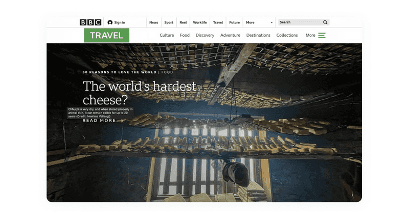
An example of an accessible website
Another factor that affects the readability of the content is the length of the line. The ideal line length is often specified between 45 and 75 characters. If the line is longer, the users’ attention can be distracted.
An excellent example of a readable and understandable website is Informazione Facile. It is a news blog written for those who have communication and comprehension diseases: the design aim to give those guys a nice look and a straightforward interface with strong contrasts.
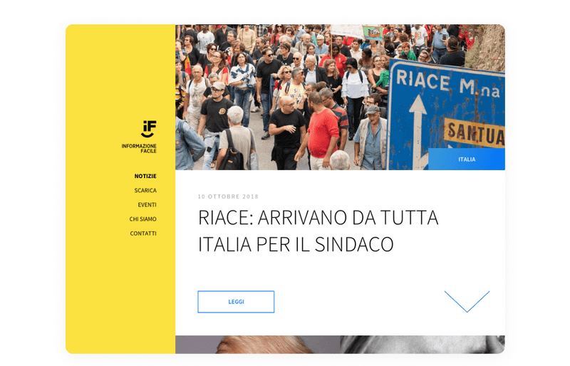
Dribbble shot by Fabrizio Porro
To increase visual accessibility in graphic design and make the content on your website more readable, break it up with headings, lists, or images to give mental breaks to the reader and support different learning styles. Group and summarize the information by hierarchy. Titles, links, controls, and labels should be clear and descriptive to enhance the user’s ability to comprehend.
If the users understand your content, you will get all the marketing and business benefits.
Accessible Design Examples
We know the principles that will help you achieve accessibility in your digital product. But let’s look at good accessible design examples. The difficulty in attaining accessibility lies in the fact that along with it, you need to achieve just as good usability and make sure that everything looks beautiful. It may sound complicated, but it’s actually possible. Let’s see:
-
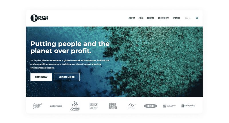
1% for the Planet
1% for the Planet is a network of businesses that have agreed to donate 1% of their profits to environmental causes. You can see both appealing visuals and high-contrasting text on the homepage. The pages of this website are simple and good-looking. One more good thing about this accessible design example is mobile responsive.
-
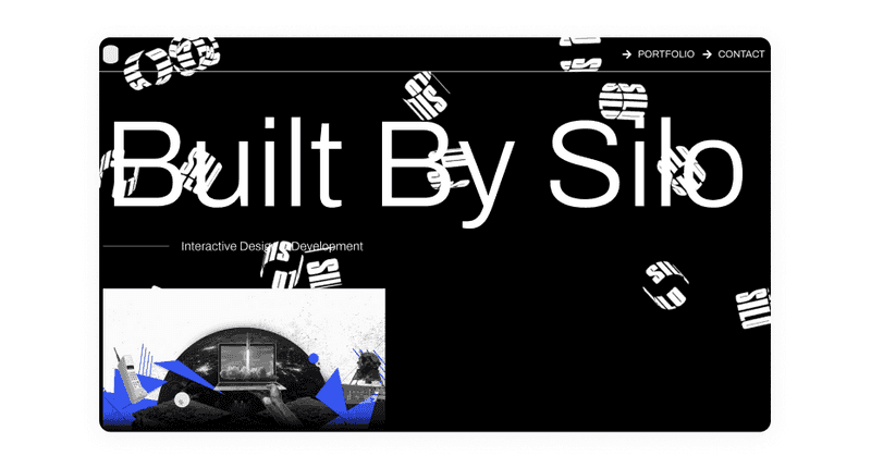
Built By Silo
Web design agency Built By Silo shows accessible design example which is both stylish and inclusive. Users can scroll down the home page and see a combination of parallax images, text, and an animated background.
The website pages are tabbed, allowing users to navigate from navigation links to projects to contact information. Despite the seemingly complex appearance, the pages are relatively simple in content, which helps make the site more accessible to everyone.
-
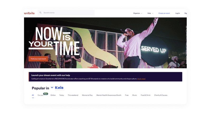
Eventbrite
Event management platform Eventbrite presents an accessible design example. In addition to letting users “Skip to the content” of each page, its layouts are clean and easy to understand by users with low vision.
-
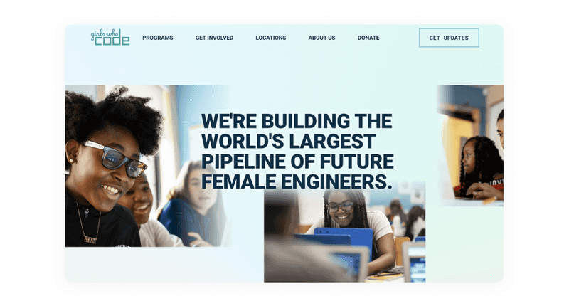
Girls Who Code
Girls Who Code is a website that provides educational materials for women who want to learn how to code. You can see the most relevant information on its pages without cluttering and easy navigation.
-
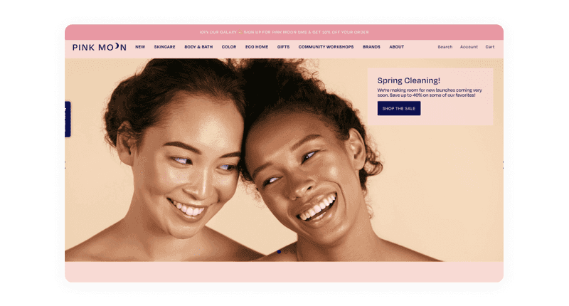
Pink Moon
Pink Moon is a great accessible design example that shows that accessibility does not mean boredom. For example, there are almost no color contrast errors in the design and good use of alternative text. Yet, Pink Moon shows appropriately labeled elements and properly used tags, ARIA tags, and logical page structuring on its navigational and product pages.
We hope that these accessible design examples inspired you. Also, try taking a look at some of your favorite websites. Are they accessible? What could they have done better?
Conclusion
So there you know, concrete tips to make your digital product accessible. Go forth and create highly usable and highly accessible designs!
Accessibility is a crucial aspect of the design process. To achieve accessibility in user interface design, you need to understand your users’ technical and physical limitations. Then you should follow some rules to make your website useful for everyone. Designers who keenly incorporate best practices of it will end up delighting their users.
If you want to launch your startup or give your business a new redesign, you need to watch the accessibility tips we gave you in this article. Of course, if you make your product accessible, you will only win from this. But if it all seems complicated to you, give this to the skilled design team. At Axicube, we follow all accessibility guidelines to ensure that everyone will be able to enjoy digital products.

