People insure their property, health, and life. It helps them get guarantees if something terrible happens to them or their property. They go online to determine what insurance companies provide to decide on where to get an insurance policy. To make it, people visit multiple websites to compare policies, request quotes, and purchase directly online.
So, nowadays, a company needs to build insurance website to not to lose a significant portion of its client base and revenue. Therefore, it has become an effective channel for attracting new customers and generating sales. According to this, the insurance website design and UI requirements have changed. Clarity, ease of use, the shortest possible user journeys, and personalized guidance are just a few.
Did you know that 94% of first impressions relate to your website design? It means that your potential clients can leave and never come back again just because of poor insurance company website design. That’s a pity, isn’t it? You can put a lot of great features and make your policy and terms profitable, but no one will know about it just because of a poorly designed website.
Creating an application is another good way to boost your insurance business. In our previous article, we talked about creating a car insurance app. Read it to find out the benefits of creating an app for your insurance business and what marketing channels it will open to you to promote your company and make a profit.

How to Make the Best Car Insurance App that Converts
But today, we want to share tips on creating insurance website design. Yet, you will see the best insurance agency website design examples that will inspire and motivate you to create a great website. We think that this article will be helpful to you.
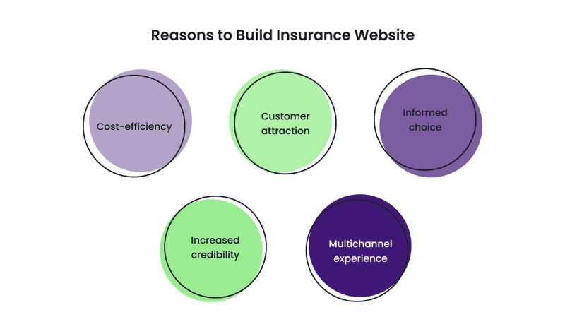
Reasons to Build Insurance Website
What is the advantage of a site over a brick-and-mortar agency other than that it won’t be so old-fashioned? The first thing that comes to mind is that the website does not have limited opening hours. But digitalization of processes leads to more benefits for your insurance business. Let’s see what these are:
-
Cost-efficiency
Everything can be done through the site so that customers do not need to visit offices; automation of processes leads to the acceleration of employees’ work and the simplification of office work. Furthermore, you save yourself from errors due to the human factor by automating some operations.
Also, automating processes with the help of a website will reduce the consumption of paper and stationery in your office, saving you money and making your company eco-friendly.
-
Customer attraction
By creating a website, you open up the possibilities of digital marketing tools for attracting new customers. These are, for example, email and SEO and marketing tools, target advertising, and more vital brand awareness reached through online presence.
You may think that this way, you will only attract the youngest people (among which there is 99 percent of Internet users aged 18 to 29) to your insurance business, but let us surprise you: according to Statista, in 2021, among the individuals 50 to 64 years, 96 percent were internet users. So, as you see, creating a website for your insurance business will help you reach a broad auditory segment.
-
Informed choice
Potential clients don’t want to waste their time. And websites help them do things faster. For example, they can visit an insurance website and look at price policy types, and choose the best plan they need. In addition, users can read reviews from other customers. It increases user trust, customers become more loyal, your site gets more conversions, and as a result, you get more profit.
-
Increased credibility
What do people do when they want to find something or find out information about something they have heard? They google it. So if you build an insurance website, it will help you construct an online presence that will increase the credibility of your business.
-
Multichannel experience
Consumers prefer multi-channel approaches of companies, including insurance agencies. The integration of physical and digital services is a must. In an Accenture survey, 66% of consumers said their top priority is getting what they want quickly and easily.
Insurance agencies that make it easy for their customers to connect to their services quickly will perform better than their competitors.

Digitalization: Why You Should Digitalize Your Business and How to Succeed
The website can become an excellent tool for cooperation with your clients and customers. But here’s the drill: the design must be as beautiful as effective. Of course, you can always build insurance website on your own, but remember that professionals can do it faster and more effectively!
Elements Your Insurance Agency Website Design Should Include
Your insurance website may contain dozens of pages; everything depends on the website’s stylistics. But some pages must be available by default. So to build insurance website perfectly, you need to know what features are essential there.
The set of features will depend on the type of business. For example, B2C companies should engage customers and provide 24/7 support. For companies like these, the most important thing is to manage the business and speed up processes. On the other hand, SaaS companies usually provide solutions for insurance agents or smaller companies, so they need to cover the most typical features.
But some features are universal and needed on every insurance website. Let’s see them:
-
Homepage
The homepage can be both the primary source of lead generation and the reason for its absence. Therefore, make insurance web design as attractive and filled with value as possible. If you don’t, your users are unlikely to want to stay on your site for long and are unlikely to return to it in the future.
To make your insurance website design successful, you need to be consistent while creating the homepage. Ideally, a homepage of the insurance agency features such elements as effective calls-to-actions. In addition, they need to be clear in terms of visibility and desired action.
Yet, you need to provide precise descriptions of your insurance company’s services, a subscription form, and links to your social media accounts. When describing your services, place a link to the corresponding Service or Product page with the rest of the details.
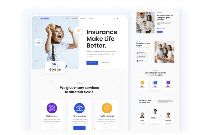
Dribbble shot by Suzauddoula Bappy
-
Services page
It is a required page that every agency will include when building an insurance website design. It goes without saying: here you need to describe your goods or services in detail. Coverage, discounts, terms and conditions, and other features are essential and should be listed.
What is important is to mention the value that your policy brings. First, write about how customers can benefit from a particular type of insurance. For example, tell us which product is ideal for different consumers, such as seniors or young couples, and why it works best for them.
When creating a page about your insurance services, avoid complex, overly professional terms. While it seems that using complicated terminology makes you look more professional, it turns off potential clients. You wouldn’t want your insurance prospects to read your dictionary site, would you? Instead, use simple, straightforward language for the best experience for your customers.
-
Tariff calculator
The cost of insurance is very individual and varies from person to person. Therefore, insurance companies need to weigh several factors when choosing a rate. Users may understand this but not want to contact agents to determine the insurance cost.
Therefore, for convenience, when making an insurance company website design, create a page to calculate the approximate cost of the selected tariff. Your potential customers can estimate how much insurance will cost without entering their personal information.
An appraiser can help potential clients decide if it’s time to change insurance companies and use your services or see if your insurance company fits their needs and budget.
And of course, the “Contact” page should include a contact form for requesting a quote or clarifying questions. As with the subscription form, the contact form should ask visitors for a minimum of personal information.
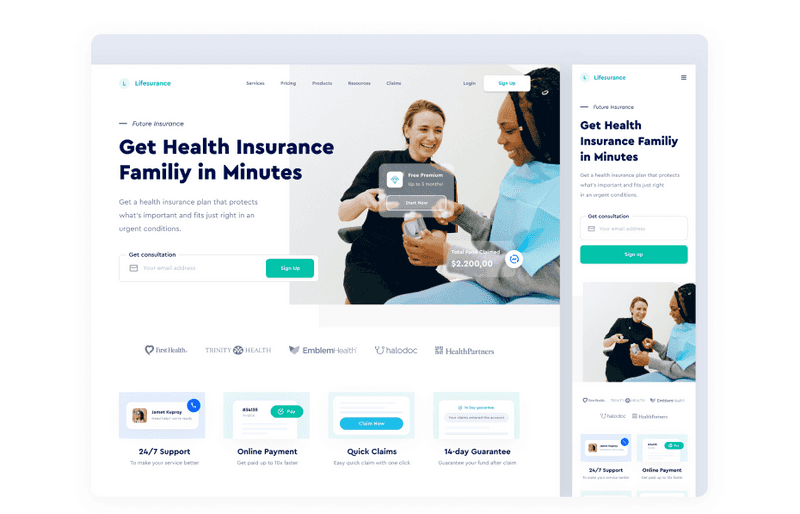
Dribbble shot by Dipa Inhouse
-
Quote page
Your customers can view your insurance company’s estimate of how much a new insurance policy will cost on the quote page. In addition, it should include details of what insurance coverage will be offered if the customer goes ahead with the purchase.
Let your clients get insurance quotes using your website or directly contacting your company. Consider that all information should be consistent, and the text should be readable.
-
Contact page
When you build insurance website, stick to the rule of thumb. It means displaying the agency’s phone number and email address at the top of every page. At the same time, the “Contacts” page is also necessary.
It is where you can list all of the communication methods your customers or leads may use to contact you, including your email addresses, phone number, physical address, and social media accounts. Also, a map with your office marked is a valuable feature.
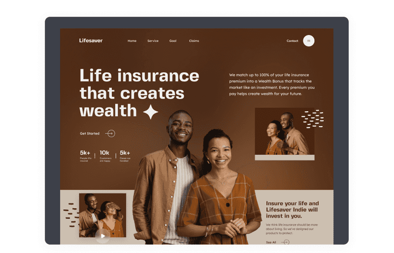
Dribbble shot by Suzauddoula Bappy
-
Shopping cart
With this website add-on, consumers can instantly shop, compare selected insurance policies, and view the pricing for their requirements to make a final decision.
-
Check out
Here the user can fill in personal information to receive the selected insurance policy and see the payment methods.
-
About page
If potential customers like your insurance website design and your agency attractive, they might like to read the About Us page, another indispensable part of every business website.
-
FAQ
FAQs are a great way to improve your customers’ or potential customers’ interactions with your website. It allows you to answer the most frequently asked questions about your product or service. But how else can it help a site for an insurance company?
One of the main reasons a user does not complete a transaction is unanswered questions or the need for additional information. You can fill that gap by including a well-researched FAQ section based on common questions your customers ask. In addition, if you’re looking to increase traffic to your site through search engines, the FAQ section may have the most potential. It is a great way to optimize the user experience and increase conversions from your website.
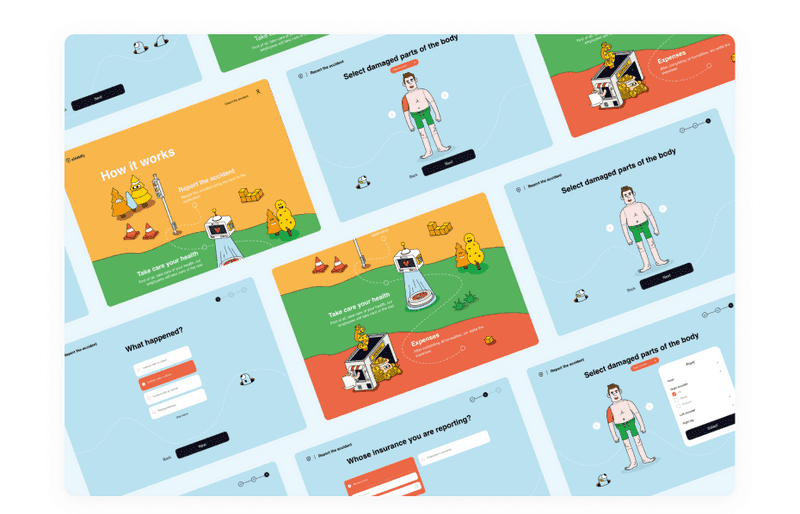
Dribbble shot by Merixstudio
You can cover all users’ needs with the above elements and make their interaction with your insurance company website pleasant.
Additional Elements Best Insurance Agency Websites Have
We learned what elements of an insurance website must be present to satisfy customers. But this is not yet a complete list of what can be helpful for your website. We suggest considering the following features to help you get more customers and profits.
-
Sign up and sign in
The client can quickly sign up and fill in all information there. But remember that there shouldn’t be too many to fill because people don’t like when there are too many steps to take.
-
Client profile
It will serve as a storage of information about clients. There, the client can fill in more details about them. With it, there will be no need to do it again if they want to buy new insurance in your company.
-
History of claims
Here, the client or insurance agent will be able to see resolved and in-process claims.
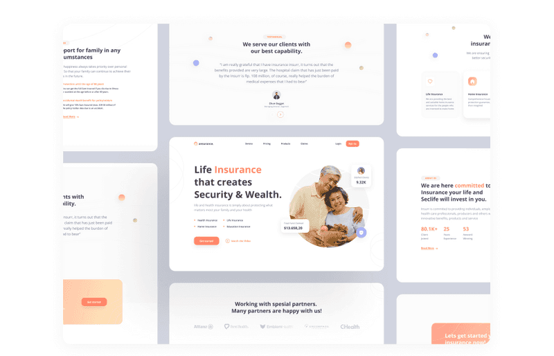
Dribbble shot by Sobat.io
-
Insurance control
Here the client will be able to view details about existing insurance plans and stop or extend them.
-
Professional photos
Choose high-quality images, illustrations, and icons to mark any services when creating a web design for insurance agents. For example, if you want to place a banner with the image of human faces, choose people similar to the portraits of your target audience. It will create the right psychological atmosphere where a potential client feels comfortable and loyal.
-
Blog
A blog is unlikely to become the primary source of lead generation for your insurance company, but at the same time, it can help in promotion without investment on your part. It will happen if you do a little research on relevant keywords and include them in your posts. Google will often crawl your blog for these search terms and rank your site higher.
The great thing about a blog is that it will work for you in the background, bringing you more leads with every new article.
Of course, you need to add new blog posts regularly. Otherwise, search engines may fall out of love with you. Yet, another plus of a blog is that you show your expertise in a topic, which will increase the loyalty of your customers and leads.
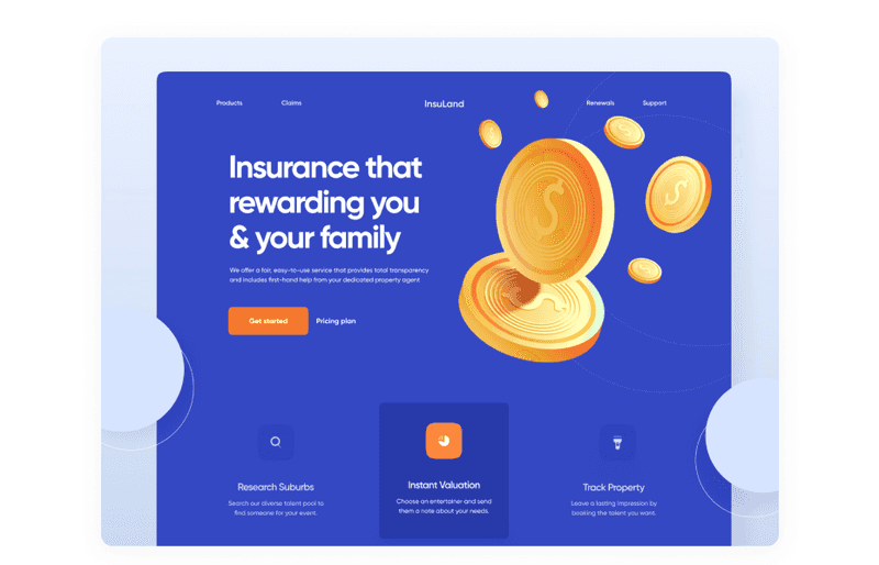
Dribbble shot by Shafi | Webflow Developer
-
Testimonials or reviews
With this feature, you can increase user trust. So often, the last argument for buying or closing a deal is positive feedback from other people. Also, with the help of this feature, you can see what customers like or dislike about your services and improve your strategy.
-
Chatbot
It can be used to make communication with your clients easier. Add some typical questions there, and the chatbot will make a part of work instead of you.
-
Integrations
Add integrations with CRM, calendar, and email to make the workflow smoother. These can be useful for your employees, so they won’t need to make useless actions during the work process.
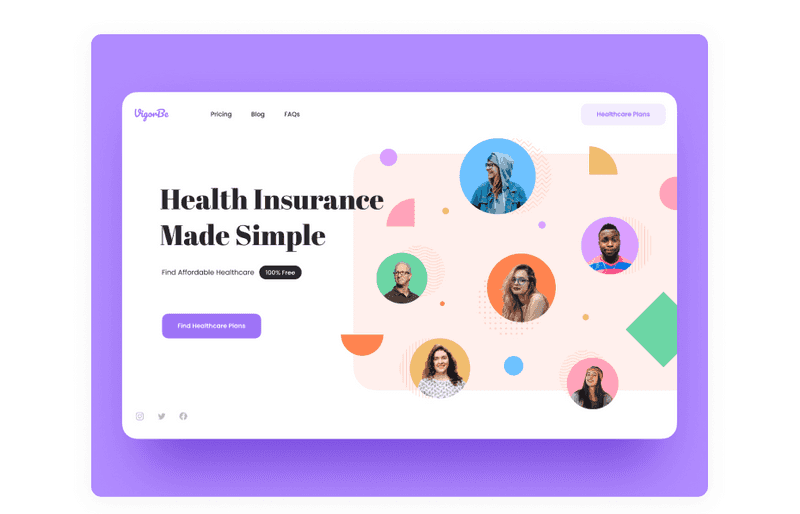
Dribbble shot by Anton Zaderaka
When building an insurance company website design, you don’t need to add all the features we mentioned at once. It is enough to start filling it with the main pages and add more of your choice according to your promotion strategy or vision.
Best Insurance Agency Websites to Use as an Example
If you are planning to build insurance website, we recommend that you study the best examples of insurance agency website design. Do not copy them; otherwise, your site will be a clone of other popular ones. Instead, take note of the tricks they use and how they can be applied to make another website design for insurance brokers. Let’s take a look at some of the best websites.
-
Lumico
Using Lumico as an example, we see that insurance website design can be anything but boring. Their homepage greets the user with colorful text in bright neon pink and bright orange. It is combined with animated graphics that are impossible to tear yourself away from.
Notice how Lumico simplifies navigation with just four menus: Products, Our Story, FAQ, and Contact Us. For example, their Products page provides information on insurance costs, expiration dates, and which Lumico insurance suits which segment of users. Also, their FAQs will answer any other questions users may have.
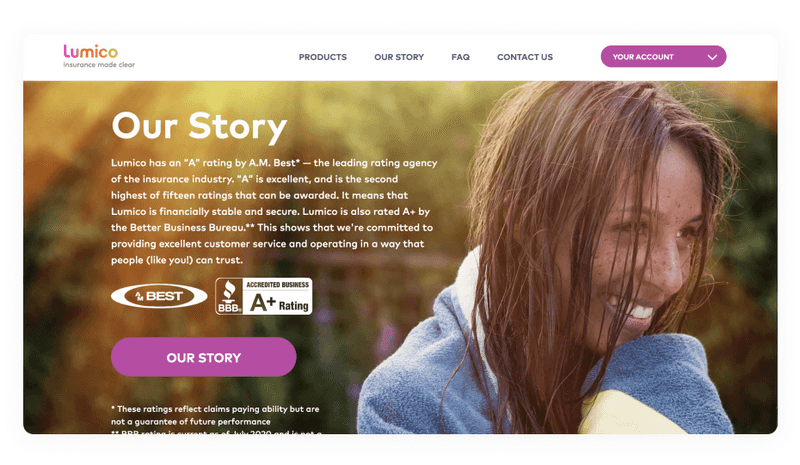
Lumico homepage
-
Geico
Here you can see the minimalist and clean insurance website design. The visitor can calculate the quote from the homepage itself, which is very convenient. In addition, despite being one of the biggest insurance brands, GEICO manages to create informative local agent descriptions.
Contact information and work hours are displayed prominently, and a photo is a nice personal touch. Unlike other major insurance agencies, the company emphasizes building a human connection by connecting the visitor with an agent in their area.
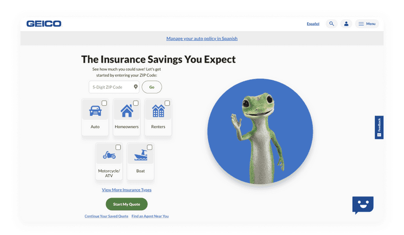
Geico homepage
-
Lemonade
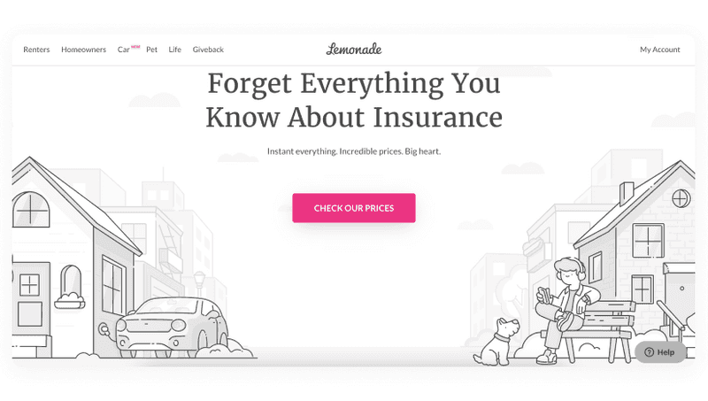
Lemonade’s insurance website design shows a playful approach to renters’ insurance. This insurance company website design is simple, with a white background and grayscale cityscape illustrations. Therefore, neon pink elements such as CTA buttons, hyperlinks, and some graphics stand out against the background.
You can immediately see reviews and companies this insurance company worked on the homepage. There are also links to pricing, their app, and social media.
This insurance website design looks very simple but, at the same time, is not loaded with unnecessary decorative graphic elements that do not annoy the user’s attention.
-
Brown&Brown insurance
The Brown & Brown life insurance website design color scheme includes white, navy, and red. The design is clean and straightforward, with a white background. Their red call to action buttons always stands out, whether on a white stage or with a blue border. Apart from getting attention, the CTA placement here is also very well done. For example, there is one “Find Your Solution” CTA right at the top of the homepage. The other one is in the center of the same page.
Please note the search feature on this website. It is located at the top of the page, and it is very convenient: the client does not need to click for a long time searching for what they need.
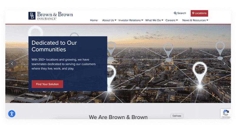
Brown&Brown homepage
-
Jetty
It only looks at the Jetty insurance agency website design to understand their branding and design. Their primary color is bright turquoise. It’s on the giant J logo on the homepage and their CTA (Get a Quote) button.
This cohesion links elements on the Jetty site that would otherwise be disparate, creating a great unity. In addition, the Jetty insurance agency targets the younger generation, which is perfectly conveyed through the design. This is an excellent example of how design can appeal to a specific audience segment.
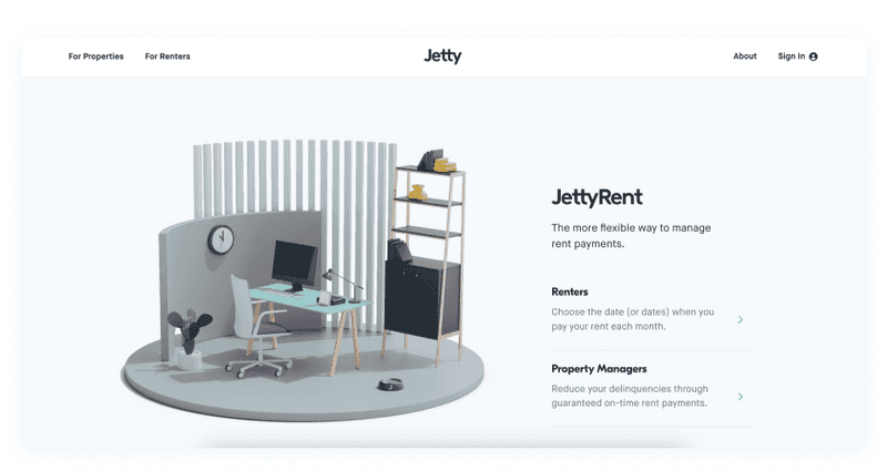
Jetty homepage
-
Medicare
As the name suggests, Medicare is health insurance. Its insurance website design is quite intuitive and straightforward. Users can compare tariff plans and choose the one that suits them best. It is essential to note the accessibility of this website. There is an option to select larger fonts, and a large number of images allows older people to move on to the following action properly.
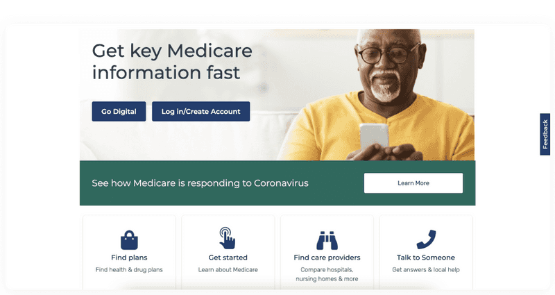
Medicare homepage
We’ve provided you with great designs for insurance agency websites, and we hope they inspire you. You may have already noted for yourself what makes them better. If not, let’s find out what secrets they know to build a perfect design!
Tips to Follow to Create a Website Design for Insurance Companies
Creating a design for an insurance site requires an integrated approach. In general, the creation of any design consists of well-defined steps. You can read about these steps and why they are needed in our previous article.

How Do the Perfect Design Process Steps Look? Everything You Need to Know
We will talk about what you need to pay special attention to when creating a website design for insurance companies. Some essential details in this business should not be overlooked because they can cost you profits and customers. Let’s look at what you need to pay attention to so that your potential customers fall in love with your site and want to order your services.
-
Appealing visuals
People often buy with their eyes. Therefore, images, colors, and videos are the primary visual elements consumers will appreciate on your company website. With nearly 40% listing images and color and 21% listing video, your business should prioritize adding images and choosing a website color scheme in the first place. Then focus on including video and the other visual elements mentioned, namely typography, infographics, and animation.
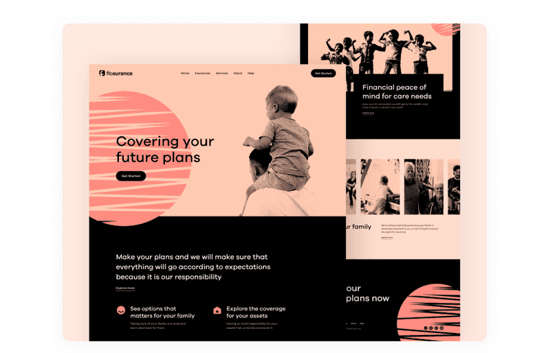
Dribbble shot by Esteen
-
Keep it simple
Even though sometimes you want to make your insurance website design filled with various decorative elements and animations, you need to know when to stop. An insurance company website does not have to be strict, but it should also be remembered that the design of such a website should not distract users. You can make a great design using color accents, high-quality images, and simple icons.
-
Ease of use
Work on making your website easy to use. Your customers shouldn’t spend too much time looking for something. If your users have to search for something on your website for too long, they will likely leave.
-
Consistent navigation
You can create a flashy insurance website design with bells and whistles, but if visitors can’t find what they’re looking for quickly, it doesn’t matter. More importantly, flashy features can turn customers off right from the start.
It is especially true for mobile visitors, who may have trouble loading a page if it is overloaded with too many features. To facilitate and improve the user experience on your website, pay attention to creating straightforward navigation. Make it intuitive and add icons to illustrate menu sections.
Also, make sure that the navigation menu is visible, or else the user can intuitively find where to click to display it.
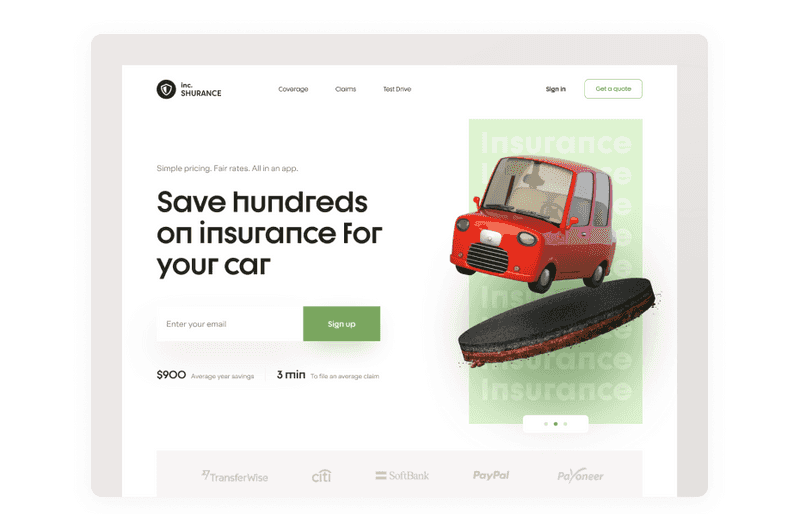
Dribbble shot by Halo Lab
-
Effective CTAs
Be wise about where you place your calls to action in your insurance website design and what information you collect from customers. For example, when visitors respond to an appropriate call to action on a particular service page, you will be able to target your marketing message more effectively.
Observe which calls to action are working and which are not effective on your site. CTAs should be highly visible but not too intrusive, as this can annoy the user.
-
Personalization
Your customers will appreciate the fast delivery of offers tailored to their requirements. Instead of spending much time researching the many options available and making difficult choices on your own, your customers will be directed to the offers they are interested in. It will increase your conversion and the loyalty of your customers.
-
Responsiveness
In fact, not having a responsive design is rated as a top reason visitors might leave a website, according to a survey of 200+ web designers and freelancers. Therefore, if you want to generate more leads, you need to consider a responsive insurance website design that fits mobile screens. Thus, the quality of service for your customers will remain high, no matter what device they use to view your website.
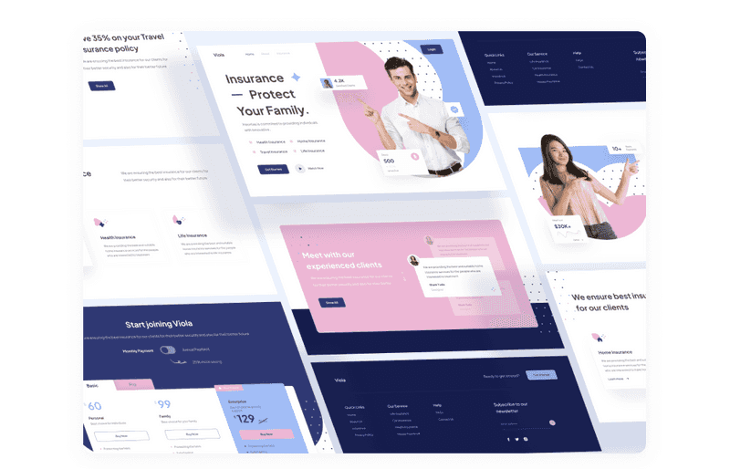
Dribbble shot by Vektora
-
Accessibility
To make your website available to all users, make it accessible. When designing a website, use the principles of accessibility that we described in our previous article. Here, you will learn how accessibility affects your website’s conversion, how it is helpful for business, and what to pay special attention to make your design pleasant for any user.

Accessibility Design Matters: Why is it So Important?
You can create a top-notch insurance website design that will impress potential customers and quickly pay off by following these tips.
Take Care of These Points When Creating an Insurance Company Website Design to Boost Conversion
To build insurance website that works fantastic and would give you a great profit, you need to take care of these points. Do it, and you will get a superb tool that will be an investment in the future of your business.
-
Brand elaboration
Remember the Geico insurance company we mentioned above. Their gecko branding is easily recognizable and memorable. In this way, users remember the brand, and when they need insurance, this branding can quickly appear in their heads, which will lead them to take out insurance there.
You should create your logo and some visual elements to make your website stand out. It is crucial to elaborate your branding into your insurance website design because 50% of consumers believe that website design is critical to a business’s overall brand. And do not forget about the constancy of the color theme. So, each color must be justified.
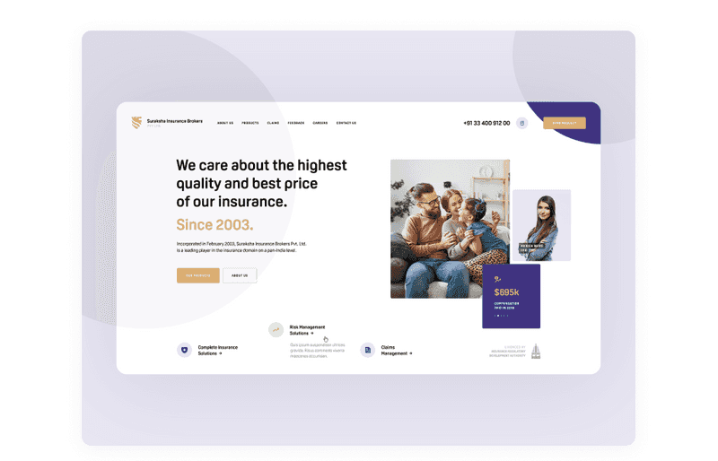
Dribbble shot by Seahawk
-
Choose a focus
Don’t try to cram everything into your home page that makes your offer valuable and attractive. Your site has enough space to tell your brand story. The About Us page and blog is a good choice. These pages will give your site more flavor and personality. Make sure your message is consistent and focused on issues you can solve.
-
Original content
The blog page and your website, in general, should contain original content. However, suppose your company does not have a copywriter and SEO specialist on staff. In that case, you can find freelance specialists who will create original content using the most relevant keywords to improve your site’s Google ranking.
-
Hire a lovely design team
It all starts with UI/UX design. Therefore, first, you need to hire designers. Designers will collect information about your project, develop a specific action plan, develop what fonts and colors are best to use, and build wireframes and prototypes. The Axicube team has worked extensively with businesses in various industries and start-ups. As a result, we have a precise sequence of actions for each project, and we are ready to help you take your business to the next level.
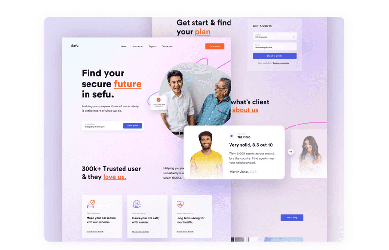
Dribbble shot by Rashed Kabir
With the knowledge of these tricks, you will be able to build insurance website that will work for you. In addition, a website will help you strengthen your brand and attract new customers, so don’t wait, get started right away!
Challenges
Creating an insurance website design is a complex undertaking that cannot be done without challenges. Consider a small list of the most common challenges that may come up when building an insurance website.
-
Optimizing website performance
As your content and number of visitors grow, your site may start to slow down, resulting in a loss of customers. To not lose customers, you need to optimize your website constantly.
To ensure optimal website performance, you need to tune website performance by enabling caching, improving page speed, and investing in responsive website design if you don’t already have one (all of these features affect search engine rankings).
-
Selling your services online
If you only sell your services offline, you will need to research your audience and competitors again to sell them through your website. Also, to successfully sell services online, you will need to familiarize yourself with new promotion channels and strengthen your online presence.
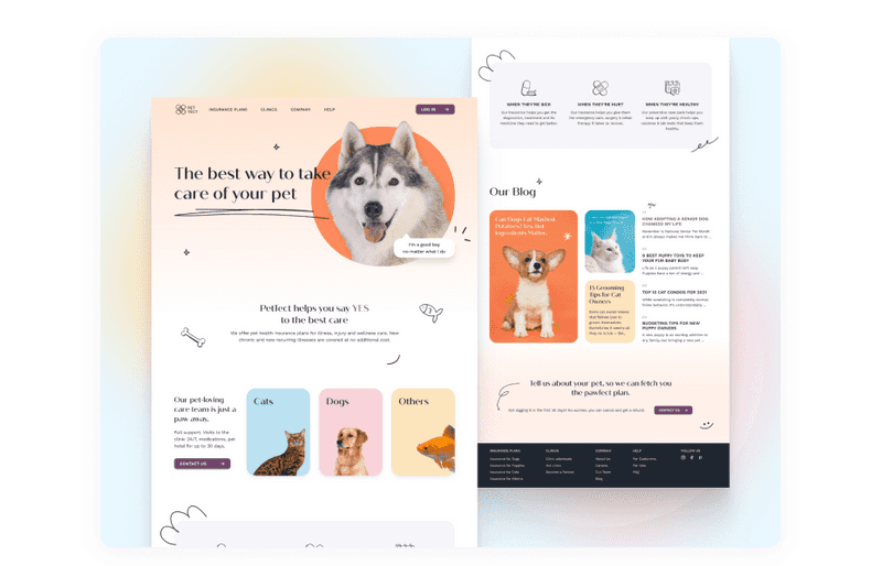
Dribbble shot by Axicube
-
Security
There are many ways to improve your website. First, developers consider all possible security measures during the development process.
One aspect of global security is the availability of SSL certificates. They provide encrypted communication between the browser and the server. This can help keep sensitive data secure, such as credit and debit card information, transaction details, usernames, and passwords.
-
CRM integration
The integration of the CRM will be good, only the data with which the organization begins is good. Thus, data quality is the primary concern of any data integration strategy. Any impurities in the data will lead to poor understanding and, ultimately, decision-making based on it.
It can be a complex issue. When inconsistent or invalid data is used to extract information, erroneous analytical data will be passed downstream, leading to more inconsistencies and a disastrous and inefficient big data environment with all datasets corrupted.
For the CRM integration to succeed, you need to organize all the information. You may also need to create additional cloud storage for the information so that all the data is correct and your site does not start to slow down.
You are now fully equipped to face the challenges of building an insurance website design. So do not hesitate before you start creating an insurance website for your business.
Final Words
A website is like a tireless employee who works for you 24 hours a day, seven days a week, and serves customers worldwide. Your website is the perfect salesperson and insurance agent - it knows everything about your company, is open all year round, meets thousands of people every day, and helps you grow your business. A website is an excellent investment in the future of your business.
We at Axicube work with different types of businesses, including insurance companies. Depending on your goals, we will help you design a website that will be attractive to customers.
Even though we use best practices, we remember that every business is unique. Therefore, it’s essential to create designs that help deal with the tasks and goals of the particular company. Whenever you need help, feel free to address Axicube, and we’ll create a proper solution for your insurance company!

