Eventually, interfaces fail to retain and convert customers. Users no longer interact with the interface as they’ve supposed to do. The business metrics start to fall, the sales go down, and the conversion rate does not fit into the patterns of the business plan. Does that mean that it’s the beginning of the end for a business? No. But it means that it’s time to conduct a UX audit and finally understand what exactly frustrates your users.
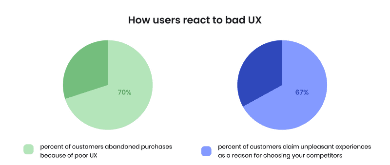
User experience is fundamental for the success of any interface, be it an application of a startup or e-commerce website. Just imagine that 70% of customers abandon purchases because of poor UX. Moreover, 67% of customers claim unpleasant experiences as a reason for choosing your competitors.
For any startup, small and medium business, e-commerce, or product company, user experience audit is a strong tool that pinpoints problems with the interface for further fixes and improvements. UX audit gives answers to four W questions that affect the behavior of the user:
- Where do users drop off?
- What do users not understand in your interface?
- Why does that happen?
- Where could you improve your product?
When you get these answers, you start to understand when the purchases are abandoned, why users do not leave their contacts, and even why they do not click on the button that you’ve placed right in the center of the landing page.
Now, great UX is an investment that has a fantastic ROI — 9,900%. So every dollar you now invest in UX will bring $100 in return. Indeed, the necessity of fixing all UX problems is now clear and monetized because no business in the world wants to lose money.
In this article, we will discuss usability audit — a tool to increase the performance of your interface and give you key insights on when to conduct an audit, how to do that on your own, and what to expect from the auditing expert teams.
What is a UX audit and when to conduct it for your company?
What is a UX audit? Katie Orenstein, Security Design Lead at IBMdesign, says ‘Auditing is not as simple as browsing the web and taking mental notes of what you see.’ Indeed, auditing is a complicated process that requires many steps that help to evaluate user interface, detect problematic areas, and find the solutions for minor and major issues. UX audit answers any usability question if it is asked correctly.
How to do a UX audit of a site at different stages of the product life cycle? Here are the examples:
- validating MVP ideas,
- implementing new functionality,
- redesigning a website
- detecting existing problems.
UX audit for the first three examples is a preventative method, while the last one is about finding and fixing existing issues. For example, the sales went down, but the quality of the product/service remained the same. The conversion rate is low. Customers start to complain about any process: purchasing, filling the forms, and even finding some information.
If you are at the point where any of these happens, consider auditing user experience.
What are the benefits of UX audit for different companies?
Do you ask yourself, ‘Why UX audit needed’ for a good and effective interface? Sure you do. Let’s imagine the situation when a startup launches a website without preliminary user research. It seems that the website looks nice, but it does not feel nice for users. We outline three basic problems a startup may encounter with UX:
- ignoring mobile
- vague MVP
- cluttered forms
The same is applied to the interfaces of product, small and medium business websites. They frequently do the same mistakes:
- service/product page/block is omitted
- no contact information
- abundance of CTAs
- complicated registration or onboarding
E-commerce businesses have all these problems, and some on the top:
- missing product info
- no site search
- unclear purchase and checkout process.
When done correctly, a UX audit of website helps to detect where exactly the problem occurred and how the company can fix it.
How UX audit helps to fix problems
Frank Chimero, co-founder of Abstract, states ‘People ignore design that ignores people’. With an impressive number of opinion-centric interfaces that are concentrated on the desires of stakeholders, not common users, user-centric design becomes an acute problem that requires urgent actions.
An effective user-centric UX helps increase conversion rate, accelerate the process of working with the interface, detect bottlenecks, improve performance, and engage users.
9 basic steps of the User experience audit
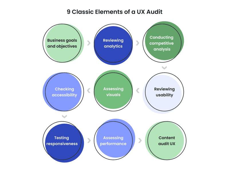
As we have already mentioned, any audit of user experience is a complicated process. The best way to do a product audit mobile UX deliverable audit, as well as any other kind of UX audit, is introducing these 9 classic elements:
- Defining business objectives and goals
- Reviewing analytics
- Conducting competitive analysis
- Checking accessibility
- Assessing visuals
- Reviewing usability
- Testing responsiveness
- Assessing performance
- Content audit UX
How to conduct UX analysis on your own
How to do a UX site audit on your own? Is it possible to do? It is. You can conduct a basic audit and determine the biggest bottlenecks. Google Analytics is one of the basic tools that one can use for determining problems. Also, you can imagine yourself as a real customer and try to complete the customer journey on your own. You will get even more insights if you conduct UX testing and ask your clients to complete the customer journey and comment on their actions. In this way, you will understand the main bottlenecks of your interface.
We’re sure now you’re asking yourself a question: ‘What is a good ux checklist to audit my website?’ We have an answer.
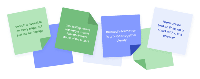
To conduct a basic UX audit on your own, you can use the UX audit checklist. It covers the essential elements that you can easily check without the help of professionals.
However, even a quick UX audit must be unbiased to be effective. And if you are not sure that you can honestly answer some questions, it’s better to ask for help.H3 Benefits of ordering professional UX analysis
A professional UX audit allows you to get an expert review of the interface and get key insights into what’s wrong with it. Professional UX researchers have a toolkit and skills for understanding why exactly UX fails to convert and at what point the patterns of users’ behaviour were ignored.
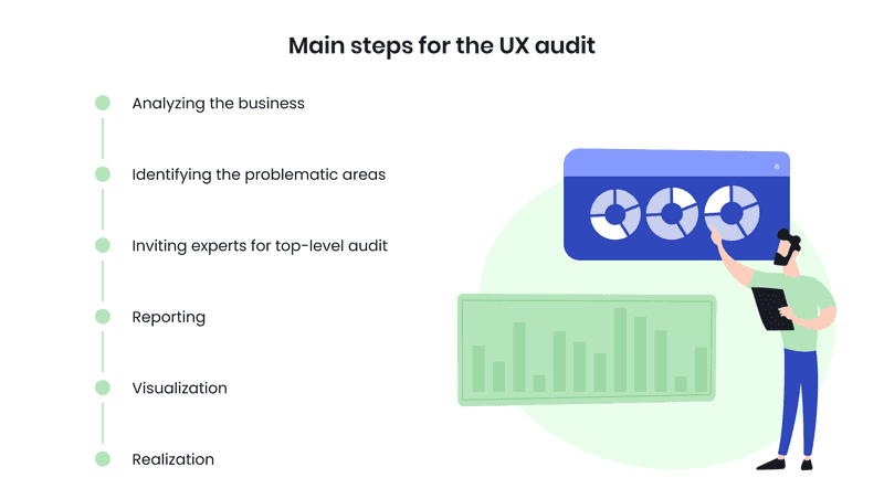
At Axicube, the main steps for UX audit are as follows:
-
Step 1. Analyzing the business
We conduct business processes, determine the goals and objectives, conduct competitive analysis, and get insights from current analytics.
-
Step 2. Identifying the problematic areas
When we know what we want to achieve with UX, we start to identify problems with the interface by implementing heuristic evaluation and estimation, cognitive and pluralistic walkthrough, and inspection of features, consistency, standards, and formal usability.
-
Step 3. Inviting experts for top-level audit
Every company has its peculiarities, so we’re always ready to invite experts who can help us with content audit UX design for a certain business area.
-
Step 4. Reporting
The data mining process is over, and the time for developing hypotheses starts. We provide our clients with a list of recommendations and explain how exactly they affect the user experience.
-
Step 5. Visualization
We put the suggestions and recommendations in mockups so you could easily understand what exactly should be done to improve the performance.
-
Step 6. Realization (optional)
If our clients have any problems implementing recommendations, we’re always ready to help them.
We must admit that UX audit is not a magic pill that will solve all the problems. During the UX analysis, we develop recommendations based on the data we collect. These recommendations may vary depending on various factors, and the effectiveness of different recommendations implemented at the same time may change. Therefore, we recommend following the golden rule of UX design: implement changes step by step. Every new integration can affect the whole performance of the interface.
Case Study: Axicube UX audit for Apricot Insurance
We can understand how a professional UX audit works for businesses by examining the Axicube for Apricot Insurance case.
As the result of our website UX audit, Axicube developed a suggested UML diagram to demonstrate how to fix bottlenecks and simplify the customer journey. Additionally, we defined the following recommendations in the interface of Apricot Insurance:
- Proving a progress indicator to show customers their location and how many steps are left to complete the journey (problem solved: giving the user a sense of control, therefore increase users’ loyalty)
- Allowing users to change information to reduce the number of mistakes and time spent for corrections (problem solved: reducing time spent on correcting information is form fields)
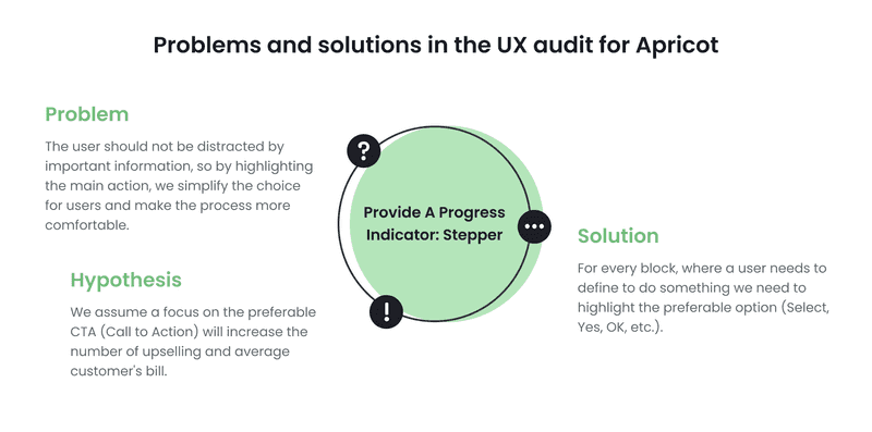
- Highlighting main actions to focus user attention on the main CTA (problem solved: increasing numbers of upsells)
Also, the list of other recommendations in this UX audit sample included fixing sidebar, introducing predictable order, sending emails for users, and others.
UX audit deliverables: what information a good report must contain
The process of UX site audit is based on collecting the information. But for further work with the data, information must be clearly analyzed and aggregated. All hypotheses, questions, and ideas should be presented along with the relevant metrics and numbers.
As a result of the professional UX audit, you get reports, documents, reviews, and a list of recommendations (if you work with a team of experts). The formats of UX reports are different depending on the goals you pursue. For example, Hubspot provides its own example of the UX audit report.
The main requirement of a professional UX audit is that, except for numbers, it should contain recommendations on fixing them. Experts may also add mockups and resources that will make this process easier.
All in all, a UX report should contact this fundamental information:
- Project description (including business goals that are to be fixed with UX)
- The methodology implemented during the process (including qualitative metrics, user behavioral information, competitive analysis, user interviews, heuristic evaluation, and other methods)
- Testing results
- Major recommendations and suggestions.
Website UX audit: are you ready to conduct it?
You can compare a UX audit to a health checkup: even if everything seems fine, we need to conduct it to prevent problems.
Startup companies can increase conversion by fixing some minor UX problems on their websites; e-commerce businesses can grow in sales by introducing payment methods that their customers use; small and medium businesses can boost their performance by simplifying the contact forms. Each case will get unique recommendations, as there are no two identical businesses in the world.
As UX enthusiasts, we advocate for strong and effective interfaces. Working with various e-commerce, SaaS, insurance, and financial companies, we developed a detailed flow for UX audit that covers all major and minor aspects, concentrating on crucial information for a selected business. We provide expert opinions for a team of designers, so you can be sure that the audit result is unbiased.Axicube is the place where effective UX happens.
